


A lightweight, standalone vanilla JavaScript library for creating a vertical accordion UI for your web application.
How to use it:
Create the accordion header & inner content as shown below:
<div class="accordion js-accordion">
  <h3>Accordion Header</h3>
  <div class="accordion_inner">
    Accordion inner content goes here
  </div>
</div>
Add custom CSS styles to the accordion.
.accordion h3 {
  font-size: 1.25em;
  padding-top: .35em;
  padding-bottom: .175em;
  padding-left: 1em;
  color: #165b65;
  background-color: #dce9ee;
  border-left: 1px solid transparent;
  border-top: 1px solid #fff;
  border-bottom: 1px solid #b5c3c9;
  cursor: pointer;
  transition: all .4s;
  position: relative;
}
.accordion h3:nth-of-type(even) {
  background-color: #edf4f7;
  border-top-color: #fff;
  border-bottom-color: #d2dbdf;
}
.accordion h3:after {
  content: "";
  position: absolute;
  top: 0;
  right: 0;
  bottom: 0;
  margin-top: 16px;
  margin-right: 1.1em;
  width: .8em;
  height: 12px;
  background: url("data:image/svg+xml;charset=utf8,%3Csvg xmlns='http://www.w3.org/2000/svg' viewBox='0 0 16 12'%3E%3Cpolygon fill='rgb(31,127,142)' points='8,12 0,0 16,0'/%3E%3C/svg%3E") 0 0 no-repeat;
}
.accordion .toggle-active, .accordion h3:nth-of-type(even).toggle-active {
  background-color: #79b8d2;
  color: #fff;
  text-shadow: 1px 1px 3px #265c72;
  border-top-color: white;
  border-bottom-color: #649cb4;
  font-weight: 300;
}
.accordion .toggle-active:after {
  background: transparent;
  border-top: 2px solid #fff;
  border-bottom: 2px solid #fff;
  height: 12px;
}
.accordion .toggle-active:before {
  content: "";
  position: absolute;
  top: 0;
  right: 0;
  bottom: 0;
  margin-top: 21px;
  margin-right: 1.1em;
  width: .8em;
  height: 2px;
  background-color: #fff;
}
.accordion > div {
  max-height: 999px;
  overflow: visible;
  transition: max-height .3s;
}
.accordion .closed {
  max-height: 0;
  overflow: hidden;
}
.core .closed { display: none; }
.accordion_inner { background-color: #ebf8f9; }
.content-contact { padding-top: 1em; }
.content-contact p {
  margin: 0;
  padding: .5em 3em 1.5em;
}
.icon-svg-use {
  position: absolute;
  top: .27em;
  left: -.5em;
  height: 16px;
  width: 16px;
  fill: #3aa5bf;
  background-color: transparent;
  border-color: transparent;
  border-radius: 0;
}
Load the core JavaScript at the end of the document.
<script src="assets/js/all.min.js"></script>
Changelog:
07/31/2018
- v0.0.2
See Also:
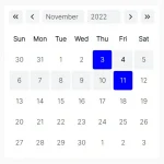 Lightweight Accessible Date Picker Component – WC Datepicker
 Responsive, Accessible Product Carousel – NovaSlider
 Stylish Accordion UI Using Details And Summary Elements
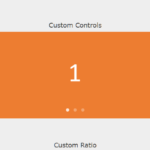 Touch-friendly Swiper/Carousel In Plain JavaScript – awesome-slider
 CSS/SCSS Dropdown & Dropup Component – Drop.css
 Mobile Tab Navigation UI In JavaScript And CSS
 Sliding Accessibility Settings Panel In JavaScript
 Generate Highly Customizable SVG Waves With Dynamowaves.js