


Omega.js is a modern responsive mobile-first navigation system for the web.
It uses CSS media queries to detect the screen size and collapse the regular navbar into a hamburger sidebar navigation (aka. off-canvas navigation).
Click/tap the hamburger button to toggle the sidebar navigation sliding out from the edge of the screen.
See also:
How to use it:
Import the Omega’s JavaScript and CSS files into the document.
<link rel="stylesheet" href="assets/css/omega.css">
<script src="assets/js/omega.js"></script>
Create the HTML for the sidebar navigation and done.
<div id="omega">
<div id="omega-content">
<nav>
<ul>
<li><a href="#">Home</a></li>
<li><a href="#">About</a></li>
<li><a href="#">Blog</a></li>
<li><a href="#">Contact</a></li>
</ul>
</nav>
<div class="omega-links">
<a href="#" class="button">Link 1</a>
<a href="#" class="button button-outline ">Link 2</a>
</div>
</div>
<button id="omega-button">☰</button>
<div id="omega-sidebar">
<div id="omega-sidebar-header"></div>
<div id="omega-sidebar-body"></div>
</div>
<div id="omega-overlay"></div>
</div>See Also:
 Responsive Dropdown/Off-canvas Navigation In Vanilla JavaScript – Menue
 Responsive Multi-level Dropdown Menu With JavaScript And CSS – ozmenu.js
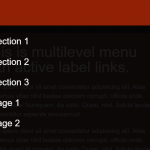 Mobile-friendly Hamburger Navigation With Submenus
 Convert Bootstrap 5 Navbar Into Offcanvas Menu
 Responsive Offcanvas Menu For Bootstrap 5
 Responsive Single-level Dropdown Menu With JavaScript
 Responsive Mobile Menu Using CSS Flexbox – ftwnav
 Responsive Multi-level Sidebar Menu With JavaScript/CSS