


Bungie Bar is an Apple.com inspired responsive navigation that collapses the long horizontal nav into a scrollable menu with left/right navigation arrows on mobile devices.
How to use it:
Insert the Bungie Bar’s JavaScript and Stylesheet into the html document.
<link rel="stylesheet" href="bungie.css">
<script src="bungie.js"></script>
Wrap the regular nav list into a container with the CSS class of ‘bungie’. That’s it.
<div id="bungie">
  <ul>
    <li><a>home</a></li>
    <li><a>messages</a></li>
    <li><a>notifications</a></li>
    <li><a>favorites</a></li>
    <li><a>profile</a></li>
    <li><a>about us</a></li>
    <li><a>more info</a></li>
    <li><a>settings</a></li>
    <li><a>privacy policy</a></li>
    <li><a>extras</a></li>
    <li><a>menu</a></li>
  </ul>
</div>
Changelog:
08/01/2018
- Cleaner scrolling increments: Removed scrolling animation for now, but each step in scrolling is measured by the width of the leftmost visible element, so that elements don’t get partially covered on the left.
See Also:
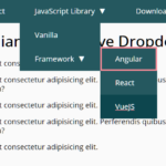 WCAG Compliant Responsive Dropdown Navigation – accessible-menu
 Accessible Dropdown Nav With Vanilla JavaScript – Clicky Menus
 Responsive Accessible Dropdown Menu Template with Vanilla JavaScript
 Modern One Page Scroll Web Template with Responsive Nav
 Responsive Dropdown/Off-canvas Navigation In Vanilla JavaScript – Menue
 Responsive Sliding Hamburge Menu System
 Responsive Sticky Mega Menu – SnazzyMenu.js
 Responsive Dropdown Mega Menu In JavaScript