


ProgressBar.js is a modern JavaScript library to create animated, smooth, creative progress indicators using SVG.
The progress indicator plugin works with any shapes thanks to the SVG path animation.
Built-in shapes:
- Line
- Circle
- Semi-Circle
- Square
How to use it:
1. Install & download the package.
# NPM
$ npm install progressbar.js --save
2. Import the main script progressbar.min.js from the dist folder.
<script src="./dist/progressbar.min.js"></script>
3. Create a container in which you’d like to draw the progress indicator.
<div id="example"></div>
4. The JavaScript to draw a progress indicator.
// circle
var myProgress = new ProgressBar.Circle('#example', {
    // options here
});
// line
var myProgress = new ProgressBar.line('#example', {
    // options here
});
// semi-circle
var myProgress = new ProgressBar.SemiCircle('#example', {
    // options here
});
// square
var myProgress = new ProgressBar.Square('#example', {
    // options here
});
5. The library also provides a lower-level API to animate any kind of SVG path.
<svg xmlns="http://www.w3.org/2000/svg" version="1.1" x="0px" y="0px" viewBox="0 0 100 100">
  <path fill-opacity="0" stroke-width="1" stroke="#bbb" d="M81.495,13.923c-11.368-5.261-26.234-0.311-31.489,11.032C44.74,13.612,29.879,8.657,18.511,13.923  C6.402,19.539,0.613,33.883,10.175,50.804c6.792,12.04,18.826,21.111,39.831,37.379c20.993-16.268,33.033-25.344,39.819-37.379  C99.387,33.883,93.598,19.539,81.495,13.923z"/>
  <path id="custom" fill-opacity="0" stroke-width="3" stroke="#ED6A5A" d="M81.495,13.923c-11.368-5.261-26.234-0.311-31.489,11.032C44.74,13.612,29.879,8.657,18.511,13.923  C6.402,19.539,0.613,33.883,10.175,50.804c6.792,12.04,18.826,21.111,39.831,37.379c20.993-16.268,33.033-25.344,39.819-37.379  C99.387,33.883,93.598,19.539,81.495,13.923z"/>
</svg>
var custom = new ProgressBar.Path('#custom', {
    // options here
});
6. All possible options to customize the progress indicator.
// built-in shapes
var myProgress = new ProgressBar.Shape('#example', {
    // Stroke color
    color: '#555',
    // Width of the stroke.
    strokeWidth: 1.0,
    // Color for lighter trail stroke
    // underneath the actual progress path.
    trailColor: '#eee',
    // Width of the trail stroke.
    trailWidth: 1.0,
    // Inline CSS styles for the created SVG element
    // Set null to disable all default styles.
    // You can disable individual defaults by setting them to `null`
    svgStyle: {
      display: 'block',
      width: '100%'
    },
    // Text options. Text element is a <p> element appended to container
    // You can add CSS rules for the text element with the className
    // NOTE: When text is set, 'position: relative' will be set to the
    // container for centering. You can also prevent all default inline
    // styles with 'text.style: null'
    // Default: null
    text: {
      // Initial value for text.
      // Default: null
      value: 'Text',
      // Class name for text element.
      // Default: 'progressbar-text'
      className: 'progressbar__label',
      // Inline CSS styles for the text element.
      // If you want to modify all CSS your self, set null to disable
      // all default styles.
      // If the style option contains values, container is automatically
      // set to position: relative. You can disable behavior this with
      // autoStyleContainer: false
      // If you specify anything in this object, none of the default styles
      // apply
      // Default: object speficied below
      style: {
        // Text color.
        // Default: same as stroke color (options.color)
        color: '#f00',
        position: 'absolute',
        left: '50%',
        top: '50%',
        padding: 0,
        margin: 0,
        // You can specify styles which will be browser prefixed
        transform: {
            prefix: true,
            value: 'translate(-50%, -50%)'
        }
      },
      // Only effective if the text.style is not null
      // By default position: relative is applied to container if text is set.
      // Setting this to false disables that feature.
      autoStyleContainer: true,
      // Only effective if the shape is SemiCircle.
      // If true, baseline for text is aligned with bottom of the SVG canvas.
      // If false, bottom line of SVG canvas is in the center of text.
      alignToBottom: true
    },
    // Fill color for the shape. If null, no fill.
    fill: null,
    // Duration for animation in milliseconds
    duration: 800,
    // Easing for animation.
    // 'linear', 'easeIn', 'easeOut', 'easeInOut'
    easing: 'linear',
    // Built-in shape passes reference to itself and a custom attachment object to step function
    from: { color: '#eee' },
    to: { color: '#000' },
    step: function(state, circle, attachment) {
      circle.path.setAttribute('stroke', state.color);
    },
    // If true, some useful console.warn calls will be done if it seems that progressbar is used incorrectly
    warnings: false
});
// custom SVG shapes
var custom = new ProgressBar.Path('#custom', {
    // Duration for animation in milliseconds
    duration: 1200,
    // Easing for animation. See #easing section.
    easing: 'easeIn',
    // Attachment which can be any object you need to modify within the step function.
    // Passed as a parameter to step function.
    attachment: document.querySelector('#container > svg'),
    // Custom animation
    from: { color: '#eee' },
    to: { color: '#000' },
    step: function(state, path, attachment) {
      // Do any modifications to attachment and/or path attributes
    }
});
7. API methods.
// SVG element
instance.svg
// SVG path
instance.path
// SVG path which presents the trail of the progress bar
instance.trail
// <p> element which presents the text label for progress bar
instance.text
// animate to a specific value (0-1)
instance.animate(progress, [options], [cb]);
// set a new value
instance.set(progress);
// stop the animation
instance.stop();
// get the current value
instance.value();
// set text
instance.setText(text);
// destroy the instance
instance.destroy();
See Also:
 Pure CSS Progress Bar Library with Custom Themes – progress-bar.css
 Modern TypeScript Progress Bar Library – BProgress
 3D Liquid Progress Bar in Pure CSS/CSS3
 Easy Scroll Position Tracking – ScrollProgress.js
 Visualize Progress Data With Animated, Circular Progress Bars – ProgressJS
 Radial Progress Indicator For Click-and-hold Actions – HoldCircleJS
 Simple Scroll Progress Indicator For Long Pages – PageBar.js
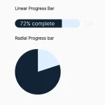 Generate Linear & Radial Progressbars Using CSS – Progress.css