


An easy, responsive, mobile-friendly slider/swiper library to switch between images with swipe events or by clicking/tapping the navigation arrows & pagination thumbnails.
How to use it:
1. Insert images to the slider container.
<div class="slide-wrapper">
  <ul class="slide">
    <li><img src="1.jpg" alt=""></li>
    <li><img src="2.jpg" alt=""></li>
    <li><img src="3.jpg" alt=""></li>
    <li><img src="4.jpg" alt=""></li>
    <li><img src="5.jpg" alt=""></li>
  </ul>
</div>
2. Add pagination thumbnails and navigation arrows to the slider.
<div class="wrap-controls">
  <div class="arrow-nav">
    <button class="prev"></button>
  </div>
  <ul class="custom-controls">
    <li><img src="1.jpg" alt=""></li>
    <li><img src="2.jpg" alt=""></li>
    <li><img src="3.jpg" alt=""></li>
    <li><img src="4.jpg" alt=""></li>
    <li><img src="5.jpg" alt=""></li>
    <li><img src="6.jpg" alt=""></li>
  </ul>
  <div class="arrow-nav">
    <button class="next"></button>
  </div>
</div>
3. The required CSS styles for the slider.
ul {
  padding: 0px;
  margin: 0px;
  list-style: none;
}
img {
  display: block;
  max-width: 100%;
}
.slide-wrapper {
  overflow: hidden;
}
.slide {
  display: flex;
}
.slide:hover {
  will-change: transform;
}
.slide li {
  flex-shrink: 0;
  max-width: 600px;
  margin: 0 20px;
  border-radius: 4px;
  overflow: hidden;
  box-shadow: 0 2px 4px rgba(0,0,0,.4);
  opacity: .8;
  transform: scale(.8);
  transition: .4s;
}
.slide li.active {
  opacity: 1;
  transform: scale(1);
}
[data-control="slide"] {
  display: flex;
  justify-content: center;
  margin-top: 20px;
}
[data-control="slide"] li a {
  display: block;
  width: 12px;
  height: 12px;
  background: #FB5;
  border-radius: 50%;
  overflow: hidden;
  text-indent: -999px;
  margin: 5px;
}
[data-control="slide"] li.active a, [data-control="slide"] li a:hover {
  background: #E54;
}
.custom-controls {
  display: flex;
  justify-content: center;
  margin-top: 40px;
  margin-bottom: 20px;
  flex-wrap: wrap;
}
.custom-controls li {
  opacity: .8;
  transform: scale(.8);
  width: 40px;
  height: 40px;
  border-radius: 50%;
  overflow: hidden;
  margin: 2px;
  box-shadow: 0 2px 2px rgba(0,0,0,.5);
  transition: .3s;
  cursor: pointer;
}
.custom-controls li.active {
  opacity: 1;
  transform: scale(1);
}
.arrow-nav {
  display: flex;
  justify-content: space-around;
  margin: 20px 10px 0 10px;
}
.arrow-nav button {
  cursor: pointer;
  border: none;
  border-radius: 50%;
  color: white;
  width: 30px;
  height: 30px;
  background: #999 url('../img/arrow.svg') center center no-repeat;
  outline: none;
}
.arrow-nav button:hover {
  background: #333 url('../img/arrow.svg') center center no-repeat;
  transition: ease-in-out .3s;
}
.arrow-nav button.prev {
  transform: rotate(-180deg);
}
.wrap-controls {
  display: flex;
  justify-content: center;
  align-items: center;
}
4. Import the necessary JavaScript files into the document.
import SlideNav from './slide.js';
5. Initialize the slider. That’s it.
const slide = new SlideNav('.slide', '.slide-wrapper');
slide.init();
slide.addArrow('.prev', '.next');
slide.addControl('.custom-controls');
See Also:
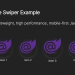 Mobile-first JavcaScript Slider Library – VibeSwiper
 Minimal Swipeable Gallery In Pure JavaScript – SwiperBox
 Lightweight Touch-enabled Swiper In Pure JavaScript – tiny-swiper
 Mobile-first Slider/Scroller In JavaScript – style-swiper
 Responsive Card Slider/Swiper In JavaScript – stacked-cards
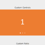 Touch-friendly Swiper/Carousel In Plain JavaScript – awesome-slider
 Lightweight Mobile Swiper In Pure JavaScript – Light-Swiper
 Mobile-first Swiper In Vanilla JavaScript – vanillaSwiper