


| Author: | webtui |
|---|---|
| Views Total: | 319 views |
| Official Page: | Go to website |
| Last Update: | August 21, 2025 |
| License: | MIT |
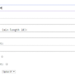
Preview:

Description:
WebTUI is a modular CSS library that gives your web projects the distinct look and feel of a Terminal User Interface (TUI).
It’s not a full-blown framework like Bootstrap or Tailwind; think of it more as a focused styling layer.
Its main function is to provide base styles, components, and utilities that evoke that classic terminal vibe using modern CSS features like layers.
Features:
- Modular Design: Import only the CSS components and utilities you actually need. Keeps things lightweight.
- CSS Layer Control: Leverages
@layerfor predictable style precedence. This drastically reduces the need for!importanthacks. - Minimal Markup: Designed to work with simple HTML structures and attributes, avoiding excessive class names.
- Theming: Comes with basic light/dark modes and supports theme plugins (like Catppuccin, Nord) or custom CSS variables.
- Plugins: Extend functionality with things like Nerd Font icons for specific components.
- Pure CSS: It provides the styles; you still structure your HTML and might write some layout CSS.
How to use it:
1. Install the package using your preferred package manager:
bun add @webtui/css
npm install @webtui/css
yarn add @webtui/css
pnpm add @webtui/css
2. In your main CSS file (e.g., global.css, index.css), you must define the layer order before any WebTUI imports. This tells the browser how to prioritize the styles.
/* Define the layers first */
@layer base, utils, components;
/* Import the base styles */
@import "@webtui/css/base.css";
/* Now import only the utilities and components you need */
/* Utils */
@import "@webtui/css/utils/box.css"; /* For box borders */
/* Components */
@import "@webtui/css/components/button.css";
@import "@webtui/css/components/typography.css";
@import "@webtui/css/components/badge.css";
@import "@webtui/css/components/input.css";
/* If using a theme plugin, import it last */
@import "@webtui/theme-catppuccin";
@import '@webtui/theme-nord';
/* If using the Nerd Font plugin, import it after components/themes */
@import "@webtui/plugin-nf";
3. Or load the library from a CDN.
<style>
  @layer base, utils, components;
</style>
<!-- Import specific versions from CDN -->
<link rel="stylesheet" href="https://cdn.jsdelivr.net/npm/@webtui/css@VERSION/dist/base.css" />
<link rel="stylesheet" href="https://cdn.jsdelivr.net/npm/@webtui/css@VERSION/dist/utils/box.css" />
<link rel="stylesheet" href="https://cdn.jsdelivr.net/npm/@webtui/css@VERSION/dist/components/button.css" />
<!-- Add other components/themes/plugins as needed -->
<link rel="stylesheet" href="https://cdn.jsdelivr.net/npm/@webtui/theme-catppuccin@VERSION/dist/index.css" />
<link rel="stylesheet" href="https://cdn.jsdelivr.net/npm/@webtui/plugin-nf@VERSION/dist/index.css" />
</head>
<!-- Full Library Import: -->
<link rel="stylesheet" href="https://cdn.jsdelivr.net/npm/@webtui/css@VERSION/dist/full.css" />
4. WebTUI applies styles based on standard HTML elements and custom attributes like is-, box-, variant-, size-, and cap-.
- Typography: Styles
h1–h6,p,a,code, etc. Import@webtui/css/components/typography.css. - Badge: Use
<span is-="badge">. Customize withvariant-(matches theme colors). Extend styles via CSS variables (--badge-color,--badge-text) or add new variants in thecomponentslayer. Nerd Font plugin addscap-attribute for different end styles. Import@webtui/css/components/badge.css. - Button: Use
<button>or any element withis-="button". Customize withvariant-,size-. Usebox-(requires@webtui/css/utils/box.css) for borders (square,round,double). Style via--button-primary,--button-secondary. Import@webtui/css/components/button.css. - Input: Styles
<input>. Forbox-borders, wrap the input in a<div box-="...">because inputs don’t support pseudo-elements needed for the box effect. Alternatively, use<div contenteditable box-="...">. Import@webtui/css/components/input.css.
<!-- Typography (styles H1-H6, p, etc.) -->
<h1>Main Heading</h1>
<h2>Subheading</h2>
<p>Some text with <code>inline code</code> and a <a href="#">link</a>.</p>
<!-- Button -->
<button>Default Button</button>
<button variant-="foreground1">Colored Button</button>
<button size-="small">Small Button</button>
<button disabled>Disabled</button>
<!-- Button with Box Utility -->
<button box-="square">Square Border</button>
<button box-="round" variant-="background2">Round & Colored</button>
<!-- Badge -->
<span is-="badge">Info</span>
<span is-="badge" variant-="foreground2">Low Priority</span>
<!-- Input (requires wrapping for box-) -->
<div box-="round">
  <input type="text" placeholder="Enter text..." />
</div>
<!-- Box Utility on a Div -->
<div box-="double">
  <p>Content inside a double-lined box.</p>
</div>
5. Check out the official documentation for more usage of Themes and Plugins.
Changelog:
v0.1.5 (08/21/2025)
- Added the View Component
- Added the Progress Component
- Removed the arrow marker from the Popover Component on Safari
v0.1.4 (07/15/2025)
- Corrects an input styling regression introduced in 0.1.3
v0.1.3 (07/10/2025)
- Added the Spinner Component
- Added the Range Component
- Fixed table borders
- Fixed input component scoping
v0.1.2 (06/27/2025)
- Switches appear dimmer when unchecked
- Switches correctly show the track when the <input> stylesheet is imported
- Added edge/bisecting caps to the Separator Component
- Properly aligns Badges vertically
- Removes an invalid initial-value property from the Dialog Component
- Removes the markdown-like # markers prefixing heading elements <h1>-<h6>
- Allows the –box-border-color CSS to be inherited and controlled with CSS variables
- Allows the –table-border-color CSS to be inherited and controlled with CSS variables
- Allows the –separator-color CSS to be inherited and controlled with CSS variables
v0.1.1 (05/26/2025)
- New Switch Component
- Tooltips remain shown when you hover your mouse over the tooltip content
v0.1.0 (05/26/2025)
- Removed the contain:* keyword from the box- utility property in favor of shear
- Adds the pre Component
- Adds the Tooltip Component
- Adds the Table Component
- Adds the Dialog Component
- Adds a half-block height variants to Buttons so they don’t appear so tall
See Also:
 Terminal Style CSS Framework – terminal.css
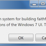 Windows 7 CSS Framework – 7.css
 Minimalist CSS Framework For Creating Modern Web Pages – Mgplus
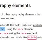 Minimal Classless CSS Framework – Simple.css
 Zero-Class Web Development with launch.css Framework
 Vanilla CSS Design System: Lightweight & Modular
 Responsive Classes CSS Framework – Prime.css
 Modern Classless CSS Framework – cosmoCSS