


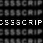
A text slide masking effect on mouse hover, built with CSS3 transitions and created by is8r.
How to use it:
Add a link with some text on your web page.
<a href="#" data-hover="Slide Masking Effect">
  Slide Masking Effect
</a>
CSS styles to enable the effect.
a {
  position: relative;
  overflow: hidden;
  color: white;
  text-decoration: none;
  border-bottom: 2px solid white;
  font-size: 30px;
  font-weight: normal;
  line-height: normal;
}
a:before {
  -moz-transition: max-width 0.2s ease-out;
  -o-transition: max-width 0.2s ease-out;
  -webkit-transition: max-width 0.2s ease-out;
  transition: max-width 0.2s ease-out;
  content: attr(data-hover);
  position: absolute;
  top: 0;
  left: 0;
  overflow: hidden;
  white-space: nowrap;
  max-width: 0;
  color: #111111;
}
a:hover:before {
  max-width: 100%;
}
a:before {
  border-bottom: 2px solid #111111;
}
See Also:
 Text Focus Effect with CSS and CSS3 Transitions
 Create Curved Text Effects with ArchText.js
 Morphing UI Elements Into Another with Blendy.js
 Smooh Theme Toggle Effects In JavaScript & CSS3
 Create Sparkling Text Effects With sparkly-text Web Component
 Add Retro Hacker Effects to Text with Hacked-Text Library
 9 Pretty Cool Text Effects – Toxel CSS
 Glowing Text Effect In Pure CSS