


A set of glowing text effects made using the CSS text-shadow property.
Examples:
h1 {
  color:#fff;
  text-shadow: 0 0 4px #fff,
  0 0 30px rgb(132, 0, 255),
  0 0 40px rgb(132, 0, 255),
  0 0 50px rgb(132, 0, 255);
}
.p1 {
  font-size: 20px;
  color: rgb(255, 255, 255);
  text-shadow: 0 0 4px rgb(255, 255, 255),
  0 0 30px rgb(132, 0, 255);
  letter-spacing: 2px;
  margin-left: 20px;
}
.p2 {
  font-size: 20px;
  color: rgb(255, 255, 255);
  text-shadow: 0 0 4px rgb(255, 255, 255),
  0 0 30px rgb(21, 255, 0);
  margin-left: 20px;
  letter-spacing: 2px;
}
.p3 {
  font-size: 20px;
  color: rgb(255, 255, 255);
  text-shadow: 0 0 4px rgb(255, 255, 255),
  0 0 30px rgb(0, 255, 221);
  margin-left: 20px;
  letter-spacing: 2px;
}
.p4 {
  font-size: 20px;
  color: rgb(255, 255, 255);
  text-shadow: 0 0 4px rgb(255, 255, 255),
  0 0 30px rgb(255, 0, 234);
  margin-left: 20px;
  letter-spacing: 2px;
}
.p5 {
  font-size: 20px;
  color: rgb(255, 255, 255);
  text-shadow: 0 0 4px rgb(255, 255, 255),
  0 0 30px rgb(255, 0, 234);
  margin-left: 20px;
  letter-spacing: 2px;
}
See Also:
 Create Curved Text Effects with ArchText.js
 Create Sparkling Text Effects With sparkly-text Web Component
 Add Retro Hacker Effects to Text with Hacked-Text Library
 9 Pretty Cool Text Effects – Toxel CSS
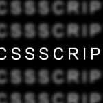 Text Focus Effect with CSS and CSS3 Transitions
 Text Slide Masking Effect with CSS3 Transitions
 Animated Text Background with SVG and CSS Stroke
 Mobile-compatible Responsive Gallery – HesGallery