


The letter slide-out effect allows you to create dynamic text reveal animations where letters smoothly expand from hidden to visible states.
It works by initially hiding letters with zero width and opacity, then expanding them sequentially when triggered by hover events.
This text reveal animation is ideal for interactive logos, dynamic headlines, or labels when there is limited space for text on a web page.
Features:
- Pure CSS transitions with minimal JavaScript for reverse animation timing
- Configurable stagger delays for each letter reveal
- Smooth cubic-bezier easing for professional animation curves
- Responsive font sizing using
clamp()function - Customizable color schemes for different letter groups
- Lightweight implementation with no external dependencies
See it in action:
How to use it:
1. Wrap your text in a container with the text-display class. Each letter requires a separate span element with a unique CSS class:
<div class="text-display">
  <span class="letter-c1">C</span>
  <span class="letter-s1">S</span>
  <span class="letter-s1">S</span>
  <span class="letter-s3">S</span>
  <span class="letter-c2">C</span>
  <span class="letter-r">R</span>
  <span class="letter-i">I</span>
  <span class="letter-p">P</span>
  <span class="letter-t">T</span>
</div>
2. Apply the base styles and animation properties:
- The letters to be revealed are initially hidden by setting their
max-widthandopacityto0. - The
overflow: hiddenproperty prevents the content of the<span>from being visible while its width is zero. - On
:hoverof the parent.text-displaycontainer, we transitionmax-widthto a value large enough to contain the letter (e.g.,200px) andopacityto1. - The staggered effect is created by applying a different
transition-delayto each letter.
.text-display {
  font-size: clamp(7rem, 20vw, 15rem);
  font-weight: 800;
  color: #2a2a2a;
  display: flex;
  align-items: baseline;
  letter-spacing: -0.03em;
  line-height: 0.85;
}
.letter-c1 {
  position: relative;
  z-index: 10;
}
.letter-c2,
.letter-s1,
.letter-s2,
.letter-s3,
.letter-r,
.letter-i,
.letter-p,
.letter-t {
  max-width: 0;
  overflow: hidden;
  opacity: 0;
  transition: all 0.5s cubic-bezier(0.4, 0, 0.2, 1);
}
.letter-s3,
.letter-c2,
.letter-r,
.letter-i,
.letter-p,
.letter-t {
  color: #3b82f6;
  font-weight: 600;
}
.text-display:hover .letter-s1 {
  max-width: 200px;
  opacity: 1;
  transition-delay: 0.05s;
}
.text-display:hover .letter-s2 {
  max-width: 200px;
  opacity: 1;
  transition-delay: 0.1s;
}
.text-display:hover .letter-s3 {
  max-width: 200px;
  opacity: 1;
  transition-delay: 0.13s;
}
.text-display:hover .letter-c2 {
  max-width: 200px;
  opacity: 1;
  transition-delay: 0.16s;
}
.text-display:hover .letter-r {
  max-width: 200px;
  opacity: 1;
  transition-delay: 0.19s;
}
.text-display:hover .letter-i {
  max-width: 200px;
  opacity: 1;
  transition-delay: 0.22s;
}
.text-display:hover .letter-p {
  max-width: 200px;
  opacity: 1;
  transition-delay: 0.28s;
}
.text-display:hover .letter-t {
  max-width: 200px;
  opacity: 1;
  transition-delay: 0.33s;
}
3. Add the JavaScript to handle reverse animation timing:
document.addEventListener("DOMContentLoaded", function () {
  const container = document.querySelector(".container");
  const letters = document.querySelectorAll('[class^="letter-"]:not(.letter-c1)');
  container.addEventListener("mouseleave", function () {
    letters.forEach((letter, index) => {
      const reverseDelay = (letters.length - index - 1) * 0.03;
      letter.style.transitionDelay = `${reverseDelay}s`;
    });
  });
  container.addEventListener("mouseenter", function () {
    const delays = [0.05, 0.1, 0.13, 0.16, 0.19, 0.22, 0.28, 0.33];
    letters.forEach((letter, index) => {
      letter.style.transitionDelay = `${delays[index]}s`;
    });
  });
});
See Also:
 Font-Based Handwriting Text Animation for the Web – Tegaki
 SwiftUI-Style Text Transitions for the Web – NumericText
 Torph: Animated Text Morphing for Vanilla JS, React, Vue, and More
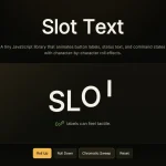 slot-text.js: Text Roll Animation for UI Labels
 Advanced Typewriter Animation Library – TypeFX.js
 Natural Typing Animations In JavaScript – Typecadence
 Animate Text Using SVG Font – svg-text-animate.js
 Text Typing Animations with Real-time Markdown/HTML Rendering – TypeMorph