


A lightweight (2kb minified) alert/toast library written in vanilla JavaScript. With a simple API and interface, this library enables you to create custom toast-like notifications easily.
How to use it:
1. Install and import the simple-vanilla-notifications.
# NPM
$ npm i simple-vanilla-notifications
// ES Module
import "simple-vanilla-notifications/defaults.css";
import { createNotificationManager } from "simple-vanilla-notifications";
// Browser
<script type="module">
import { createNotificationManager } from "./dist/js/simple-vanilla-notifications.js";
</script>2. Create and display a basic toast message on the screen.
const { createNotification } = createNotificationManager();
const notification = createNotification("A basic toast message!");
3. Available options.
const { createNotification } = createNotificationManager({
  // wrapper element
  container: document.createElement("div"),
  // time to wait before auto-dismiss the toast
  defaultAutoDismissTimeout: 3200,
  // determine whether to show a close button
  defaultDismissible: true,
  // whether to animate notifications.
  animated: true,
  exitAnimationTime: 3200,
});
4. Dismiss the toasts manually.
dismissNotification(notification.id);
// remove all
dismissAllNotifications();
5. Destroy the instance.
const { createNotification, destroy } = createNotificationManager();
destroy();
6. Override the default CSS styles.
.svn-notifications-container,.svn-notification,.svn-notification-close-button{
  box-sizing:border-box;
  font-family:sans-serif;
  border:0;
  padding:0;
  margin:0;
  background-color:inherit;
  color:inherit
}
.svn-notifications-container{
  position:fixed;
  right:8px;
  bottom:8px;
  display:flex;
  flex-direction:column;
  gap:8px;
  z-index:1001;
  align-items:flex-end
}
.svn-notification{
  width:max-content;
  padding:8px;
  border-radius:4px;
  color:#fff;
  background-color:gray;
  user-select:none;
  box-shadow:0 0 3px #000c;
  display:flex;
  gap:8px;
  align-items:center
}
.svn-notification-close-button{
  padding:8px;
  display:inline-flex;
  align-items:baseline;
  justify-content:center;
  border-radius:4px
}
.svn-notification-close-button:hover{
  background-color:#d3d3d3;
  color:#000
}
.svn-notification-close-button:active{
  background-color:#a9a9a9;
  color:#000
}
Changelog:
v3.2.0 (11/23/2022)
- You can now pass createNotificationManager a documentInstance option to use a Document instance that isn’t on the global object, for example,deno_dom.
- All calls to methods on document other than createElement will be null-checked, so you can write your own super bare-bones document implementation if you’re feeling crazy.
- Changed window.whatever() calls to whatever() for environments that use a different global object.
- The notification container will only be appended onto the end of the body if body exists on the documentInstance.
11/15/2022
- Bugfix
08/16/2022
- Add mobile layout & make overflowing text scrollable
See Also:
 Material Design Toast & Snackbar Library with Action Buttons – MiniSnackbar
 Developer-Friendly Toast Alerts in JavaScript – Toast-JS
 Sonner-Style Stacked Toast Notifications in JavaScript – Toastry
 Framework-Agnostic Toast Notifications with TypeScript – NotifyX
 Advanced Toast/Tooltip/Popover/Confirm/Modal Notification Library – toast-anchor
 Modern Toast Popup JavaScript Library – EggyJS
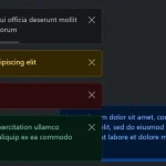 Advanced Alert Notification System For Bootstrap 5 – AvalynxAlert.js
 SVG Gooey Toast Notification Library – Physics Toast