


input-mask.js is a lightweight, cross-platform, progressively enhanced JS library that has the ability to validate and mask your input fields with accessibility support.
The placeholder attribute, available for <textarea> and several <input> types, provides a hint describing the expected value of a form control. For example, a developer can tell a browser to display XXXXX-XXXX for an input requiring a long-format American ZIP code, or (XXX) XXX-XXXX for an input requiring a North American-style telephone number. The placeholder attribute was introduced in HTML5 and has been supported since IE 10.
By default, the placeholder appears as gray text inside an input field. The placeholder disappears when the value becomes non-empty.
Because of the inability to easily style the placeholder and because it disappears on data entry, designers and developers have been asking for a permanent, styleable placeholder that demarks what data the user is allowed to enter in a text box. They’ve been asking for “input-masking” — a string of characters representing the expected data format which updates as the user enters the value, continuously displaying a hint as to the remaining required characters. There is finally an accessible solution for this demand.
Accessibility & Placeholder
Before we dive in, a note on accessibility: Do not use the placeholder attribute as a replacement for a <label>, as doing so reduces the accessibility and usability of the form control. While the label is shown at all times, the placeholder is only shown before the user enters a value.
The placeholder is not an alternative for <label> nor for the title attribute.
For each text field, checkbox, radio button, and drop-down menu, always include an associated <label> describing its purpose. Associating a <label> with each form control improves accessibility by both providing a large, clickable area for mouse users to access the form control, and by ensuring assistive technologies (AT) correctly inform the user of the purpose of a focused form control. The hint given by the label is always read by AT, unless ARIA attributes provide alternatives.
When requiring input data to match a specific pattern, ALWAYS include a title attribute describing the expected pattern.
How to use it:
Just include the JavaScript file masking-input.js in the document and the masking-input library is ready for use. The data-autoinit attribute is used to determine whether to automatically initialize the library or not.
<script src="js/masking-input.js" data-autoinit="true"></script>
Set the input masks and validation rules as follows:
<label for="expiration">Credit Card Expiration Month</label>
<input id="expiration" type="tel" placeholder="MM/YY" class="masked" pattern="(1[0-2]|0[1-9])\/\d\d" data-valid-example="11/18" title="2-digit month and 2-digit year greater than 01/15">
<label for="zip">Zip Code</label>
<input id="zip" type="tel" name="zipcode" placeholder="XXXXX" pattern="\d{5}" class="masked" title="5-digit zip code">
<label for="zipca">Canadian Zip Code</label>
<input id="zipca" type="text" name="zipcodeca" placeholder="XXX XXX" pattern="\w\d\w \d\w\d" class="masked" data-charset="_X_ X_X" title="6-character alphanumeric zip code in the format of A1A 1A1">
<label for="tel">Telephone</label>
<input id="tel" type="tel" name="phone" placeholder="(XXX) XXX-XXXX" pattern="\(\d{3}\) \d{3}\-\d{4}" class="masked" title="10-digit number">
<label for="cc">Credit Card Number</label>
<input id="cc" type="tel" name="ccnumber" placeholder="XXXX XXXX XXXX XXXX" pattern="\d{4} \d{4} \d{4} \d{4}" class="masked" title="16-digit number">
See Also:
 Easy Input Mask JavaScript Library – MaskerJS
 Lightweight Form Validation and Input Masking/Formatting – Masker.js
 Lightweight Input Masking for Web Devs – Masky.js
 Easy Input Mask Component In Vanilla JavaScript & Vue.js – Maska
 Cross-Framework Input Masking Library – Maskfy.js
 Masking Sensitive Input Fields with masked-password
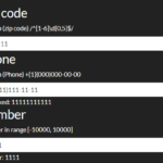 Feature-rich Input Mask Plugin With Vanilla JavaScript – imaskjs
 Developer-friendly Input Mask & Validation Library – smask