


The goal of an accessible modal dialog is to achieve modality without relying on the keyboard to close. Modal dialogs that use the Escape key to close can be disorienting and disruptive to users who do not utilize the keyboard, such as those with limited mobility, beginners, and the younger generations.
An accessible modal dialog should use a single action to close, which can be accomplished using a simple dynamic button adding an extra level of visual hierarchy and delineation to a design. This tutorial demonstrates how this can be achieved using vanilla JavaScript and native HTML5 <dialog> element.
How to use it:
1. Create a dialog box using the <dialog> HTML element.
<dialog id="dialog" class="dialog">
  <header>
    <h1>Dialog Title</h1>
    <!-- Close Button -->
    <button type="submit" aria-label="Close dialog" id="js-close-button">
      <svg viewBox="0 0 352 512" width="100" title="times">
        <path d="M242.72 256l100.07-100.07c12.28-12.28 12.28-32.19 0-44.48l-22.24-22.24c-12.28-12.28-32.19-12.28-44.48 0L176 189.28 75.93 89.21c-12.28-12.28-32.19-12.28-44.48 0L9.21 111.45c-12.28 12.28-12.28 32.19 0 44.48L109.28 256 9.21 356.07c-12.28 12.28-12.28 32.19 0 44.48l22.24 22.24c12.28 12.28 32.2 12.28 44.48 0L176 322.72l100.07 100.07c12.28 12.28 32.2 12.28 44.48 0l22.24-22.24c12.28-12.28 12.28-32.19 0-44.48L242.72 256z" />
      </svg>
    </button>
  </header>
  <article>
    <p>Modal Content Here</p>
    <form method="dialog">
      <p>
        <!-- Another Close Button -->
        <button type="submit">Close me! (without animation)</button>
      </p>
    </form>
  </article>
</dialog>
2. The necessary CSS for the modal dialog & open/close animations.
:root {
  --golden-ratio: 1.61803398875;
  --color-text: black;
  --color-bg: white;
  --gutter: 3ch;
  --leading: 1.5;
  --spacing-x: var(--gutter);
  --spacing-y: calc(var(--leading) * var(--golden-ratio) * 1ex);
  --page-padding-x: clamp(5vw, calc((100vw - 75ch) / 2), 38.2vw);
  --border-width: 0.1em;
  --transition: 250ms ease-out;
}
.dialog {
  --animation-in-settings: 500ms cubic-bezier(0.25, 0, 0.3, 1) normal;
  --animation-out-settings: 500ms cubic-bezier(0.5, -0.5, 0.1, 1.5) normal;
  max-inline-size: min(90vw, 45ch);
  max-block-size: min(80vh, 100%);
  max-block-size: min(80dvb, 100%);
  padding: 0;
}
.dialog[open] {
  -webkit-animation: slidein var(--animation-in-settings);
  animation: slidein var(--animation-in-settings);
}
@media (prefers-reduced-motion: reduce) {
  .dialog[open] {
    -webkit-animation: fadein var(--animation-out-settings);
    animation: fadein var(--animation-out-settings);
  }
}
.dialog.is-hidden {
  -webkit-animation: minimize var(--animation-out-settings);
  animation: minimize var(--animation-out-settings);
}
@media (prefers-reduced-motion: reduce) {
  .dialog.is-hidden {
    -webkit-animation: fadeout var(--animation-out-settings);
    animation: fadeout var(--animation-out-settings);
  }
}
.dialog header,
.dialog article {
  padding-inline: var(--spacing-x);
}
.dialog header {
  display: grid;
  grid-template-columns: 1fr auto;
  align-items: center;
  position: sticky;
  top: 0;
  padding-block: calc(var(--spacing-y) / 2);
  background-color: var(--color-bg);
  border-bottom: var(--border-width) solid;
}
.dialog header>* {
  margin: 0;
  line-height: 1;
}
.dialog header button {
  display: grid;
  place-items: center;
  width: 2rem;
  height: 2rem;
  padding: 0;
}
.dialog article {
  padding-block: var(--spacing-y);
}
.dialog::-webkit-backdrop {
  position: fixed;
  top: 0;
  left: 0;
  right: 0;
  bottom: 0;
  background-color: rgba(0, 0, 0, 0.5);
  -webkit-backdrop-filter: blur(0.5rem);
  backdrop-filter: blur(0.5rem);
  -webkit-animation: none;
  animation: none;
}
.dialog::backdrop {
  position: fixed;
  top: 0;
  left: 0;
  right: 0;
  bottom: 0;
  background-color: rgba(0, 0, 0, 0.5);
  -webkit-backdrop-filter: blur(0.5rem);
  backdrop-filter: blur(0.5rem);
  -webkit-animation: none;
  animation: none;
}
.dialog[open]::-webkit-backdrop {
  -webkit-animation: fadein var(--animation-in-settings);
  animation: fadein var(--animation-in-settings);
}
.dialog[open]::backdrop {
  -webkit-animation: fadein var(--animation-in-settings);
  animation: fadein var(--animation-in-settings);
}
.dialog.is-hidden::-webkit-backdrop {
  -webkit-animation: fadeout var(--animation-out-settings);
  animation: fadeout var(--animation-out-settings);
}
.dialog.is-hidden::backdrop {
  -webkit-animation: fadeout var(--animation-out-settings);
  animation: fadeout var(--animation-out-settings);
}
svg {
  width: 1em;
  height: 1em;
}
a:focus,
button:focus {
  outline: calc(var(--border-width) * 2) solid blue;
  outline-offset: var(--border-width);
}
@-webkit-keyframes slidein {
  from {
    opacity: 0;
    transform: translateY(50%);
  }
  to {
    opacity: 1;
    transform: translateY(0);
  }
}
@keyframes slidein {
  from {
    opacity: 0;
    transform: translateY(50%);
  }
  to {
    opacity: 1;
    transform: translateY(0);
  }
}
@-webkit-keyframes fadein {
  from {
    opacity: 0;
  }
  to {
    opacity: 1;
  }
}
@keyframes fadein {
  from {
    opacity: 0;
  }
  to {
    opacity: 1;
  }
}
@-webkit-keyframes fadeout {
  to {
    opacity: 0;
  }
}
@keyframes fadeout {
  to {
    opacity: 0;
  }
}
@-webkit-keyframes minimize {
  to {
    opacity: 0;
    transform: scale(0);
  }
}
@keyframes minimize {
  to {
    opacity: 0;
    transform: scale(0);
  }
}
3. The main JavaScript to enable the modal dialog.
var dialog = document.querySelector("dialog");
document.querySelector("#js-open-button").onclick = function () {
  //dialog.show();
  dialog.showModal();
};
document.querySelector("#js-close-button").onclick = function () {
  dialog.classList.add("is-hidden");
  dialog.addEventListener(
    "webkitAnimationEnd",
    function () {
      dialog.classList.remove("is-hidden");
      dialog.close();
      dialog.removeEventListener("webkitAnimationEnd", arguments.callee, false);
    },
    false
  );
};
See Also:
 WAI-ARIA Compliant Dialog Box In JavaScript – a11y-dialog
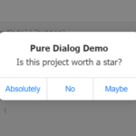 iOS Style Dialog Web Component – pure-dialog
 Modern Dialog Modals with Invoker Command API
 Create Custom Stylish Dialogs with SnapDialog JavaScript Library
 Easily Build Confirmation Popups with the confirmDialog.js Library
 Create Bootstrap 5 Modals Programmatically With JavaScript – bs_dialogs.js
 Moden Modal Window Using Dialog Element and CSS @starting-style
 Async, Promise-based Alert/Confirm/Prompt Dialogs – Prompts.js