


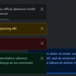
Toastifier is a simple yet highly customizable alert popup JavaScript library inspired by Material Toasts.
It can be used with any framework/library built using JavaScript.
Features:
- Auto dismiss
- 4 alert types: error, success, warn, info.
- 4 fancy animations: flip, bounce, fade, zoom.
- Pause the countdown timer on hover.
- onClick function.
- Custom styles.
- With or without icons.
How to use it:
1. Install and import the Toastifier.
# Yarn
$ yarn add toastifier
# NPM
$ npm i toastifier
import 'toastifier/dist/toastifier.min.css';
import toastifier from 'toastifier';
2. Show a basic alert popup on the screen.
toastifier('Basic Alert');3. Set the notification type:
- error
- success (default)
- warn
- info
toastifier('Alert Message Here',{
  type: 'warn'
});
4. Set the animation type:
- flip
- bounce (default)
- fade
- zoom
toastifier('Alert Message Here',{
  animation: 'flip'
});
5. Set the position of the alert popups.
- top-left
- top-center (default)
- top-right
- bottom-left
- bottom-center
- bottom-right
toastifier('Alert Message Here',{
  position: 'top-left'
});
6. Set the duration of the animation. Default: 3000.
toastifier('Alert Message Here',{
  duration: 5000
});
7. Determine whether to pause the countdown timer on hover.
toastifier('Alert Message Here',{
  onhoverPause: true
});
8. Determine whether to show the icon in the alert popup.
toastifier('Alert Message Here',{
  showIcon: true
});
9. Trigger a function when the user clicks the alert popup.
toastifier('Alert Message Here',{
  onClick: function(){
    // ...
  }
});
10. More options to customize the alert popups.
toastifier('Alert Message Here',{
  // additional CSS rules here
  styleClass: {},
  // background color
  background: '#222'
  // text color
  text: '#fff'
  // border property
  border: '1px solid #222',
  // show box shadow
  shadow: true,

});
See Also:
 Advanced Alert Notification System For Bootstrap 5 – AvalynxAlert.js
 Lightweight JavaScript Notification System – Simple Display Alert
 Sleek Toast & Growl Alert Notification Library – Nostfly.js
 Create iOS-Style Popups & Notifications With Popup JS Library
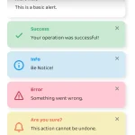 Simple & Stylish JavaScript Alert Notifications – SnapAlert.js
 Notification/Dialog/Loading Indicator JavaScript Library – Fnon
 JavaScript Plugin For Custom Toast Notifications – Simple Notify
 Customizable Alerts & Dialogs Made Easy – Yoyo Popup