


A pure CSS solution to create a slim stylish circular progress bar using SVG Path Animation and CSS3 animations & transforms.
Basic Usage:
Create load animation using CSS3 keyframes.
@-webkit-keyframes
load { 0% {
stroke-dashoffset:0
}
}
@-moz-keyframes
load { 0% {
stroke-dashoffset:0
}
}
@keyframes
load { 0% {
stroke-dashoffset:0
}
}
Add the core CSS/CSS3 styles for your progress bars.
.progress>li {
  display: inline-block;
  position: relative;
  text-align: center;
  color: #93A2AC;
  font-family: Lato;
  font-weight: 100;
  margin: 2rem;
}
.progress>li:before {
  content: attr(data-name);
  position: absolute;
  width: 100%;
  bottom: -2rem;
  font-weight: 400;
}
.progress>li:after {
  content: attr(data-percent);
  position: absolute;
  width: 100%;
  top: 3.7rem;
  left: 0;
  font-size: 2rem;
  text-align: center;
}
.progress svg {
  width: 10rem;
  height: 10rem;
}
.progress svg:nth-child(2) {
  position: absolute;
  left: 0;
  top: 0;
  transform: rotate(-90deg);
  -webkit-transform: rotate(-90deg);
  -moz-transform: rotate(-90deg);
  -ms-transform: rotate(-90deg);
}
.progress svg:nth-child(2) path {
  fill: none;
  stroke-width: 25;
  stroke-dasharray: 629;
  stroke: rgba(255, 255, 255, 0.9);
  -webkit-animation: load 10s;
  -moz-animation: load 10s;
  -o-animation: load 10s;
  animation: load 10s;
}
Create a circular progress bar using SVG paths and use data-percent attribute to specify the percentage value.
<ul class="progress">
  <li data-name="SVG Skill" data-percent="13%"> <svg viewBox="-10 -10 220 220">
    <g fill="none" stroke-width="3" transform="translate(100,100)">
      <path d="M 0,-100 A 100,100 0 0,1 86.6,-50" stroke="url(#cl1)"/>
      <path d="M 86.6,-50 A 100,100 0 0,1 86.6,50" stroke="url(#cl2)"/>
      <path d="M 86.6,50 A 100,100 0 0,1 0,100" stroke="url(#cl3)"/>
      <path d="M 0,100 A 100,100 0 0,1 -86.6,50" stroke="url(#cl4)"/>
      <path d="M -86.6,50 A 100,100 0 0,1 -86.6,-50" stroke="url(#cl5)"/>
      <path d="M -86.6,-50 A 100,100 0 0,1 0,-100" stroke="url(#cl6)"/>
    </g>
    </svg> <svg viewBox="-10 -10 220 220">
    <path d="M200,100 C200,44.771525 155.228475,0 100,0 C44.771525,0 0,44.771525 0,100 C0,155.228475 44.771525,200 100,200 C155.228475,200 200,155.228475 200,100 Z" stroke-dashoffset="81"></path>
    </svg> </li>
</ul>
See Also:
 Build 3D Voxel Art in SVG with heerich.js
 Pure CSS Progress Bar Library with Custom Themes – progress-bar.css
 Generate Highly Customizable SVG Waves With Dynamowaves.js
 Save SVG Data To A File Using the svg-export JavaScript library
 Modern TypeScript Progress Bar Library – BProgress
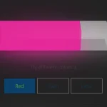 3D Liquid Progress Bar in Pure CSS/CSS3
 Easy Scroll Position Tracking – ScrollProgress.js
 Simple SVG To PNG/JPG Converter In JavaScript (TypeScript)