


A Vanilla JS & CSS powered animated circular speedometer (progress bar) designed to show the percentage completion of a task.
How to use it:
1. Create a container to hold the progress bar.
<div class="progress"></div>
2. The necessary CSS styles.
.progress {
  width: 200px;
  height: 200px;
  border-radius: 50%;
  display: flex;
  justify-content: center;
  align-items: center;
  position: relative;
}
.progress i {
  position: absolute;
  top: 0;
  left: 0;
  right: 0;
  bottom: 0;
  transform: rotate(calc(45deg + calc(calc(360deg / var(--tlt-br-cnt)) * var(--i))));
}
.progress i::after {
  content: '';
  position: absolute;
  top: 0;
  left: 0;
  background: hsla(0, 0%,100%, 12%);;
  width: 5px;
  height: 20px;
  border-radius: 999rem;
  transform: rotate(-45deg);
  transform-origin: top;
  opacity: 0;
  animation: barCreationAnimation 100ms ease forwards;
  animation-delay: calc(var(--i) * 15ms);
}
.progress .selected-demo::after {
  background: hsl(130, 100%, 50%);
  box-shadow: 0 0 1px hsl(130, 100%, 50%),
              0 0 3px hsl(130, 100%, 30%),
              0 0 4px hsl(130, 100%, 10%);
}

.percent-text {
  font-size: 3rem;
  animation: barCreationAnimation 500ms ease forwards;
  animation-delay: calc(var(--tlt-br-cnt) * 15ms / 2);
}
.text-demo{
  color: hsl(130, 100%, 50%);
  text-shadow: 0 0 1px hsl(130, 100%, 50%),
                  0 0 3px hsl(130, 100%, 30%),
                  0 0 4px hsl(130, 100%, 10%);
  opacity: 0;
}
3. The main JavaScript to generate a circular progress bar inside the container you just created.
const wrapper = document.querySelectorAll('.progress');
const barCount = 50; // number of bars
const percentDemo = 50 * 90/100; // 90%
for (let index = 0; index < barCount; index++) {
  const className = index < percentDemo ? 'selected-demo' : '';
  wrapper[0].innerHTML += `<i style="--i: ${index};" class="${className}"></i>`;
}
wrapper[0].innerHTML += `<p class="selected percent-text text-demo">90%</p>`
See Also:
 Pure CSS Progress Bar Library with Custom Themes – progress-bar.css
 Modern TypeScript Progress Bar Library – BProgress
 3D Liquid Progress Bar in Pure CSS/CSS3
 Easy Scroll Position Tracking – ScrollProgress.js
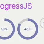 Visualize Progress Data With Animated, Circular Progress Bars – ProgressJS
 Radial Progress Indicator For Click-and-hold Actions – HoldCircleJS
 Simple Scroll Progress Indicator For Long Pages – PageBar.js
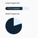 Generate Linear & Radial Progressbars Using CSS – Progress.css