


Bootstrap 5 is an immensely popular web framework for designing responsive, mobile-friendly applications and websites. But writing for multiple devices comes with challenges.
Although Bootstrap includes some CSS components with table-related features, an extension can be useful to save time when you need to create responsive tables, especially those with mixed data types or tabular elements within rows.
In this post, you’ll find a lightweight and simple CSS extension that converts wide Bootstrap tables into one or two-column tables on smaller screen sizes. It supports a number of devices and platforms, including desktops, laptops, smartphones, and tablets. So you can be sure that your tables will be displayed on all platforms.
How to use it:
1. Import the stylesheet Responsive-Table.css into your Bootstrap 5 project.
<!-- Bootstrap 5 -->
<link rel="stylesheet" href="/path/to/cdn/bootstrap.min.css" />
<script src="/path/to/cdn/bootstrap.bundle.min.js"></script>
<!-- Responsive Table -->
<link rel="stylesheet" href="/path/to/Responsive-Table.css" />
2. Add the CSS class ‘table-mobile-responsive’ to the HTML table and the extension will automatically convert HTML tables into compact and more-readable cards when viewed on small screens.
<table class="table table-mobile-responsive">
  ...
</table>
3. Convert your wide table into a two-column list view, just add the CSS class ‘table-mobile-sided’ to the <table>.
<table class="table table-mobile-responsive table-mobile-sided">
  ...
</table>
4. Remove the default styling by using the CSS class ‘table-mobile-styleless’.
<table class="table table-mobile-responsive table-mobile-styleless">
  ...
</table>
5. Enable the stripped rows on small screens.
<table class="table table-mobile-responsive table-mobile-striped">
  ...
</table>
Changelog:
06/08/2022
- Add striped table style and variables
See Also:
 Make Bootstrap 5 Tables More Readable On Mobile Devices – AvalynxTable.js
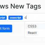 Easy Tags Input Component For Bootstrap 5/4 – Tags.js
 Add Web Audio Feedback to Bootstrap 5 Components – Bootstrap UI Sounds
 iOS-style Bottom Sheet Component for Bootstrap 5 – BootstrapSheet
 Inspect CSS Styles With Bootstrap Popover CSS Inspector
 Navbar-Synced Context Menu for Bootstrap 5 – BRC JS
 Shadstrap: Bootstrap 5 Theme with shadcn/ui Aesthetics
 Lightweight Loading Overlay Plugin For Bootstrap 5 – AvalynxLoader