


Cally provides a set of responsive, customizable, accessible, feature-rich calendar web components for web applications, with a minimal bundle size of 8.5KB min/gzip. These components support single dates, date ranges, and multi-month displays while maintaining complete accessibility and localization support.
For React and shadcn/ui projects, compare this shadcn date and date range picker.
Key Features:
- Single date selection and date ranges
- Multiple month displays
- RTL text direction
- Screen reader compatibility
- Keyboard navigation
- Custom theming through CSS parts
- Full localization via Intl.DateTimeFormat
How to use it:
1. To get started, you can either install it via npm or use a CDN link.
# NPM
$ npm install cally
import "cally";
<script type="module" src="https://unpkg.com/cally"></script>
2. Create a basic date picker using the <calendar-date> component, which includes a <calendar-month> component inside it.
<calendar-date>
  <calendar-month></calendar-month>
</calendar-date>
Properties and attributes:
Dates are expected in ISO-8601 format (YYYY-MM-DD).
| Property | Attribute | Description | Type | Default |
|---|---|---|---|---|
value | value | The currently selected date | string | "" |
min | min | The earliest selectable date | string | "" |
max | max | The latest selectable date | string | "" |
focusedDate | focused-date | The date currently focused by the calendar | string | undefined |
firstDayOfWeek | first-day-of-week | The first day of the week (Sunday is 0, Monday is 1, etc.) | number | 1 |
showOutsideDays | show-outside-days | Display days outside the current month | boolean | false |
locale | locale | The locale for date formatting (uses browser’s locale if unset) | string/undefined | undefined |
months | months | Number of months to display | number | 1 |
pageBy | page-by | How next/previous buttons navigate (“months” or “single”) | "single", "months" | "months" |
isDateDisallowed | – | Function that returns true if a date should not be selectable | (date: Date) => boolean | () => false |
Events:
Cally emits non-bubbling CustomEvents in response to user interaction.
| Name | Description | Type |
|---|---|---|
change | Emitted when the selected date changes via user interaction | Event |
focusday | Emitted when the focused day changes (via keyboard or next/previous buttons) | CustomEvent<Date> |
Methods:
| Name | Description |
|---|---|
focus | Focuses the <calendar-month> containing the currently focused date |
CSS Parts:
| Name | Description |
|---|---|
container | The main container for the component |
header | Container for the heading and navigation buttons |
button | Any button within the component |
previous | The previous page button |
next | The next page button |
disabled | A button disabled due to min/max limits |
heading | The calendar heading label |
Slots:
| Name | Description |
|---|---|
| Default slot | Place your <calendar-month> components here, or other markup. <calendar-month> doesn’t need to be a direct descendant. |
previous | The content of the previous page button (defaults to “Previous”). Slot an icon here. |
next | The content of the next page button (defaults to “Next”). Slot an icon here. |
heading | The visible heading content. You might replace this with a year selector. A visually-hidden heading is always rendered for accessibility. |
3. To enable users to select a range of dates, use the <calendar-range> component and include a <calendar-month> inside.
<calendar-range>
  <calendar-month></calendar-month>
</calendar-range>
Properties and attributes:
The value property expects a date range in ISO-8601 format (YYYY-MM-DD/YYYY-MM-DD). Other dates use the YYYY-MM-DD format.
| Property | Attribute | Description | Type | Default |
|---|---|---|---|---|
value | value | The currently selected date range | string | "" |
min | min | The earliest selectable date | string | "" |
max | max | The latest selectable date | string | "" |
focusedDate | focused-date | The date currently focused by the calendar | string | undefined |
tentative | tentative | The tentatively selected date (e.g., the start of a range selection) | string | "" |
firstDayOfWeek | first-day-of-week | The first day of the week (Sunday is 0, Monday is 1, etc.) | number | 1 |
showOutsideDays | show-outside-days | Display days outside the current month | boolean | false |
locale | locale | The locale for date formatting (uses browser’s locale if unset) | string/undefined | undefined |
months | months | Number of months to display | number | 1 |
pageBy | page-by | How next/previous buttons navigate (“months” or “single”) | "single", "months" | "months" |
isDateDisallowed | – | Function that returns true if a date should not be selectable | (date: Date) => boolean | () => false |
Events:
| Name | Description | Type |
|---|---|---|
change | Emitted when the selected range changes via user interaction | Event |
focusday | Emitted when the focused day changes (via keyboard or next/previous buttons) | CustomEvent<Date> |
rangestart | Emitted when the user starts selecting a range | CustomEvent<Date> |
rangeend | Emitted when the user finishes selecting a range | CustomEvent<Date> |
Methods:
| Name | Description |
|---|---|
focus | Focuses the <calendar-month> containing the currently focused date |
CSS Parts:
| Name | Description |
|---|---|
container | The main container for the component |
header | Container for the heading and navigation buttons |
button | Any button within the component |
previous | The previous page button |
next | The next page button |
disabled | A button disabled due to min/max limits |
heading | The calendar heading label |
Slots:
| Name | Description |
|---|---|
| Default slot | Place your <calendar-month> components here, or other markup. <calendar-month> doesn’t need to be a direct descendant. |
previous | The content of the previous page button (defaults to “Previous”). Slot an icon here. |
next | The content of the next page button (defaults to “Next”). Slot an icon here. |
heading | The visible heading content. You might replace this with a year selector. A visually-hidden heading is always rendered for accessibility. |
4. To display several months simultaneously, include multiple <calendar-month> components within either <calendar-range> or <calendar-date>. Set the months attribute of the parent component to the total number of months you want to display. Use the offset attribute on each <calendar-month> to specify its position relative to the first visible month.
<calendar-range months="2">
  <div class="grid">
    <calendar-month></calendar-month>
    <calendar-month offset="1"></calendar-month>
  </div>
</calendar-range>
5. To enable users to select multiple dates (not date ranges), use the <calendar-multi> component:
Properties and attributes:
| Property | Attribute | Description | Type | Default |
|---|---|---|---|---|
value | value | A space-separated list of selected dates | string | "" |
min | min | The earliest selectable date | string | "" |
max | max | The latest selectable date | string | "" |
focusedDate | focused-date | The date currently focused by the calendar | string | undefined |
firstDayOfWeek | first-day-of-week | The first day of the week (Sunday is 0, Monday is 1, etc.) | number | 1 |
showOutsideDays | show-outside-days | Display days outside the current month | boolean | false |
locale | locale | The locale for date formatting (uses browser’s locale if unset) | string/undefined | undefined |
months | months | Number of months to display | number | 1 |
pageBy | page-by | How next/previous buttons navigate (“months” or “single”) | "single", "months" | "months" |
isDateDisallowed | – | Function that returns true if a date should not be selectable | (date: Date) => boolean | () => false |
Events:
| Name | Description | Type |
|---|---|---|
change | Emitted when the selected date(s) change via user interaction | Event |
focusday | Emitted when the focused day changes (via keyboard or next/previous buttons) | CustomEvent<Date> |
Methods:
| Name | Description |
|---|---|
focus | Focuses the <calendar-month> containing the currently focused date |
CSS Parts:
| Name | Description |
|---|---|
container | The main container for the component |
header | Container for the heading and navigation buttons |
button | Any button within the component |
previous | The previous page button |
next | The next page button |
disabled | A button disabled due to min/max limits |
heading | The calendar heading label |
Slots:
| Name | Description |
|---|---|
| Default slot | Place your <calendar-month> components here, or other markup. <calendar-month> doesn’t need to be a direct descendant. |
previous | The content of the previous page button (defaults to “Previous”). Slot an icon here. |
next | The content of the next page button (defaults to “Next”). Slot an icon here. |
heading | The visible heading content. You might replace this with a year selector. A visually-hidden heading is always rendered for accessibility. |
<calendar-multi>
  <calendar-month></calendar-month>
</calendar-multi>
6. More about the <calendar-month> component:
Properties and attributes:
| Property | Attribute | Description | Type | Default |
|---|---|---|---|---|
offset | offset | In a multi-month view, controls the displayed month relative to the start. | number | 0 |
CSS Custom Properties:
| Name | Description | Default |
|---|---|---|
--color-accent | The primary accent color | black |
--color-text-on-accent | Text color when using --color-accent | white |
CSS Parts:
| Name | Description |
|---|---|
heading | The label for the month |
table | The <table> element |
tr | Any row within the table |
head | The table header row |
week | The table body rows |
th | The table header cells |
td | The table body cells |
button | Any button used in the component |
day | The buttons representing each day |
selected | Any selected days |
today | Today’s day |
disallowed | Any day disallowed via isDateDisallowed |
outside | Any days outside the current month |
range-start | The day marking the start of a date range |
range-end | The day marking the end of a date range |
range-inner | Any days between the start and end of a date range |
7. Explore these guides for detailed information on using Cally’s components:
- Frameworks: Learn how to integrate Cally with your preferred JavaScript framework.
- Theming: Discover how to customize Cally’s appearance to match your application’s style.
- Usage: Find examples of integrating Cally with existing components to create more complex user interfaces. For detailed information on each component, refer to the Component API documentation.
Changelog:
v0.9.2 (04/07/2026)
- Bugfixes
See Also:
 Modern Mobile-friendly JS Date Picker – PremiumCalendar.js
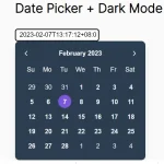 Lightweight Accessible Datepicker Calendar Component – DateDreamer
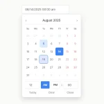 Accessible Customizable Date/Time/Date Picker for Modern Web App – FDatepicker
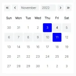 Lightweight Accessible Date Picker Component – WC Datepicker
 Vanilla Calendar JS Library for Date Picking, Scheduling, and Timelines
 Vanilla JS Date Picker with Range Selection – EssealDatePicker
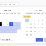 Elegant Accessible Date Range Picker In JavaScript – Hotel Datepicker
 Versatile Datetime Picker For Bulma – bulma-calendar