


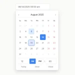
Datera is a customizable date and date range picker JS library that transforms a regular input field into a date selection input.
When the date input is focused or clicked, a monthly calendar appears, which enables users to select a single date, multiple dates, or even a date range.
More Features:
- Set min/max years
- Set min/max dates
- Enable/disable dates
- 10 modern themes included.
How to use it:
1. Download and include Datera’s JavaScript and Stylesheet on the page.
<script src="/dist/datera.min.js"></script>
<link rel="stylesheet" href="/dist/datera.min.css" />
2. Create a standard input field for the date picker:
<input class="datepicker" />
3. Initialize Datera and connect it to the input field:
new window.Datera("datepicker", {
    // options here
}).mount();
4. Set an array of pre-selected dates:
new window.Datera("datepicker", {
    value: [],
}).mount();
5. Customize the current date and highlighted day.
new window.Datera("datepicker", {
    // Highlighted day (today)
    currentDay: new Date().getDate(),
    // Gets the current date (default today)
    currentDate: new Date(),

}).mount();
6. Set the min/max years allowed to select
new window.Datera("datepicker", {
    minYear: 1980,
    maxYear: 2050,
}).mount();
7. Set the min/max dates allowed to select.
new window.Datera("datepicker", {
    minDate: null,
    maxDate: null,
}).mount();
8. Set the min/max dates allowed to select.
new window.Datera("datepicker", {
    minDate: null,
    maxDate: null,
}).mount();
9. Enable/dsiable dates.
new window.Datera("datepicker", {
    disabledDates: null,
    enabledDates: null,
}).mount();
10. Set the first day of the week (0 – sunday; 1 – monday).
new window.Datera("datepicker", {
    startWeek: 0,
}).mount();
11. Localize the date picker.
new window.Datera("datepicker", {
    daysOfWeek: ["Sun", "Mon", "Tue", "Wed", "Thu", "Fri", "Sat"],
    months: [
      "January",
      "February",
      "March",
      "April",
      "May",
      "June",
      "July",
      "August",
      "September",
      "October",
      "November",
      "December",
    ],
}).mount();
12. All available date picker themes:
new window.Datera("datepicker", {
    // theme1-dark, theme1-light,
    // theme2-dark, theme2-light,
    // theme3-dark, theme3-light,
    // theme4-dark, theme4-light,
    // theme5-dark, theme5-light
    theme: "theme1-dark",
}).mount();
13. Set the selection type:
- single: Single date
- list: A list of dates
- range: Date range
new window.Datera("datepicker", {
    selectionType: "single",
}).mount();
See Also:
 Accessible Customizable Date/Time/Date Picker for Modern Web App – FDatepicker
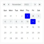 Lightweight Accessible Date Picker Component – WC Datepicker
 Vanilla JS Date Picker with Range Selection – EssealDatePicker
 Feature-rich Calendar & Date Picker Components – Cally
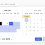 Elegant Accessible Date Range Picker In JavaScript – Hotel Datepicker
 Versatile Datetime Picker For Bulma – bulma-calendar
 Powerful, Customizable JavaScript Date Picker – Datelite
 Easy Datetime & Date Range Pickers in Vanilla JavaScript