


Yet another pure CSS and SVG solution to create smooth circular progress bars indicating percentages on the web app.
How to use it:
1. Create the HTML for the SVG based circular progress bar.
<div class="percent">
  <svg>
    <circle cx="70" cy="70" r="70"></circle>
    <circle cx="70" cy="70" r="70"></circle>
  </svg>
  <div class="number">
    <h2>90<span>%</span></h2>
  </div>
</div>
2. The core stylesheet for the circular progress bar.
svg {
  position: relative;
  width: 150px;
  height: 150px;
  z-index: 1000;
}
svg circle {
  width: 100%;
  height: 100%;
  fill: none;
  stroke: #191919;
  stroke-width: 10;
  stroke-linecap: round;
  transform: translate(5px, 5px);
}
.percent {
  position: relative;
  width: 150px;
  height: 150px;
  border-radius: 50%;
  box-shadow: inset 0 0 50px #000;
  background: #222;
  z-index: 1000;
}
.percent .number {
  position: absolute;
  top: 0;
  left: 0;
  width: 100%;
  height: 100%;
  display: flex;
  justify-content: center;
  align-items: center;
  border-radius: 50%;
}
.percent .number h2 {
  color: #777;
  font-weight: 700;
  font-size: 40px;
  transition: 0.5s;
}
See Also:
 Pure CSS Progress Bar Library with Custom Themes – progress-bar.css
 Modern TypeScript Progress Bar Library – BProgress
 3D Liquid Progress Bar in Pure CSS/CSS3
 Easy Scroll Position Tracking – ScrollProgress.js
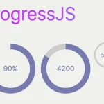 Visualize Progress Data With Animated, Circular Progress Bars – ProgressJS
 Radial Progress Indicator For Click-and-hold Actions – HoldCircleJS
 Simple Scroll Progress Indicator For Long Pages – PageBar.js
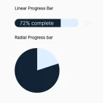 Generate Linear & Radial Progressbars Using CSS – Progress.css