


progress-bars.js is a X-Tag powered web component used for creating animated, customizable, circular progress bar to indicate the loading status.
How to use it:
Include both X-Tag core library and the progress-bar.js script on the webpage when needed.
<script src="/path/to/x-tag-core.min.js"></script>
<script src="/path/to/progress-bars.js"></script>
Create a circular progress bar and config it with the following attributes:
- progress: Gets or sets the progress
- circlesize: Gets or sets the width and height of the circle
- barsize: Gets or sets the size of the bar
- circlebackground: Gets or sets the hexadecimal color for the circle backgorund
- barcolor: Gets or sets the color of the bar
- filledcolor: Gets or sets the color of the bar when it is filled
- progressStringFormat: Gets or sets a string informing how the progress should be displayed. It must contain the following string to be replaced as the progress: {p}.
- displayTextWhenDone: Gets or sets a value indicating if the donetext should replace the progress of the bar when it’s set to 100%
- donetext: Gets or sets the text that should be displayed when the progress is set to 100%
- isundeterminated: Returns zero (0) if the bar is set as defined and one (1) if the bar is set as undefined
- setUndeterminated(isUndeterminated): Sets the bar as defined or undefined
<circular-progress-bar id="bar-1" barcolor="#EE5C42" filledcolor="#8B3626" progressStringFormat="Progress: {p}%" displayTextWhenDone="false"></circular-progress-bar>
See Also:
 Pure CSS Progress Bar Library with Custom Themes – progress-bar.css
 Modern TypeScript Progress Bar Library – BProgress
 3D Liquid Progress Bar in Pure CSS/CSS3
 Easy Scroll Position Tracking – ScrollProgress.js
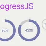 Visualize Progress Data With Animated, Circular Progress Bars – ProgressJS
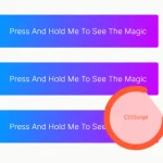 Radial Progress Indicator For Click-and-hold Actions – HoldCircleJS
 Simple Scroll Progress Indicator For Long Pages – PageBar.js
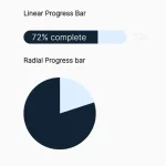 Generate Linear & Radial Progressbars Using CSS – Progress.css