


Graphs are a great way to visualize data as they help us see things much easier than tables or lists.
Graph.js is a tiny JavaScript library that lets you draw animated bar/column, pie/donut, and line area charts from one or more datasets. It is useful when you want your users to see changes over time on the same chart.
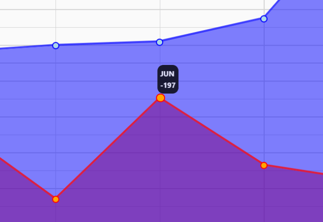
See It In Action:
How to use it:
1. Include the Graph.js and Graph.css on the page.
<link rel="stylesheet" href="graph.css" />
<script src="graph.js"></script>
2. Create an empty DIV that serves as the container for the chart.
<div id="graph"></div>
3. Initialize the graph.js on the container.
var graph = new jLineGraph(document.getElementById("graph"), {
    title: "Example Chart",
});
4. Add labels to the x-axis of the chart.
var graph = new jLineGraph(document.getElementById("graph"), {
    title: "Example Chart",
    labels: [
      "JAN",
      "FEB",
      "MAR",
      "APR",
      "MAI",
      "JUN",
      "JUL",
      "AUG",
      "SEP",
      "OCT",
      "NOV",
      "DEC",
    ],
});
5. Populate the chart with the dataset(s) you provide.
var graph = new jLineGraph(document.getElementById("graph"), {
    title: "Example Chart",
    labels: [
      "JAN",
      "FEB",
      "MAR",
      "APR",
      "MAI",
      "JUN",
      "JUL",
      "AUG",
      "SEP",
      "OCT",
      "NOV",
      "DEC",
    ],
    datasets: [
      {
        type: "line",
        label: "Data 1",
        data: [-40, 80, 10, 60, 100, 120, 250, 910, 10, 30, 240, 320],
        primaryColor: "red",
        secondaryColor: "orange",
        fill: true,
      },
      {
        type: "line",
        label: "Data 2",
        data: [-40, 80, 10, 60, 100, 120, 250, 910, 10, 30, 240, 320],
        primaryColor: "blue",
        secondaryColor: "lightblue",
        fill: true,
      }
    ]
});
6. To generate a column chart, just replace the “line” with “bar” as follows:

var graph = new jLineGraph(document.getElementById("graph"), {
    title: "Example Chart",
    labels: [
      "JAN",
      "FEB",
      "MAR",
      "APR",
      "MAI",
      "JUN",
      "JUL",
      "AUG",
      "SEP",
      "OCT",
      "NOV",
      "DEC",
    ],
    datasets: [
      {
        type: "bar",
        label: "Data 1",
        data: [-40, 80, 10, 60, 100, 120, 250, 910, 10, 30, 240, 320],
        primaryColor: "red",
        secondaryColor: "orange",
        fill: true,
      },
      {
        type: "bar",
        label: "Data 2",
        data: [-40, 80, 10, 60, 100, 120, 250, 910, 10, 30, 240, 320],
        primaryColor: "blue",
        secondaryColor: "lightblue",
        fill: true,
      }
    ]
});
7. Create a pie chart:
var graph = new jLineGraph(document.getElementById("graph"), {
    title: "Example Chart",
    type: "pie",
    datasets: [
      {
        label: "Amerika",
        data: [150],
        primaryColor: "red",
        secondaryColor: "orange"
      },
      {
        label: "Europa",
        data: [150],
        primaryColor: "blue",
        secondaryColor: "lightblue"
      },
      {
        label: "Asien",
        data: [300],
        primaryColor: "green",
        secondaryColor: "lightgreen"
      }
    ]
});
Changelog:
07/02/2022
- update
06/21/2022
- dynamic point width/height
05/30/2022
- JS update
05/25/2022
- Removed z-index
See Also:
 Responsive CSS Chart Library For Web – Neo Charts
 Financial Data Visualization Library for JavaScript – VisionCharts
 Minimal Canvas Based Bar & Line Chart Library – TChart.js
 High-Performance WebGPU Charting Library for Large Datasets – ChartGPU
 Lightweight Responsive SVG Charts with CSS Transitions – Beaned-Charts
 Minimalist Bar (Column) Charts with HTML5 Canvas – bar-js
 Minimal Bar/Line/Pie Chart JavaScript Library – Chartly.js
 Simple Plain Column Chart JavaScript Library – simpleBar.js