


VisionCharts is a lightweight, high-performance JavaScript charting library that creates interactive, customizable line/area/bar/column charts from financial and economic time-series data.
Features:
- Financial-first design optimized for economic data patterns and visualization requirements
- Line and area charts with customizable curve types, points, and gradient fills
- Bar charts supporting grouped, stacked, and individual bar configurations
- SVG rendering for crisp vector graphics at any resolution
- Zero dependencies standalone implementation without external requirements
- Multiple dataset support for comparative analysis across different data series
- Technical indicators including SMA, EMA, Bollinger Bands, RSI, and MACD
- Recession line indicators with configurable shaded areas for economic periods
- Logarithmic and linear scaling toggle for different data visualization needs
- Responsive design with automatic container dimension adaptation
- Performance optimization for handling large financial datasets efficiently
How to use it:
1. Install VisionCharts and import the required components based on your specific charting requirements:
# NPM
$ npm install visioncharts
import { LineChart, BarChart, createChart, calculateIndicator } from 'visioncharts';2. Create a basic line chart. The data should follow a consistent format with x and y field mappings:
lineChart = new LineChart({
// target container
container: '#line-chart',
// your data
data: data,
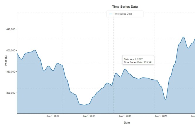
options: {
title: 'Time Series Data',
xField: 'date',
yField: 'price',
xType: 'time',
yType: 'number',
xAxisName: xAxisName,
yAxisName: yAxisName,
curve: 'monotone',
showPoints: false, // Ensuring points are off as per previous request
area: false,
showZeroLine: false,
showLegend: true, // Enable legend by default
gradient: false, // Gradient disabled by default
recessions: recessions,
grid: { // Added to enable and configure the grid
show: true
// You can override other grid defaults here if needed, e.g.:
// color: '#d3d3d3',
// dashArray: '5,5'
},
studies: [] // Initialize empty studies array
}
});
// Render the chart (this will also render the legend)
lineChart.render();3. Bar chart implementation follows a similar pattern but includes additional configuration options for bar-specific properties:
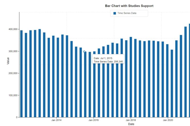
barChart = new BarChart({
  container: '#bar-chart',
  data: data,
  options: {
    title: 'Bar Chart with Studies Support',
    xField: 'x',         // Point to the 'x' field which contains Date objects
    yField: 'y',
    xType: 'time',       // Explicitly set to 'time'
    yType: 'number',
    xAxisName: xAxisName,
    yAxisName: yAxisName,
    showValues: false,
    showZeroLine: true,
    showLegend: true,
    isLogarithmic: false,
    recessions: recessions,
    dateFormat: { year: 'numeric', month: 'short', day: 'numeric' },
    grid: {
      show: true
    },
    // Studies-specific options for BarChart
    studiesAsLines: true,    // Render studies as lines overlaid on bars
    studyLineWidth: 2,       // Default line width for studies
    studyPointRadius: 0,     // No points for studies by default
    studies: []              // Initialize empty studies array
  }
});
barChart.render();
4. Multiple dataset charts require the createChart factory function with dataset arrays containing individual series configuration:
const chart = createChart('line', {
  container: '#chart-container',
  data: [
    {
      id: 'nasdaq',
      name: 'NASDAQ',
      color: '#1468a8',
      width: 2,
      data: nasdaqData
    },
    {
      id: 'dow',
      name: 'Dow Jones',
      color: '#34A853',
      width: 2,
      data: dowData
    },
    {
      id: 'sp500',
      name: 'S&P 500',
      color: '#EA4335',
      width: 2,
      data: spData
    }
  ],
  options: {
    title: 'Market Comparison',
    isPanelView: false, // Show all on same chart
    isLogarithmic: true
  }
});
chart.render();
5. Technical indicators integration uses the calculateIndicator function to generate overlay data. Here’s how you’d add a 20-period Simple Moving Average (SMA):
// Assumes 'chart' is an existing LineChart instance with stockData
const smaData = calculateIndicator('sma', stockData, {
  period: 20,
  valueField: 'y', // The field in your data object to use for calculation
  xField: 'x'      // The field for the date/time
});
// Add the calculated data as a new line on the chart
chart.addDataset({
  id: 'sma-20',
  name: 'SMA (20)',
  color: '#FBBC05',
  width: 1.5,
  data: smaData
});
// Re-render the chart to show the new line
chart.render();
6. API methods.
render(): Renders the chart within the specified container. You must call this method initially to draw the chart and again after making changes that require a full redraw.toggleLogarithmic(isLogarithmic): Toggles the Y-axis scale between linear (false) and logarithmic (true). This is useful for comparing percentage changes across datasets with different magnitudes.togglePanelView(isPanel): For charts with multiple datasets, this method switches between a single, combined view (false) and a multi-panel view (true) where each dataset gets its own individual chart panel.toggleRecessionLines(show): Shows or hides the shaded areas that indicate recession periods, based on therecessionsdata provided in the options.toggleZeroLine(show): Shows or hides the horizontal reference line at the zero value on the Y-axis.setXAxisName(name): Updates the title for the X-axis.setYAxisName(name): Updates the title for the Y-axis.filterByDate(startDate, endDate): Zooms the chart to a specific date range. The dates should be provided as strings in ‘YYYY-MM-DD’ format.addDataset(dataset): Adds a new dataset to the chart. This is commonly used to plot technical indicators calculated after the initial render.addStudy(datasetId, studyOptions): Adds a technical study (e.g., ’ema’, ‘sma’) directly to an existing dataset identified by itsid.exportSVG(): Returns a string containing the complete SVG markup of the current chart view.exportPNG(scaleFactor): Returns a promise that resolves with a PNG data URL of the chart. You can provide an optionalscaleFactor(e.g.,2for double resolution) to export a higher-quality image.
7. All default options:
// Line Chart
const defaultLineChartOptions = {
  chartType: 'line',
  curve: 'linear', // 'step', 'Cardinal', 'Monotone'
  showPoints: false,
  pointRadius: 3,
  xField: 'x',
  yField: 'y',
  xType: 'number',
  yType: 'number',
  areaOpacity: 0.2,
  gradient: false,
  tickLabelFontSize: '13px',
  xFormatOptions: {
    year: 'numeric',
    month: 'short',
    day: 'numeric'
  },
  yFormatOptions: {
    maximumFractionDigits: 2,
    minimumFractionDigits: 0
  },
  grid: {
    show: true,
    color: '#e0e0e0',
    strokeWidth: 1,
    dashArray: '4,4'
  },
  showEndingLabels: false,
  endingLabelsConfig: {
    show: true,
    fontSize: '11px',
    fontFamily: 'Arial, sans-serif',
    fontWeight: 'bold',
    backgroundColor: '#ffffff',
    borderColor: '#cccccc',
    borderWidth: 1,
    borderRadius: 3,
    padding: { top: 2, right: 2, bottom: 2, left: 2 },
    offsetX: 8,
    offsetY: 0,
    textColor: null,
    showBorder: true,
    showBackground: true
  }
};
const defaultBarChartOptions = {
chartType: 'bar',
xField: 'category',
yField: 'y',
xType: 'time',
yType: 'number',
barWidth: 0.7,
barSpacing: 0.2,
showValues: false,
valuePosition: 'top',
colors: ['#1468a8', '#34A853', '#FBBC05', '#EA4335'],
stacked: false,
dateFormat: { year: 'numeric', month: 'short' },
xFormatOptions: {
year: 'numeric',
month: 'short'
},
yFormatOptions: {
maximumFractionDigits: 1,
minimumFractionDigits: 0
},
skipLabels: 3,
grid: {
show: true,
color: '#e0e0e0',
strokeWidth: 1,
dashArray: '4,4'
},
isPanelView: false,
timeBarPixelWidth: 10,
showZeroValueBars: true,
showEndingLabels: false,
endingLabelsConfig: {
show: true,
fontSize: '11px',
fontFamily: 'Arial, sans-serif',
fontWeight: 'bold',
backgroundColor: '#ffffff',
borderColor: '#cccccc',
borderWidth: 1,
borderRadius: 3,
padding: { top: 2, right: 2, bottom: 2, left: 2 },
offsetX: 8,
offsetY: 0,
textColor: null,
showBorder: true,
showBackground: true
},
// Studies rendering options for BarChart
studiesAsLines: true,
studyLineWidth: 2,
studyPointRadius: 0,
};Changelog:
v2.0.6 (12/25/2025)
- chart now has toggle to start from zero
- bugfixes
v2.0.5 (12/02/2025)
- Crosshair now interactive with studies single panel
- Line chart area opacity now dataset specific
- Update theme switchback
- Added support for themes on dashboard
v2.0.4 (11/30/2025)
- Added theme support
- Stats and zero line now customizable
- Modified stats and zero line to use existing svg overlay
- Updated coordinate system for panel crosshair
- Bugfixes
v2.0.3 (11/19/2025)
- Fixed bar chart rendering
- Optimized core files
- Tooltip enhancements and bug fixes
v2.0.1 (11/13/2025)
- Fixed crosshair tooltip
- Charts can now handle datasets of 1 value, and NULL/empty values
- Barchart invert issue fix
- Improved chart destroy method
v2.0.1 (09/12/2025)
- Added studies to legend panel view
- Study in legend for panel view
- study legend integration 1
- Added study values to tooltip
- Legend now toggles in panel mode
- Fixed line/bars starting late panel mode
v2.0.0 (09/01/2025)
- added new panel view features, improved browser support, and fixed some rendering issues.
See Also:
 Responsive CSS Chart Library For Web – Neo Charts
 Animated Column/Line/Area/Pie Chart Library – Graph.js
 Minimal Canvas Based Bar & Line Chart Library – TChart.js
 Lightweight Responsive SVG Charts with CSS Transitions – Beaned-Charts
 High-Performance WebGPU Charting Library for Large Datasets – ChartGPU
 Minimalist Bar (Column) Charts with HTML5 Canvas – bar-js
 Minimal Bar/Line/Pie Chart JavaScript Library – Chartly.js
 Simple Plain Column Chart JavaScript Library – simpleBar.js