


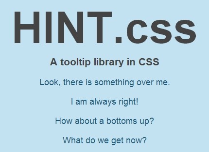
HINT.css is a tooltip library made in pure CSS/CSS3 that allows you create nice looking and animated tooltips/hints on your web page.
Features:
- Lightweight and easy to use.
- Animations based on CSS3 transitions and transforms.
- Fully customizable via CSS classes.
- 4 directions: left, right, top and right.
- 8 extra types of tooltip/hint: error, warning, info, success, always, rounded, no-animate, and bounce.
How to use it:
Include the hint.css in the head section of your document.
<link rel="stylesheet" href="hint.css">
Add a link to the Html element. Use ‘data-hint’ attribute for the tooltip/hint content. Use class attribute to specify the direction and other available modifiers.
<a class="hint--top hint--error" data-hint="This is an error tooltip">Hover me</a>
You can also use the ‘aria-label’ attribute instead.
<a class="hint--top hint--error" aria-label="This is an error tooltip">Hover me</a>
All possible themes.
- hint–error
- hint–info
- hint–warning
- hint–success
Change the size of the tooltip.
- hint–small
- hint–medium
- hint–large
More CSS classes to customize the tooltip
- hint–always: always display
- hint–rounded: rounded corner
- hint–no-animate: with no animation
- hint–bounce: with bounce animation
Changelog:
v2.7.0 (10/02/2021)
- Add new class to hide arrow – hint–no-arrow
06/13/2020
- v2.6.0
11/27/2018
- v2.5.1
See Also:
 Mobile-friendly Image Comparison In Pure JS – before-after-slider
 Create Customizable Modal Windows with Rabbit Lightweight Modal
 Elegant Notification Popup Library – spop
 Lightweight Date Picker & Date Range Picker Component – deskycal
 Simple Toast Notification System – Toastinette.js
 Displaying Image Copyright / Credit Overlays With Vanilla JavaScript – Copy.js
 Dynamic Bootstrap Grid Layout Generator – json2bootgrid
 Convert HTML To LLM-Friendly Semantic Markdown Using JavaScript