


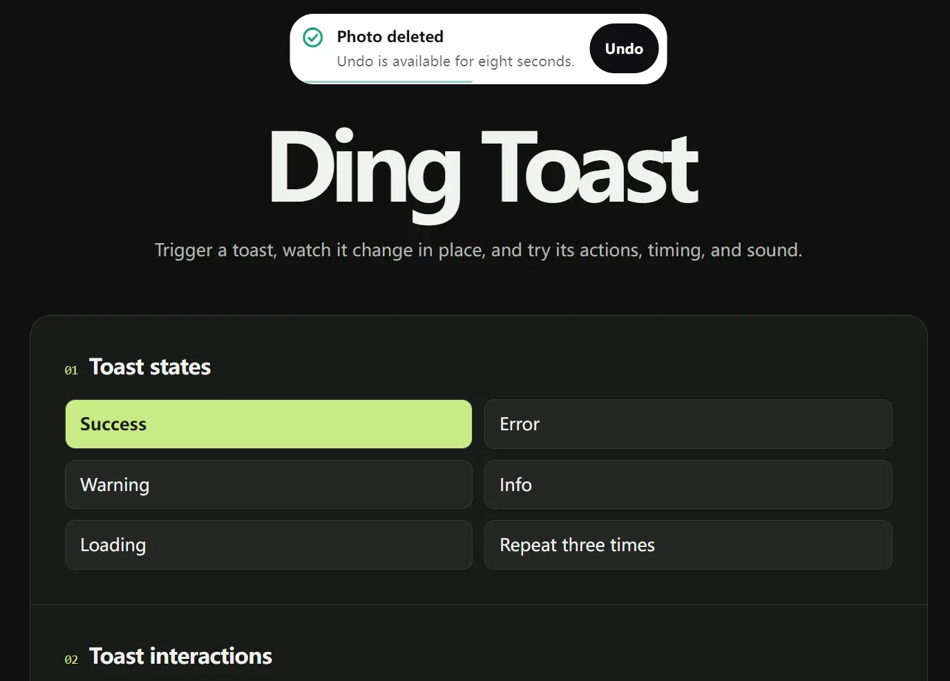
Ding is a JavaScript toast notification library that shows one message at a time and morphs it with spring physics as new notifications arrive.
Features
- Success, error, warning, info, and loading notifications.
- Interrupted animations retain their spring momentum.
- Descriptions, avatar images, and trailing metadata.
- Primary and secondary action buttons.
- Promise-driven status changes and progress bars.
- Timed dismissal, hover and focus pauses, and duplicate counters.
- Six screen positions and light, dark, or system themes.
- Optional notification sounds and keyboard controls.
- Optional adapters for React & Svelte.
See It In Action
How To Use It
Installation
Install the package for your stack.
- Plain JavaScript:
npm install @yusufceng1z/ding - React 18+:
npm install @yusufceng1z/ding-react - Svelte 5:
npm install @yusufceng1z/ding-svelte
Basic Usage
For a plain HTML page, import the ES module and mount the toaster once:
<button id="save-button" type="button">Save</button>
<script type="module">
  import { mountToaster, toast } from 'https://cdn.jsdelivr.net/npm/@yusufceng1z/ding/dist/index.js';
  mountToaster({ position: 'top-center' });
  document.querySelector('#save-button').addEventListener('click', () => {
    toast.success('Changes saved');
  });
</script>
For a bundled JavaScript app, use the installed package. mountToaster() returns a cleanup function for unmounting the renderer.
import { mountToaster, toast } from '@yusufceng1z/ding';
const unmount = mountToaster({ position: 'top-center' });
toast.success('Changes saved');
React And Svelte Integration
Render one Toaster near the application root and import toast from the same framework package.
React:
import { Toaster, toast } from '@yusufceng1z/ding-react';
export default function App() {
  return (
    <>
      <Toaster position="top-center" theme="system" />
      <button onClick={() => toast.success('Changes saved')}>Save</button>
    </>
  );
}
Svelte:
<script>
  import { Toaster, toast } from '@yusufceng1z/ding-svelte';
</script>
<Toaster position="top-center" theme="system" />
<button onclick={() => toast.success('Changes saved')}>Save</button>
For a React project using the shadcn registry, this command adds the Ding package and a ding-toaster.tsx wrapper:
npx shadcn@latest add @ding/ding
Promise And Progress Notifications
Pass a Promise-returning saveSettings() function that rejects on failure. Handle the returned Promise’s rejection in the calling code.
toast.promise(saveSettings(), {
  loading: 'Saving settings',
  success: 'Settings saved',
  error: (error) => error instanceof Error ? error.message : 'Save failed',
}).catch(console.error);
Keep the ID from toast.loading() to report progress. If a newer notification takes over the visible toast, Ding ignores updates from the older caller.
const id = toast.loading('Uploading image', { progress: 0 });
toast.update(id, { progress: 0.6 });
toast.update(id, {
  type: 'success',
  title: 'Image uploaded',
  progress: null,
});
Add An Undo Action
An action can change the message after a click. Here, restoreDraft() is your application’s restore function.
toast.success('Draft deleted', {
  action: {
    label: 'Undo',
    onClick: () => {
      restoreDraft();
      return { type: 'info', title: 'Draft restored' };
    },
  },
});
Configure The Toaster
Use toast.configure() for the shared position, theme, sound, and screen-reader labels. The example sets Spanish accessible names for the notification region and dismiss button.
toast.configure({
  position: 'bottom-right',
  theme: 'dark',
  sound: true,
  volume: 0.5,
  labels: {
    region: 'Avisos',
    dismiss: 'Cerrar notificación',
  },
});
Public API Reference
Notification Methods
| Method | Description |
|---|---|
toast.success(title, options?) | Shows a success notification and returns its string ID. |
toast.error(title, options?) | Shows an error notification, persistent by default, and returns its ID. |
toast.warning(title, options?) | Shows a warning notification and returns its ID. |
toast.info(title, options?) | Shows an information notification and returns its ID. |
toast.loading(title, options?) | Shows a persistent loading notification and returns its ID. |
toast.promise(input, messages) | Shows loading and the resolved or rejected state. input is a Promise or a function returning one. Returns that Promise. |
toast.update(id, patch) | Updates the notification owned by the supplied caller ID; returns no value. |
toast.dismiss(id?) | Dismisses the specified notification or every notification when called with no ID. |
toast.configure(settings) | Changes position, theme, accessible labels, or audio settings for the shared toaster. |
mountToaster(options?) | Mounts the plain DOM renderer; returns an unmount function. |
Promise Messages
toast.promise(input, messages) requires the following message fields:
| Field | Description |
|---|---|
loading | String displayed while the Promise is pending. |
success | String or (value) => string callback for the resolved value. |
error | String or (error) => string callback for the rejection reason. |
Toast Options
| Option | Description |
|---|---|
id | Optional string identifying the caller. Reuse it for related notifications from the same source. |
description | Additional line of text below the title. |
action | Primary button object with label and onClick. |
secondary | Secondary button object with label and onClick. |
image | Avatar or thumbnail URL that replaces the status icon. |
meta | Short text displayed after the title. |
progress | Number from 0 to 1 for a progress bar. |
duration | Auto-dismiss time in milliseconds. 0 persists. Ordinary status notifications default to 5000. |
Update Patch
toast.update(id, patch) accepts the following fields. Changing type or the action buttons recalculates the default dismissal behavior unless the same patch supplies duration.
| Field | Description |
|---|---|
title | Replaces the notification title. |
description | Replaces the description string. |
type | success, error, warning, info, or loading. |
duration | Changes the dismissal time in milliseconds. |
progress | Number from 0 to 1; null removes the bar. |
action | Replaces the primary button; null removes it. |
secondary | Replaces the secondary button; null removes it. |
meta | Replaces trailing text; null removes it. |
image | Replaces the avatar URL; null restores the status icon. |
Global Settings And Toaster Props
toast.configure(settings) accepts every setting below. mountToaster(options?) and the React/Svelte <Toaster /> components accept only position, theme, and labels.
| Setting | Accepted values and default |
|---|---|
position | top-left, top-center (default), top-right, bottom-left, bottom-center, bottom-right. |
theme | system (default), light, dark. |
labels | Optional region and dismiss strings. Defaults: Notifications and Dismiss notification. |
sound | false (default), true for built-in tones, or (type) => void for custom sound. |
volume | Number from 0 to 1; default 0.5 for built-in sound. |
Keyboard And Accessibility
The toaster uses an assertive live region for errors and a polite region for other messages.
Escape dismisses a notification unless focus is inside a dialog, menu, or editable control. Alt+T focuses the notification.
Ding respects prefers-reduced-motion and mirrors its position on right-to-left pages.
Alternatives
- SVG Gooey Toast Notification Library – Physics Toast
- Simple Vanilla JavaScript Toast Notification Library – Toastify
- NotifyX: JavaScript Toast Notifications with AI Streaming
FAQs
Q: Why does toast.promise() show success for an HTTP error response?
A: fetch() resolves for HTTP error responses. Check response.ok and reject or throw on failure before resolving the request Promise.
Q: Why doesn’t the first notification play a sound?
A: Browsers restrict audio until a user interacts with the page. Enable sound and trigger the notification from a click or key press.
See Also:
 Dynamic Toast Notification JS Library for Bootstrap 5 – AvalynxToast
 Stackable JavaScript Toast Notifications with Sound and Actions – chyrp
 Sonner-Style Toasts in Vanilla JavaScript – vanilla-sonner
 Pure JS Notification System Inspired by Bootstrap 5 – ZephyrToast
 Create Bootstrap 5 Toasts Dynamically – bootstrap-show-toast
 NotifyX: JavaScript Toast Notifications with AI Streaming
 JavaScript Toast Notification Library with Actions and HTML – rm-toast-notification
 Cyberpunk Toast Notifications with Glitch Effects – CyberToast.js