


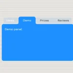
A pretty cool, animated tabs component / widget / control with subtle fade transition effects. Made using CSS and CSS3 transitions.
How to use it:
Create radio input based tabs and tabbed content panels as follow.
<div class="tabs">
  <div class="tab">
    <input type="radio" name="css-tabs" id="tab-1" checked class="tab-switch">
    <label for="tab-1" class="tab-label">Tab One</label>
    <div class="tab-content">Content One</div>
  </div>
  <div class="tab">
    <input type="radio" name="css-tabs" id="tab-2" class="tab-switch">
    <label for="tab-2" class="tab-label">Tab Two</label>
    <div class="tab-content">Content Two</div>
  </div>
  <div class="tab">
    <input type="radio" name="css-tabs" id="tab-3" class="tab-switch">
    <label for="tab-3" class="tab-label">Tab Three</label>
    <div class="tab-content">Content Three</div>
  </div>
</div>
The Core CSS styles.
* { box-sizing: border-box; }
.tabs {
  position: relative;
  margin: 3rem 0;
  background: #1abc9c;
  height: 14.75rem;
}
.tabs::before,
.tabs::after {
  content: "";
  display: table;
}
.tabs::after { clear: both; }
.tab { float: left; }
.tab-switch { display: none; }
.tab-label {
  position: relative;
  display: block;
  line-height: 2.75em;
  height: 3em;
  padding: 0 1.618em;
  background: #1abc9c;
  border-right: 0.125rem solid #16a085;
  color: #fff;
  cursor: pointer;
  top: 0;
  transition: all 0.25s;
}
.tab-label:hover {
  top: -0.25rem;
  transition: all 0.25s;
}
.tab-content {
  padding: 1.618rem;
  background: #fff;
  color: #2c3e50;
  border-bottom: 0.25rem solid #bdc3c7;
  height: 12rem;
  position: absolute;
  z-index: 1;
  top: 2.75em;
  left: 0;
  opacity: 0;
  transition: all 0.35s;
}
Make the radio inputs act as tabs.
.tab-switch:checked + .tab-label {
  background: #fff;
  color: #2c3e50;
  border-bottom: 0;
  border-right: 0.0625rem solid #fff;
  transition: all 0.35s;
  z-index: 2;
  top: -0.0625rem;
}
.tab-switch:checked + .tab-label:hover { top: -0.0625rem; }
.tab-switch:checked + .tab-label + .tab-content {
  opacity: 1;
  transition: all 0.35s;
  z-index: 3;
}
See Also:
 CSS-Only Inverted Corner Tabs With Anchor Positioning
 Animated Tabs Component In Pure CSS – Tabsy CSS
 Convert Sectioned Contents Into Tabs – tinytabs
 Lightweight Pure JavaScript Tabs With URL Persistence – Tabzy.js
 Dynamic External Content Tabs with Quicktabs.js
 Create Accessible Tabs with Pure CSS and Semantic HTML
 Accessible Tabs Component – tab-container
 Simple Fast Vanilla JavaScript Tabs