


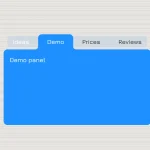
A pure CSS/CSS3 tabs interface where you can switch between tabbed content with a fading animation.
How to use it:
Create the tabbed content and radio input based tab navigation as these:
<div data-tabs class="tabs">
   <div class="tab">
      <input type="radio" name="tabgroup" id="tab-1" checked>
      <label for="tab-1">Tab 1</label>
      <div class="tab__content">
         <h4>Tab heading 1</h4>
      </div>
   </div>
   <div class="tab">
      <input type="radio" name="tabgroup" id="tab-2">
      <label for="tab-2">Tab 2</label>
      <div class="tab__content">
         <h4>Tab heading 2</h4>
      </div>
   </div>
   <div class="tab">
      <input type="radio" name="tabgroup" id="tab-3">
      <label for="tab-3">Tab 3</label>
      <div class="tab__content">
         <h4>Tab heading 3</h4>
      </div>
   </div>
   <div class="tab">
      <input type="radio" name="tabgroup" id="tab-4">
      <label for="tab-4">Tab 4</label>
      <div class="tab__content">
         <h4>Tab heading 4</h4>
      </div>
   </div>
</div>
The primary CSS/CSS3 rules for the tabs interface.
.tabs {
  clear: both;
  position: relative;
  max-width: 650px;
  margin: 0 auto;
}
.tab { float: left; }
.tab__content {
  position: absolute;
  top: 40px;
  left: 0;
  right: 0;
  bottom: 0;
  transition: opacity .2s cubic-bezier(.42, 0, .34, 1.01);
  opacity: 0;
}
Activate the tab navigation.
.tab label {
  margin-right: 20px;
  position: relative;
  top: 0;
  cursor: pointer;
  color: #333;
  text-transform: uppercase;
}
.tab [type=radio] { display: none; }
[type=radio]:checked ~ label {
  border-bottom: 2px solid #1d1d1d;
  color: #1d1d1d;
  z-index: 2;
}
[type=radio]:checked ~ label ~ .tab__content {
  z-index: 1;
  opacity: 1;
}
See Also:
 CSS-Only Inverted Corner Tabs With Anchor Positioning
 Animated Tabs Component In Pure CSS – Tabsy CSS
 Convert Sectioned Contents Into Tabs – tinytabs
 Lightweight Pure JavaScript Tabs With URL Persistence – Tabzy.js
 Dynamic External Content Tabs with Quicktabs.js
 Create Accessible Tabs with Pure CSS and Semantic HTML
 Accessible Tabs Component – tab-container
 Simple Fast Vanilla JavaScript Tabs