


Matter.css is a collection of Material Design inspired, CSS only components for modern web & mobile design.
Components included:
- Button
- Checkbox
- Radio button
- Toggle switch
- Range slider
- Progress bar
- Text field
- Tooltip
- And more…
How to use it:
Download and include the Matter.css on the web page.
<link rel="stylesheet" href="matter.css">
The markup.
<a class="title" href="https://codepen.io/finnhvman/pen/MQyJxV" target="_top">Button - Contained</a>
<div><button class="pure-material-button-contained">Contained</button></div>
<div><button class="pure-material-button-contained" disabled>Contained</button></div>
<a class="title" href="https://codepen.io/finnhvman/pen/GYaWdV" target="_top">Button - Outlined</a>
<div><button class="pure-material-button-outlined">Outlined</button></div>
<div><button class="pure-material-button-outlined" disabled>Outlined</button></div>
<a class="title" href="https://codepen.io/finnhvman/pen/YeXwNY" target="_top">Button - Text</a>
<div><button class="pure-material-button-text">Text</button></div>
<div><button class="pure-material-button-text" disabled>Text</button></div>
<div class="checkboxes">
  <label class="pure-material-checkbox">
      <input type="checkbox">
      <span>Unchecked</span>
  </label>
  <label class="pure-material-checkbox">
      <input type="checkbox" checked>
      <span>Checked</span>
  </label>
  <label class="pure-material-checkbox">
      <input type="checkbox">
      <span>Indeterminate</span>
  </label>
</div>
<div class="checkboxes">
  <label class="pure-material-checkbox">
      <input type="checkbox" disabled>
      <span>Unchecked</span>
  </label>
  <label class="pure-material-checkbox">
      <input type="checkbox" checked disabled>
      <span>Checked</span>
  </label>
  <label class="pure-material-checkbox">
      <input type="checkbox" disabled>
      <span>Indeterminate</span>
  </label>
</div>
<div class="radios">
  <label class="pure-material-radio">
      <input type="radio" name="group-enabled">
      <span>Unchecked</span>
  </label>
  <label class="pure-material-radio">
      <input type="radio" name="group-enabled" checked>
      <span>Checked</span>
  </label>
</div>
<div class="radios">
  <label class="pure-material-radio">
      <input type="radio" name="group-disabled" disabled>
      <span>Unchecked</span>
  </label>
  <label class="pure-material-radio">
      <input type="radio" name="group-disabled" checked disabled>
      <span>Checked</span>
  </label>
</div>
<div class="switches">
  <label class="pure-material-switch">
      <input type="checkbox">
      <span>Off</span>
  </label>
  <br/>
  <label class="pure-material-switch">
      <input type="checkbox" checked>
      <span>On</span>
  </label>
</div>
<div class="switches">
  <label class="pure-material-switch">
      <input type="checkbox" disabled>
      <span>Off</span>
  </label>
  <br/>
  <label class="pure-material-switch">
      <input type="checkbox" checked disabled>
      <span>On</span>
  </label>
</div>
<div>
  <label class="pure-material-slider">
      <input type="range" min="0" max="100">
      <span>Slider</span>
  </label>
</div>
<div>
  <label class="pure-material-slider">
      <input type="range" min="0" max="100" disabled>
      <span>Slider</span>
  </label>
</div>
<div>
  <progress class="pure-material-progress-circular"></progress>
</div>
<div class="progresses">
  <progress class="pure-material-progress-linear" value="0" max="100"></progress>
  <progress class="pure-material-progress-linear"></progress>
</div>
<div class="textfields">
  <label class="pure-material-textfield-filled">
      <input placeholder=" ">
      <span>Empty</span>
  </label>
  <label class="pure-material-textfield-filled">
      <input placeholder=" " value="Some text">
      <span>Non-empty</span>
  </label>
  <label class="pure-material-textfield-filled">
      <textarea placeholder=" "></textarea>
      <span>Empty Textarea</span>
  </label>
  <label class="pure-material-textfield-filled">
      <textarea placeholder=" ">Some text</textarea>
      <span>Non-empty Textarea</span>
  </label>
</div>
Previews:

Matter.css Preview 1

Matter.css Preview 2
Changelog:
v0.2.2 (04/26/2019)
- Fix box-sizing reset issues
- Fix issue with colors
v0.2.0 (03/27/2019)
- Add: Color System (Primary, Secondary, Error, Warning, Success)
- Add: Link (style for anchor tag)
- Add: Typography (h1 – h6, overline, subtitles, and more)
- Add: Unelevated Button (shadowless Contained Button)
- Change: Buttons – Remove forced uppercase (96c9a5c)
- Change: Components – Introduce intermediate CSS variables for theme colors (1cb7650)
- Change: Switch – Use surface color as off color of thumb
See Also:
 Google Material Inspired Time Picker Component – timepicker-ui
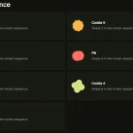 Material Design 3 Expressive Loading Indicator to React/Vue/Svelte/Vanilla JS
 Material Design Icon Picker in Vanilla JavaScript
 Material Design-style Time Picker Web Component – clock-timepicker
 Material Design 3 Date Picker with Vanilla JS & Bootstrap 5
 Lightweight Material Design 3 CSS Framework – GMX.css
 Simple Interactive Snackbar & Toast Notification In Vanilla JavaScript – notifyjs
 High-performance Ripple Click Effect – chaocore-ripple