


A lightweight and customizable JavaScript range slider input library that provides a great way to obtain numerical values from the user. Easy to customize via CSS.
It can apply to a variety of use cases: simulate a volume control, control a light dimmer, range-select an image size or quality, and so forth.
How to use it:
1. Install the package and import the range slider input as an ES module.
# Yarn
$ yarn add range-slider-input
# NPM
$ npm i range-slider-input
2. Or load the necessary JavaScript and Stylesheet from the dist folder.
<link rel="stylesheet" href="dist/style.css" />
<script src="dist/rangeslider.umd.min.js"></script>
3. Create an empty DIV to hold the custom range slider input.
<div id="range-slider-example">

</div>
4. Call the rangeSlider function to generate a basic range slider.
rangeSlider(document.querySelector('#range-slider-example'));
5. Create a vertical range slider.
rangeSlider(document.querySelector('#range-slider-example'), {
  orientation: 'vertical'
})
#range-slider-example {
margin: auto;
height: 300px;
}6. Override the default CSS to create your own range slider styles.
#range-slider-example {
  height: 16px;
  background: #4b4d61;
}
#range-slider-example .range-slider__range {
  background: #ff4141;
}
#range-slider-example .range-slider__thumb {
  width: 30px;
  height: 30px;
  border-radius: 4px;
}
#range-slider-example .range-slider__thumb[data-lower] {
  background: url("data:image/svg+xml,%3Csvg xmlns='http://www.w3.org/2000/svg' fill='' width='30' height='30' viewBox='0 0 24 24'%3E%3Cpath d='M3,5A2,2 0 0,1 5,3H19A2,2 0 0,1 21,5V19A2,2 0 0,1 19,21H5C3.89,21 3,20.1 3,19V5M11,7A2,2 0 0,0 9,9V17H11V13H13V17H15V9A2,2 0 0,0 13,7H11M11,9H13V11H11V9Z' /%3E%3C/svg%3E") #ff4141;
}
#range-slider-example .range-slider__thumb[data-upper] {
  background: url("data:image/svg+xml,%3Csvg xmlns='http://www.w3.org/2000/svg' width='30' height='30' viewBox='0 0 24 24'%3E%3Cpath d='M5,3H19A2,2 0 0,1 21,5V19A2,2 0 0,1 19,21H5A2,2 0 0,1 3,19V5A2,2 0 0,1 5,3M15,10.5V9A2,2 0 0,0 13,7H9V17H13A2,2 0 0,0 15,15V13.5C15,12.7 14.3,12 13.5,12C14.3,12 15,11.3 15,10.5M13,15H11V13H13V15M13,11H11V9H13V11Z' /%3E%3C/svg%3E") #ff4141;
}
#range-slider-example .range-slider__thumb[data-lower][data-active] {
  animation: rotate-anti-clockwise .9s infinite;
}
#range-slider-example .range-slider__thumb[data-upper][data-active] {
  animation: rotate-clockwise .9s infinite;
}
7. All available options to customize the range slider.
rangeSlider(document.querySelector('#range-slider-example'), {
  // min value
  min: 0,
  // max value
  max: 100,

  // step size
  step: 1,
  // initial values
  value: [25, 75],
  // disable the range slider element
  disabled: false,
  // disable the range slider
  rangeSlideDisabled: false,
  // disable left/right (top/bottom) thumbs
  thumbsDisabled: [false, false],
  // or 'vertical'
  orientation: 'horizontal',
  // callback function
  onInput: function(valueSet) {
    // ...
  },
})
8. API methods.
// get min value
instance.min()
// get max value
max()
// get step size
step()
// get values
value()
// set values
value([minValue, mavValue])
// get orientation
orientation()
// disable range slider element
disabled()
// disable range slider
rangeSlideDisabled()
// disable thumbnails
thumbsDisabled([true, true])
Changelog:
01/07/2023
- v2.4.3: Update
12/27/2022
- v2.4.1: Modified onInput
06/05/2022
- v2.3.0: Added a return value property: removeGlobalEventListeners()
06/05/2022
- v2.2.0: Added a return value property: currentValueIndex()
06/03/2022
- v2.1.0: New properties: onThumbDragStart, onThumbDragEnd, onRangeDragStart and onRangeDragEnd
See Also:
 Responsive & Touch-enabled Range Slider In Vanilla JavaScript – rangeSlider
 Accesible Range Slider Custom Element
 Build Custom Circular Range Sliders with CircularRange Web Component
 Accessible Dual-Handle Range Slider Library – range-slider.js
 Accessible Dual-Thumb Range Slider for Web & Mobile – DoubleRange
 Modern Range Sliders Based On Native Range Inputs – dual-range-input
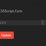 Highly Customizable Range Slider In JavaScript – Slider89.js
 Interactive Range Slider with Tooltip Using Pure CSS