


Awesome Notifications is a standalone JavaScript library to create animated, customizable notification popups on the web page.
Features:
- Modal style notifications.
- Toast style notifications.
- Supports HTML content.
- Confirm & alert dialogs.
- Auto dismisses after a certain timeout.
- Countdown progress bar.
- Font Awesome based icons.
- Info/Success/Warning/Alert themes.
- Async support.
How to use it:
Install & Import:
# NPM
$ npm install awesome-notifications --save
// ES 6
import AWN from 'awesome-notifications';
// CommonJS:
const AWN = require('awesome-notifications');
For browser, Include Font Awesome and the Awesome Notifications’ stylesheet in the head section of the page.
<link rel="stylesheet" href="https://netdna.bootstrapcdn.com/font-awesome/4.7.0/css/font-awesome.min.css">
<link href="dist/style.css" rel="stylesheet">
Include the Awesome Notifications’ JavaScript in the page when needed.
<script src="dist/index.var.js"></script>
Initialize the Awesome Notifications library with default options. To config the library, pass the options (see below) as on object to the AWN() function.
var notifier = new AWN();
Create your own notification popups with the following JavaScript syntax.
// basic
notifier.tip('Message here');
// info message
notifier.info('Message here');
// success message
notifier.success('Message here');
// warning message
notifier.warning('Message here');
// alert messages
notifier.alert('Message here');
// confirm dialog
notifier.confirm('Are you sure?', okFunc, cancelFunc);
// modal window with custom css class
notifier.modal('<h2>Your custom title</h2><p>Your custom text</p>', 'custom-class-name')
// async toast
notifier.async(promise, onResolve, onReject, html)
// shows loader and blocks the screen
notifier.asyncBlock(promise, onResolve, onReject, html)
Default options to customize the notification popup.
maxNotifications: 10,
animationDuration: 300,
position: "bottom-right",
labels: {
  tip: "Tip",
  info: "Info",
  success: "Success",
  warning: "Attention",
  alert: "Error",
  async: "Loading",
  confirm: "Confirmation required",
  confirmOk: "OK",
  confirmCancel: "Cancel"
},
icons: {
  tip: "question-circle",
  info: "info-circle",
  success: "check-circle",
  warning: "exclamation-circle",
  alert: "exclamation-triangle",
  async: "cog fa-spin",
  confirm: "exclamation-triangle",
  prefix: "<i class='fa fas fa-fw fa-",
  suffix: "'></i>",
  enabled: true
},
replacements: {
  tip: null,
  info: null,
  success: null,
  warning: null,
  alert: null,
  async: null,
  "async-block": null,
  modal: null,
  confirm: null,
  general: {
    "<script>": "",
    "</script>": ""
  }
},
messages: {
  tip: "",
  info: "",
  success: "Action has been succeeded",
  warning: "",
  alert: "Action has been failed",
  confirm: "This action can't be undone. Continue?",
  async: "Please, wait...",
  "async-block": "Loading"
},
formatError(err) {
  if (err.response) {
    if (!err.response.data) return '500 API Server Error'
    if (err.response.data.errors) {
      return err.response.data.errors.map(o => o.detail).join('<br>')
    }
    if (err.response.statusText) {
      return `${err.response.status} ${err.response.statusText}: ${err.response.data}`
    }
  }
  if (err.message) return err.message
  return err
},
durations: {
  global: 5000,
  success: null,
  info: null,
  tip: null,
  warning: null,
  alert: null
},
minDurations: {
  async: 1000,
  "async-block": 1000
},
Changelog:
v3.1.3 (03/31/2022)
- DEPRECATION WARNING: $saturation: Passing a number without unit % (0) is deprecated.
v3.1.2 (09/29/2020)
- update
v3.1.1 (04/22/2020)
- Removed error which was displayed when you create new toast at the end of old toast’s animation.
v3.1.0 (12/10/2019)
- New method closeToasts. It closes all visible toasts.
v3.0.5 (11/30/2019)
- Removed error which was displayed when you get rejected promise
v3.0.4 (11/28/2019)
- Removed comma between buttons in confirmation window
v3.0.3 (06/26/2018)
- add option to hide cancel btn in confirm
v3.0.2 (05/08/2018)
- Added: Keyup listeners for popups
- async-block now rejects all keydowns
- popup now removes focus on open. Tab key and its combination keydowns are being omitted to keep focus trapped. Esc key closes the window
- confirm now set focus to OK button on open. Tab key and its combination keydowns are handled to keep focus inside the window.Esc key closes the window
- Added: afterDelete method to elem class
05/02/2018
- v3.0.1: position option now works as expected
v3.0.0 (04/26/2018)
- Added: Optional options paramater for every public method. It used to override global options per call.
- Added: Durations settings for each toast separately. It’s available under options.durations property.
- Added: Minimum durations settings for each async element. It’s available under options.minDurations property.
- Added: New default function which formats errors. It’s available under options.formatError property.
- Added: Now all messages passed to alert() method will be formatted by options.formatError.
- Added: All toasts and popups methods, now return HTMLElement which was created by them.
- Added: New default messages. It’s available under options.messages
- Added: Enhanced design for toasts and popups.
- Added: Brand new handsome and detailed documentation.
- Added: New JS bundle for modern browsers.
- Added: _addToast method
- Added: _addPopup method
- Added: _afterAsync method
- Added: _responseHandler method, which is specific for _afterAsync
- Added: container getter
- Added: Webpack compress bundles to gzip format
- Changed: New library gzipped sizes: 4kb – default bundle, 3kb – modern bundle.
- Changed: Now icons are use Font Awesome 5 by default.
- Changed: html parameter of all elements, now named message. It’s no longer mandatory.
- Changed: options.modal.okLabel to options.labels.confirmOk
- Changed: options.modal.okLabel to options.labels.confirmCancel
- Changed: options.modal.okLabel to options.labels.confirmCancel
- Changed: options.asyncBlockMinDuration to options.minDurations[“async-block”]
- Changed: options.duration to options.durations.global
- Changed: options.handleReject to options.formatError
- Changed: Internal name of Modal class changed to Popup
- Changed: Change browserlist setting for default bundle
- Changed: Rename defaults.js file to options.js
- Changed: Rename modal.js file to popup.js
- Removed: notify method
- Removed: _runFunction method
- Removed: _getContainer method
- Removed: options.modal.maxWidth property, use CSS instead
- Now NPM dist contains index.var.js
10/25/2018
- v2.2.9
See Also:
 Vanilla JavaScript Image Comparison Plugin – BeforeAfterJs
 Validating Credit Card Numbers With Pure JavaScript – credicard.js
 Fire An Event When An Element Gets Stuck – Sticky Event Listener
 Customizable Bubble Animation With JavaScript And Canvas – bubbly-bg
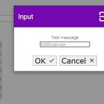 Minimal Customizable Modal Dialog Boxes In JavaScript – msg.js
 Slim Progressbar Component With LitElement – monkey-bar
 Minimal One Page Scroll In Pure JavaScript – skrllr.js
 Create A Responsive Tabs Component Using CSS and Radio Input