


In this tutorial, you’ll be learning how to use SVG and CSS to make super smooth animated waves that can be used as background to make your website look awesome. Let’s get started.
How to use it:
1. Create an SVG element for the waves.
<svg class="waves" xmlns="http://www.w3.org/2000/svg" xmlns:xlink="http://www.w3.org/1999/xlink" viewBox="0 24 150 28" preserveAspectRatio="none" shape-rendering="auto">
  <defs>
    <path id="gentle-wave" d="M-160 44c30 0 58-18 88-18s 58 18 88 18 58-18 88-18 58 18 88 18 v44h-352z" />
  </defs>
  <g class="parallax">
    <use xlink:href="#gentle-wave" x="48" y="0" fill="rgba(255,255,255,0.7" />
    <use xlink:href="#gentle-wave" x="48" y="3" fill="rgba(255,255,255,0.5)" />
    <use xlink:href="#gentle-wave" x="48" y="5" fill="rgba(255,255,255,0.3)" />
    <use xlink:href="#gentle-wave" x="48" y="7" fill="#fff" />
  </g>
</svg>
2. Apply basic styles to the waves.
.waves {
  position:relative;
  width: 100%;
  height:15vh;
  margin-bottom:-7px; /*Fix for safari gap*/
  min-height:100px;
  max-height:150px;
}
3. Animate the waves using CSS3 animations.
.parallax > use {
  animation: move-forever 25s cubic-bezier(.55,.5,.45,.5)     infinite;
}
.parallax > use:nth-child(1) {
  animation-delay: -2s;
  animation-duration: 7s;
}
.parallax > use:nth-child(2) {
  animation-delay: -3s;
  animation-duration: 10s;
}
.parallax > use:nth-child(3) {
  animation-delay: -4s;
  animation-duration: 13s;
}
.parallax > use:nth-child(4) {
  animation-delay: -5s;
  animation-duration: 20s;
}
@keyframes move-forever {
  0% {
   transform: translate3d(-90px,0,0);
  }
  100% {
    transform: translate3d(85px,0,0);
  }
}
/*Shrinking for mobile*/
@media (max-width: 768px) {
  .waves {
    height:40px;
    min-height:40px;
  }
}
See Also:
 Generate Random SVG Waves Using JavaScript – wavery
 Generate Highly Customizable SVG Waves With Dynamowaves.js
 Siri-style Audio Waveform With JavaScript And Canvas – siriwave.js
 Generate Animated Random SVG Waves With JavaScript – wavejs
 Create Animated Waves With JavaScript and Canvas – waving.js
 Minimalist Canvas Waves In JavaScript – wavy.js
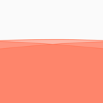 Flexible Configurable Waves Animation In Vanilla JavaScript – wavejs
 Generate Animated Waves Using JavaScript And Canvas