


| Author: | malleeshkanna1 |
|---|---|
| Views Total: | 0 views |
| Official Page: | Go to website |
| Last Update: | April 15, 2025 |
| License: | MIT |
Preview:

Description:
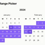
PremiumCalendar is a lightweight JavaScript library that provides customizable calendar, date picker, and date range picker functionality for modern web applications.
You can use this calendar for booking forms, event selection, task schedulers, or anywhere you need users to pick dates or date ranges without heavy UI frameworks.
Features:
- Fast Setup: Get a calendar running with minimal HTML and JS.
- Customizable: Control appearance (color, shape), selection modes (single/range), and date availability.
- Lightweight: No external library dependencies, not even jQuery.
- Mobile-Friendly: Responsive design and supports touch swiping for month navigation.
- Simple API: Initialize and configure through a straightforward options object.
- Date Controls: Disable past/future dates, specific days of the week, or individual dates.
- Dark Mode: Built-in dark theme option.
- Callbacks: Hooks for date selection (
handleChange) and month changes (onMonthChange).
How to use it:
1. Download the PremiumCalendar package and import the following files into your project:
<link rel="stylesheet" href="./dist/premiumcalendar.min.css" />
<script type="module">
  import MMKPremiumCalendar from './dist/premiumcalendar.min.js'
});
2. Create an empty div element where you want the calendar to appear. Give it an ID so the script can find it.
<div id="calendar"></div>
3. Create a new instance of MMKPremiumCalendar and pass the container selector:
new MMKPremiumCalendar("#calendar", {
    // options here
});
4. Available options and callbacks.
type(string):"single"(default) or"range". Sets the selection mode.color(string): CSS color value (e.g.,#3498db,rgb(52, 152, 219)) for highlights.disablePrevDates(boolean): Iftrue, disables dates before today. Defaultfalse.disableFutureDates(boolean): Iftrue, disables dates after today. Defaultfalse.shape(string):"default"(square/rounded rectangle) or"circle".disableDays(array): Array of strings ("sun","mon","tue","wed","thu","fri","sat") for days to disable. Example:["sun", "sat"]. Default[].datesupto(string): Maximum selectable date in"YYYY-MM-DD"format. Defaultnull.disabledDates(array): Array of specific dates"YYYY-MM-DD"to disable. Example:["2024-12-25"]. Default[].darkMode(boolean): Iftrue, enables the dark theme. Defaultfalse.handleChange(function): Callback executed when a date or range is selected. Receives the selected date (stringYYYY-MM-DDforsingle) or range (array of strings forrange) as an argument.onMonthChange(function): Callback executed when the displayed month changes (e.g., via arrows or swipe). Receives the new month information (likely year and month).dateRange(string): Controls the output forrangetype inhandleChange."onlyRange"(default) gives[start, end]."all"gives[start, date1, date2, ..., end].
new MMKPremiumCalendar("#calendar", {
    type: "range",
    color: "#4f46e5",
    disablePrevDates: false,
    disableFutureDates: false,
    shape: "default",
    handleChange: null,
    onMonthChange: null,
    disableDays: [],
    datesupto: null,
    dateRange: "onlyRange",
    disabledDates: [],
    darkMode: false,
});
See Also:
 Feature-rich Calendar & Date Picker Components – Cally
 Lightweight Accessible Date Picker Component – WC Datepicker
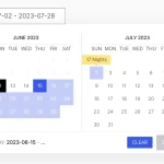 Elegant Accessible Date Range Picker In JavaScript – Hotel Datepicker
 Lightweight Date Picker & Date Range Picker Component – deskycal
 Minimal Clean Inline Date Picker – Hello Week
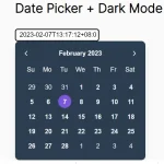 Lightweight Accessible Datepicker Calendar Component – DateDreamer
 Flexible Date & Date Range Picker – Datera.js
 Vanilla JavaScript Date & Date Range Picker For The Web