


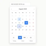
This is a flexible, powerful, accessible, multi-language, framework-agnostic date & date range picker for modern web design.
Inspired by bootstrap-datepicker, and it works with most popular front-end frameworks such as Bootstrap, Bulma, Foundation, etc.
Main features:
- 3 modes: inline, date picker, date range picker
- i18n.
- Keyboard navigation.
- Days/months/years/decades views.
- Allows to pick multiple dates.
- Allows to disable/highlight specific days.
- Custom date format.
How to use it:
1. Include the stylesheet in the head section of the document.
<!-- Standalone -->
<link href="dist/css/datepicker.min.css" rel="stylesheet" />
<!-- For Bootstrap 4 -->
<link href="dist/css/datepicker-bs4.min.css" rel="stylesheet" />
<!-- For Bulma -->
<link href="dist/css/datepicker-bulma.min.css" rel="stylesheet" />
<!-- For Foundation -->
<link href="dist/css/datepicker-foundation.min.css" rel="stylesheet" />
2. Include the main JavaScript and local files at the end of the document.
<script src="dist/js/datepicker.min.js"></script>
<script src="dist/js/locales/fr.min.js"></script>
3. Or include the all-in-on JS as follows:
<script src="dist/js/datepicker-full.min.js"></script>
4. Create an inline date picker and define the selected date in the data-date attribute.
<div id="inline" data-date="01/05/2020"></div>
5. Attach the date picker to an input field you specify.
<input type="text" name="datepicker">
const elem = document.querySelector('input[name="datepicker"]');
const datepicker = new Datepicker(elem, {
      // options here
});
6. Create a date range picker from two input fields as follows:
<div id="range">
  <input type="text" name="start">
  <span>To</span>
  <input type="text" name="end">
</div>
const elem = document.getElementById('range');
const dateRangePicker = new DateRangePicker(elem, {
      // options here
});
7. Default options & callback functions for the date picker.
const datepicker = new Datepicker(elem, {
      // Whether or not to close the datepicker immediately when a date is selected.
      autohide: false,
      // CSS class for button elements
      buttonClass: 'button',
      // If true, displays a "Clear" button at the bottom of the datepicker to clear the input value.
      // If 'autoclose' is also set to true, this button will also close the datepicker.
      clearBtn: false,
      // Delimiter string to separate the dates in a multi-date string.
      dateDelimiter: ',',
      // Array of date strings or a single date string formatted in the given date format.
      datesDisabled: [],
      // Days of the week that should be disabled.
      // Values are 0 (Sunday) to 6 (Saturday).
      // Multiple values should be comma-separated.
      Example: disable weekends: '06' or '0,6' or [0,6].
      daysOfWeekDisabled: [],
      // Days of the week that should be highlighted. Values are 0 (Sunday) to 6 (Saturday).
      daysOfWeekHighlighted: [],
      // Date to view when initially opening the calendar.
      // Date, String or Object with keys year, month, and day.
      // Defaults to today() by the program
      defaultViewDate: undefined,
      // Whether to show the date picker when the associated input filed has the readonly attribute.
      enableOnReadonly: true,
      // Date format string.
      format: 'mm/dd/yyyy',
      // The date format, combination of d, dd, D, DD, m, mm, M, MM, yy, yyyy.
      language: 'en',
      // Maximum limit to selectable date. No limit is applied if null is set.
      maxDate: null,
      // Maximum number of dates users can select. No limit is applied if 0 is set.
      maxNumberOfDates: 1,
      // Muximum limit to the view that the date picker displayes. 0:days – 3:decades.
      maxView: 3,
      // Minimum limit to selectable date. No limit is applied if null is set.
      minDate: null,
      // HTML (or plain text) for the button label of the "Next" and "Prev" button.
      nextArrow: '»',
      prevArrow: '«',
      // left|right|auto for horizontal and top|bottom|auto for virtical.
      orientation: 'auto',
      // The level that the date picker allows to pick. 0:date,1: month  or 2:year
      pickLevel: 0,
      // Object to assign or unset shortcut keys
      shortcutKeys: {
        show: {key: 'ArrowDown'},
        hide: null,
        toggle: {key: 'Escape'},
        prevButton: {key: 'ArrowLeft', ctrlOrMetaKey: true},
        nextButton: {key: 'ArrowRight', ctrlOrMetaKey: true},
        viewSwitch: {key: 'ArrowUp', ctrlOrMetaKey: true},
        clearButton: {key: 'Backspace', ctrlOrMetaKey: true},
        todayButton: {key: '.', ctrlOrMetaKey: true},
        exitEditMode: {key: 'ArrowDown', ctrlOrMetaKey: true},
      }
      // Whether or not to show the day names of the week.
      showDaysOfWeek: true,
      // If false, the datepicker will be prevented from showing when the input field associated with it receives focus.
      showOnFocus: true,
      // Show the date picker when the associated input filed is clicked
      showOnClick: true,
      // The view that the datepicker should show when it is opened.
      // Accepts: 0 or "days" or "month", 1 or "months" or "year", 2 or "years" or "decade", 3 or "decades" or "century", and 4 or "centuries" or "millenium".
      // Useful for date-of-birth datepickers.
      startView: 0,
      // The string that will appear on top of the datepicker. If empty the title will be hidden.
      title: '',
      // Whether to show the today button.
      todayButton: false,
      // 0  focus Move the focused date to the current date without changing the selection
      // 1 select  Select (or toggle the selection of) the current date
      todayButtonMode: 0,
      // If true, highlights the current date.
      todayHighlight: false,
      // Update the selected date(s) with the input field's value when the input field is losing focus
      updateOnBlur: true,
      // Week numbers to display
      weekNumbers: 0,
      // Day of the week start. 0 (Sunday) to 6 (Saturday)
      weekStart: 0,
      // A function that takes a date as a parameter and returns one of the following values:
      beforeShowDay: function(date){
        /* Return:
           {Object} - Things to customize. Available properties are:
             enabled: {Boolean} - whether the cell is selctable
             classes: {String} - space-sparated additional CSS classes for the cell element
             content: {String} - HTML for the cell element's child nodes
           {String} - additional classes — same as returning { classes: additionalClasses }
           {Boolean} - whether the cell is selctable — same as returning { enabled: isSelectable }
        /*
      }
      beforeShowDecade: function(date){
        /* Return:
           {Object} - Things to customize. Available properties are:
             enabled: {Boolean} - whether the cell is selctable
             classes: {String} - space-sparated additional CSS classes for the cell element
             content: {String} - HTML for the cell element's child nodes
           {String} - additional classes — same as returning { classes: additionalClasses }
           {Boolean} - whether the cell is selctable — same as returning { enabled: isSelectable }
        /*
      }
      beforeShowMonth: function(date){
        /* Return:
           {Object} - Things to customize. Available properties are:
             enabled: {Boolean} - whether the cell is selctable
             classes: {String} - space-sparated additional CSS classes for the cell element
             content: {String} - HTML for the cell element's child nodes
           {String} - additional classes — same as returning { classes: additionalClasses }
           {Boolean} - whether the cell is selctable — same as returning { enabled: isSelectable }
        /*
      }
      beforeShowYear: function(date){
        /* Return:
           {Object} - Things to customize. Available properties are:
             enabled: {Boolean} - whether the cell is selctable
             classes: {String} - space-sparated additional CSS classes for the cell element
             content: {String} - HTML for the cell element's child nodes
           {String} - additional classes — same as returning { classes: additionalClasses }
           {Boolean} - whether the cell is selctable — same as returning { enabled: isSelectable }
        /*
      }
});
8. Additional settings for the date range picker.
const dateRangePicker = new DateRangePicker(elem, {
      // Whether to allow one side of the date-range to be blank.
      allowOneSidedRange: false,
      // Input fields to attach start- and end-date pickers. Must contain 2 items.
      input: input

});
9. Available props & methods.
// Determines if the date picker is shown
Datepicker.active
// Adds new locals
Datepicker.locales.en = {
  days: ["Sunday", "Monday", "Tuesday", "Wednesday", "Thursday", "Friday", "Saturday"],
  daysShort: ["Sun", "Mon", "Tue", "Wed", "Thu", "Fri", "Sat"],
  daysMin: ["Su", "Mo", "Tu", "We", "Th", "Fr", "Sa"],
  months: ["January", "February", "March", "April", "May", "June", "July", "August", "September", "October", "November", "December"],
  monthsShort: ["Jan", "Feb", "Mar", "Apr", "May", "Jun", "Jul", "Aug", "Sep", "Oct", "Nov", "Dec"],
  today: "Today",
  clear: "Clear",
  titleFormat: "MM y",
  format: "mm/dd/yyyy",
  weekstart: 0
}
// Formats a date
Datepicker.formatDate(date, format, lang);
// Parses date strings
Datepicker.parseDate(dateStr, format, lang);
// Shows the date picker
instance.show();
// Refreshes a date picker
instance.refresh(target, forceRender);
// Toggles the display of the picker element
instance.toggle();
// Destroys the date picker
instance.destroy();
// Updates the date picker
instance.update(options);
// Updates options
instance.setOptions(options);
// Sets focused date
instance.setFocusedDate( viewDate [, resetView ] );
// Gets focused date
instance.getFocusedDate( [ format ] );
// Sets selected date(s)
instance.setDate( date1 [, date2 [, ... dateN ]][, options ] );
instance.setDate( dates [, options ] );
instance.setDate( [ options ] );
// Returns a Date object of selected date
instance.getDate(format);
// Updates options of the date range picker
rangepicker.setOptions(options);
// Get the start and end dates of the date range picker
rangepicker.getDate(format);
// Destroys the date range picker
rangepicker.destory();
10. Event handlers.
instance.addEventListener('changeDate', function (e, details) {
  /* details:
  date: {Date} - Selected date(s) (see getDate())
  viewDate: {Date} - Focused date
  viewMode: {Number} - ID of the current view
  datepicker: {Datepicker} - Datepicker instance
  */
});
instance.addEventListener('changeMonth', function (e, details) {
  /* details:
  date: {Date} - Selected date(s) (see getDate())
  viewDate: {Date} - Focused date
  viewMode: {Number} - ID of the current view
  datepicker: {Datepicker} - Datepicker instance
  */
});
instance.addEventListener('changeView', function (e, details) {
  /* details:
  date: {Date} - Selected date(s) (see getDate())
  viewDate: {Date} - Focused date
  viewMode: {Number} - ID of the current view
  datepicker: {Datepicker} - Datepicker instance
  */
});
instance.addEventListener('changeYear', function (e, details) {
  /* details:
  date: {Date} - Selected date(s) (see getDate())
  viewDate: {Date} - Focused date
  viewMode: {Number} - ID of the current view
  datepicker: {Datepicker} - Datepicker instance
  */
});
instance.addEventListener('hide', function (e, details) {
  /* details:
  date: {Date} - Selected date(s) (see getDate())
  viewDate: {Date} - Focused date
  viewMode: {Number} - ID of the current view
  datepicker: {Datepicker} - Datepicker instance
  */
});
instance.addEventListener('show', function (e, details) {
  /* details:
  date: {Date} - Selected date(s) (see getDate())
  viewDate: {Date} - Focused date
  viewMode: {Number} - ID of the current view
  datepicker: {Datepicker} - Datepicker instance
  */
});
Changelog:
v1.3.3 (06/05/2023)
- Change bs5 scss to prevent compile error with bootstrap 5.3
v1.3.2 (05/15/2023)
- Add protection against fake keydown event triggered on autofill on Chromium-based browsers
v1.3.1 (04/08/2023)
- Fix – Rename WeekNumbersTemplate.js to weekNumbersTemplate.js to fix an error caused by the case mismatch between the path in import statement and actual file name
v1.3.0 (04/08/2023)
- Add weekNumbers option to add support for week numbering systems other than ISO 8601
- Add enableOnReadonly option
- Add shortcutKeys option to change/disable some keyboard operations
- Add toggle() API method
- Add forceRefresh to the method options of setDate() and update() API
- Add viewDate to the method options of setDate() API
- Add callback function support to datesDisabled option for rule-based disabling
- Add getFocusedDate() and setFocusedDate() API methods
- Bugfixes
v1.2.0 (01/01/2022)
- Edge Legacy (non-Chromium Edge) is no longer supported.
- Date picker element is now inserted after the associated input element by default.
- Add Bootstrap 5 support.
- Add Web Components support.
- Change the default placement of orientation: ‘auto’ to bottom-left.
- Replace out-of-date dev dependencies: node-sass, uglyfy-es → dart-sass, terser.
- Deprecate disableTouchKeyboard option.
- Change the way to Keep input element focused when clicking picker in order to prevent flicker.
- Remove keydown event cancellation except arrow keys’ preventDefault.
- Apply the bootstrap-datepicker’s locale updates.
- Revise container’s functionality.
- Bug fix.
v1.1.4 (03/14/2021)
- Chnage datepicer.show() to move the focus to the input field if it’s not focused
v1.1.3 (03/08/2021)
- Fix: TypeError occurs when initial dates are set in the input filed in multidate mode
v1.1.2 (01/18/2021)
- Fix: inline picker submits form by click on prev/next buttons
- Fix: date with the name of 30-day month is parsed incorrectly if the current date is the 31st
v1.1.1 (01/02/2020)
- Bug fixes
v1.1.0 (12/25/2020)
- Add updateOnBlur option
- Add showOnClick option (#21)
- Add pickLevel option
- Add optional forceRender argument to refresh()API
- Add setDates() API to DateRangePicker
v1.0.3 (05/31/2020)
- Fixed: setDate() add option to prevent dispatching change event
v1.0.2 (04/26/2020)
- Fixed: disableTouchKeyboard still displays keyboard on month change
- Fixed: calendar wasn’t redrawn properly in some conditions
v1.0.1 (03/12/2020)
- add stylesheet for Foundation
- add support for importing js by package name
See Also:
 Accessible Customizable Date/Time/Date Picker for Modern Web App – FDatepicker
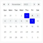 Lightweight Accessible Date Picker Component – WC Datepicker
 Vanilla JS Date Picker with Range Selection – EssealDatePicker
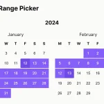 Feature-rich Calendar & Date Picker Components – Cally
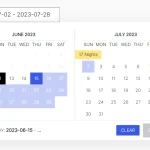 Elegant Accessible Date Range Picker In JavaScript – Hotel Datepicker
 Versatile Datetime Picker For Bulma – bulma-calendar
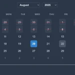 Powerful, Customizable JavaScript Date Picker – Datelite
 Easy Datetime & Date Range Pickers in Vanilla JavaScript
This is not Internet Explorer compatible.
“Made for modern browsers — no IE support” – https://mymth.github.io/vanillajs-datepicker/#/
Hi, your comments does not seem to work. I keep getting a 400 – Bad Request error.
how to make it compatible with all browsers.. including IE
This is pretty cool, but I cannot seem to get the event listeners to register.
How to use the event handlers on a range picker?
Does this picker have any configuration options to change the generated html?