


lightPick.js is a JavaScript library to lets you create a flexible, customizable, multi-language, user-friendly date range picker component using moment.js.
More features:
- Also can be used as a date picker.
- Custom date format.
- Allows you to set min/max dates.
- Useful event handlers and API methods.
How to use it:
Include the necessary moment.js and jQuery lightPick.js libraries at the bottom of the webpage.
<script src="https://cdnjs.cloudflare.com/ajax/libs/moment.js/2.22.2/moment-with-locales.min.js"></script>
<script src="lightpick.js"></script>
Create a standard input field the date range picker should attach to.
<input type="text" id="demo">
Initialize the date range picker on the input field and done.
const myPicker = new lightPick({
      field: document.getElementById('demo'),
      singleDate: false
});
To initialize the library as a single date picker, set the singleDate options to true.
const myPicker = new lightPick({
      field: document.getElementById('demo'),
      singleDate: true // default: true
});
Sometimes you might need to display the date range using 2 input fields:
<input type="text" id="start">
<input type="text" id="end">
const myPicker = new lightPick({
      field: document.getElementById('start'),
      secondField: document.getElementById('end')
});
Specify the language you want to use. By default, the plugin will detect and use the language based on your browser language.
const myPicker = new lightPick({
      field: document.getElementById('demo'),
      singleDate: false,
      lang: 'en',
});
More configuration options with default values.
const myPicker = new lightPick({
      // target form field
      field: null,
      // end of date range will set here
      secondField: null,
      // first day of the week
      // 1 = Monday
      firstDay: 1,
      // parent element
      parentEl: 'body',
      // language
      lang: 'auto',
      // date format
      format: 'DD/MM/YYYY',
      // separator character
      separator: ' - ',
      // number of months to display
      numberOfMonths: 1,
      // number of columns to display
      numberOfColumns: 2,
      // single date mode
      singleDate: true,

      // auto close after selection
      autoclose: true,
      // Repick start/end instead of new range.
      repick: false,
      // start/end dates
      startDate: null,
      endDate: null,
      // min/max dates
      minDate: null,
      maxDate: null,
      // an array of disabled dates
      disableDates: null,
      // selects second date before/after the first selected date
      selectForward: false,
      selectBackward: false,
      // min/max days
      minDays: null,
      maxDays: null,
      // shows tooltip
      hoveringTooltip: true,
      // hide on click
      hideOnBodyClick: true,
      // shows footer
      footer: false,
      // disabled dates in the range
      disabledDatesInRange: true,
      // 'left' or 'right', 'top' or 'bottom', and 'auto'
      orientation: 'auto',
      // disable Saturday and Sunday.
      disableWeekends: false,
      // inline mode
      inline: false,
      // long (e.g., Thursday), short (e.g., Thu), narrow (e.g., T).
      weekdayStyle: 'short',
      dropdowns: {
        years: {
          min: 1900,
          max: null,
        },
        months: true,
      },
      // localization
      locale: {
        buttons: {
          prev: '←',
          next: '→',
          close: '×',
          reset: 'Reset',
          apply: 'Apply',
        },
        tooltip: {
          one: 'day',
          other: 'days',
        },
        tooltipOnDisabled: null,
      },
      // callbacks
      onSelect: null,
      onOpen: null,
      onClose: null
});
Available event handlers.
const myPicker = new lightPick({
      onSelect: function(start, end){
        // ...
      },
      onOpen:  function(start, end){
        // ...
      },
      onClose: function(start, end){
        // ...
      },
      onError: function(start, end){
        // ...
      }
});
API methods.
// sets a date
myPicker.setDate(date)
// gets current date
myPicker.getDate()
// gets current start of date range
myPicker.getStartDate()
// gets current end of date range
myPicker.getEndDate()
// returns clone dates now
myPicker.getX()
// shows date range picker
myPicker.show()
// hides date range picker
myPicker.hide()
// destroys date range picker
myPicker.destroy()
Changelog:
v1.5.0 (11/13/2019)
- All getX methods returns clone dates now
v1.4.5 (11/04/2019)
- Fix merge conflict
v1.4.4 (11/03/2019)
- Fix autoclose refresh date issue
v1.4.3 (11/02/2019)
- Fix reload options for dropdowns and locale objects
v1.4.2 (11/01/2019)
- Added scss file.
v1.4.1 (10/24/2019)
- Updated
v1.3.6 (10/22/2019)
- Fix minDate, maxDate, disableDates and value format issue
v1.3.5 (10/22/2019)
- Add weekday display style
v1.3.4 (03/30/2019)
- Fixed `setDate` do not work with `inline = true`
v1.3.3 (03/29/2019)
- fix setDate with inline option
v1.3.2 (03/25/2019)
- New option: dropdowns
v1.3.1 (03/22/2019)
- New option: inline (default is false)
- Dropdown list months, years
v1.2.10 (02/13/2019)
- bugfix
- improve sync
v1.2.9 (01/15/2019)
- bugfix
v1.2.8 (12/18/2018)
- improved option orientation (checking available space on top when value is auto)
v1.2.7 (12/10/2018)
- fix bug when used both options repick and minDays (on repick date minDays was ignored)
v1.2.6 (11/08/2018)
- new option: orientation
- new option: disableWeekends
- fixed bug
v1.2.5 (09/11/2018)
- Improve pluralize.
v1.2.4 (08/27/2018)
- Tooltip on disabled days.
v1.2.3 (08/24/2018)
- Removed extra div days in next month.
- new callback: onError Calling when disabledDatesInRange is set to false and user is select range includes disabled dates.
- minor bug fixes
v1.2.2 (08/23/2018)
- new options: disabledDatesInRange, tooltipNights
v1.1.2 (08/22/2018)
- new option: footer
v1.1.1 (08/16/2018)
- Fixed: On select method invoked when Lightpick instance is created
v1.1.0 (07/20/2018)
- drop support IE
- now header (month name) is clickable for fast change month
v1.0.9 (07/19/2018)
- fixed bug
v1.0.6 (07/12/2018)
- Improves styling
v1.0.5 (07/12/2018)
- Bugfix: When a parentEl is provided in options, the position is incorrect
v1.0.4 (07/12/2018)
- Improves CSS
v1.0.3 (07/09/2018)
- Fixed: Can always pick a one-day-range
v1.0.0 (06/22/2018)
- Constructor name to begin with a capital letter: lightPick to Lightpick
v0.0.6 (06/20/2018)
- new option: repick
v0.0.5 (06/19/2018)
- hidden on start
v0.0.4 (06/18/2018)
- Added tooltip
- Option buttons moved to locale
See Also:
 Accessible Customizable Date/Time/Date Picker for Modern Web App – FDatepicker
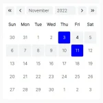 Lightweight Accessible Date Picker Component – WC Datepicker
 Vanilla JS Date Picker with Range Selection – EssealDatePicker
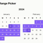 Feature-rich Calendar & Date Picker Components – Cally
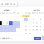 Elegant Accessible Date Range Picker In JavaScript – Hotel Datepicker
 Versatile Datetime Picker For Bulma – bulma-calendar
 Powerful, Customizable JavaScript Date Picker – Datelite
 Easy Datetime & Date Range Pickers in Vanilla JavaScript
Nice, but please correct the name os the class in the JS code, it’s “Lightpick”, not “lightPick”
I am not sure where I enter this code. It is working without it but is limited I think.
Initialize the date range picker on the input field and done.
 const myPicker = new lightPick({
 field: document.getElementById('demo'),
 singleDate: false
 });
Using this and love it. Anyway to make it so the first date selected has to be a certain day, in my case a Sunday?