


Modal JS is a tiny JavaScript library that extends Bootstrap 5’s modal component with dynamic features and programmatic control.
You can create modals with HTML content, manage multiple nested windows, and replace existing modals without losing state. The library handles modal stacking and proper cleanup automatically.
Modal JS also comes with a subtle background blur effect that focuses user attention on active modals by dimming other page content.
How to use it:
1. To get started, makes sure you have the latest Bootstrap 5 framework loaded in your project.
<link rel="stylesheet" href="/path/to/cdn/bootstrap.min.css" />
<script src="/path/to/cdn/bootstrap.min.js"></script>
2. Download and load the Modal JS files:
<link href="css/modal.min.css" rel="stylesheet">
<script src="js/modal.min.js"></script>
3. Instantiate the Modal class with your desired options. This example shows a basic modal with a title and HTML content. The afterClose function executes after the modal is closed.
new Modal({
  title : 'Title',
  html : 'HTML Content Here',
  afterClose: function(){
    alert('Closed')
  }
});
4. All possible options with default values:
new Modal({
  // Set a specific ID or let it be generated
  id : false,
  // Modal title
  title : '',
  // HTML content for the modal body
  html : '',
  // Set a specific width in pixels
  width: false,
  // Add custom CSS classes to the modal
  addClass : '',
  // Close any currently open modal (keeps the overlay)
  replace : false,
  // Customize the close button HTML
  tplClose : '',
  // Function to execute after the modal is opened
  callback : false,
  // Function to execute after the modal is closed
  afterClose : false,

});
Changelog:
v0.1.6 (04/24/2025)
- Bugfix
See Also:
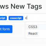 Easy Tags Input Component For Bootstrap 5/4 – Tags.js
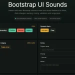 Add Web Audio Feedback to Bootstrap 5 Components – Bootstrap UI Sounds
 iOS-style Bottom Sheet Component for Bootstrap 5 – BootstrapSheet
 Inspect CSS Styles With Bootstrap Popover CSS Inspector
 Navbar-Synced Context Menu for Bootstrap 5 – BRC JS
 Make Bootstrap 5 Tables More Readable On Mobile Devices – AvalynxTable.js
 Bootstrap 5 Theme with shadcn/ui Aesthetics – Shadstrap
 Lightweight Loading Overlay Plugin For Bootstrap 5 – AvalynxLoader