


An easy-to-use form wizard JavaScript component for Bootstrap 5 to create user-friendly HTML forms that are easy to fill out and submit.
It makes use of Bootstrap 5’s tabs component to group form fields and converts them into an intuitive step-by-step wizard interface. Whether you’re working on a complex sign-up form or a simple contact form, this component might be helpful.
How to use it:
1. Load the Form Wizard Component into your Bootstrap project.
<!-- Bootstrap 5 Framework -->
<link rel="stylesheet" href="/path/to/cdn/bootstrap.min.css" />
<script src="/path/to/cdn/bootstrap.bundle.min.js"></script>
<!-- Bootstrap 5 Form Wizard -->
<script src="/path/to/dist/js/bootstrap-form-wizard.min.js"></script>
2. Group your form fields using Bootstrap 5’s tabs component as follows:
<div class="my-wizard">
  <div class="mb-4">
      <label for="field1_1" class="form-label">Field 1.1</label>
      <input id="field1_1" name="field1_1" type="text" class="form-control" placeholder="Field 1.1" required form="example" data-bfw-in-step="1">
  </div>
  <form action="" method="post" id="example">
      <ul class="nav nav-pills mb-3 justify-content-center" role="tablist">
          <li class="nav-item">
              <a class="nav-link active" href="#ex1_step1" data-bs-toggle="step">Step 1</a>
          </li>
          <li class="nav-item">
              <a class="nav-link" href="#ex1_step2" data-bs-toggle="step">Step 2</a>
          </li>
          <li class="nav-item">
              <a class="nav-link" href="#ex1_step3" data-bs-toggle="step">Step 3</a>
          </li>
          <li class="nav-item">
              <a class="nav-link" href="#ex1_step4" data-bs-toggle="step">Step 4</a>
          </li>
      </ul>
      <div class="tab-content mt-3">
          <div class="tab-pane fade show active" id="ex1_step1" role="steppanel">
              <div class="mb-3">
                  <label for="field1" class="form-label">Field 1 (*)</label>
                  <input id="field1" name="field1" type="text" class="form-control" placeholder="Field 1" required>
              </div>
              <div class="mb-3">
                  <label for="field2" class="form-label">Field 2 (*)</label>
                  <select id="field2" name="field2" class="form-select" required>
                      <option value="">Select item</option>
                      <option value="1">One</option>
                      <option value="2">Two</option>
                      <option value="3">Three</option>
                  </select>
              </div>
              <div class="mb-3">
                  <label for="field3" class="form-label">Field 3 (*)</label>
                  <textarea id="field3" name="field3" class="form-control" rows="3" placeholder="Field 3" required></textarea>
              </div>
          </div>
          <div class="tab-pane fade" id="ex1_step2" role="steppanel">
              <div class="mb-3">
                  <label for="field4" class="form-label">Field 4</label>
                  <input id="field4" name="field4" type="email" class="form-control" placeholder="[email protected]">
              </div>
              <div class="mb-3">
                  <label for="field5" class="form-label">Field 5</label>
                  <input id="field5" name="field5" type="password" class="form-control" placeholder="field5" >
              </div>
              <div class="mb-3">
                  <label for="field6" class="form-label">Field 6</label>
                  <div class="form-check">
                      <input id="field6" name="field6" class="form-check-input" type="checkbox" value="1">
                      <label class="form-check-label" for="field6">
                          Checkbox 6.1
                      </label>
                  </div>
                  <div class="form-check">
                      <input id="field62" name="field6" class="form-check-input" type="checkbox" value="2">
                      <label class="form-check-label" for="field62">
                          Checkbox 6.2
                      </label>
                  </div>
                  <div class="form-check">
                      <input id="field63" name="field6" class="form-check-input" type="checkbox" value="3">
                      <label class="form-check-label" for="field63">
                          Checkbox 6.3
                      </label>
                  </div>
              </div>
          </div>
          <div class="tab-pane fade" id="ex1_step3" role="steppanel">
              <div class="mb-3">
                  <label for="field7" class="form-label">Field 7</label>
                  <input id="field7" name="field7" type="url" class="form-control" placeholder="https://ww.google.com/">
              </div>
              <div class="mb-3">
                  <label for="field8" class="form-label">Field 8</label>
                  <input id="field8" name="field8" type="number" class="form-control" placeholder="0" required>
              </div>
              <div class="mb-3">
                  <label for="field9" class="form-label">Field 9</label>
                  <div class="form-check">
                      <input id="field9" name="field9" class="form-check-input" type="radio" value="1">
                      <label class="form-check-label" for="field9">
                          Radio 9.1
                      </label>
                  </div>
                  <div class="form-check">
                      <input id="field92" name="field9" class="form-check-input" type="radio" value="2">
                      <label class="form-check-label" for="field92">
                          Radio 9.2
                      </label>
                  </div>
                  <div class="form-check">
                      <input id="field93" name="field9" class="form-check-input" type="radio" value="3">
                      <label class="form-check-label" for="field93">
                          Radio 9.3
                      </label>
                  </div>
              </div>
          </div>
          <div class="tab-pane fade" id="ex1_step4" role="steppanel"></div>
      </div>
      <div class="text-end mt-3">
          <button type="button" class="btn btn-secondary ms-2" data-bfw-action="back">< Back1</button>
          <button type="submit" class="btn btn-primary ms-2" data-bfw-action="next">Next1 ></button>
      </div>
  </form>
</div>
3. Initialize the form wizard.
document.addEventListener('DOMContentLoaded', event => {
  new BootstrapFormWizard(document.getElementById('example'), {
      // options
  });
});
4. Available options to customize the form wizard interface.
document.addEventListener('DOMContentLoaded', event => {
  new BootstrapFormWizard(document.getElementById('example'), {
      class: {
        activeStep: 'active',
      },
      lang: {
        backBtn: '< Back',
        nextBtn: 'Next >',
        nextBtnSubmit: 'Send',
        fieldReqNotFocusable: 'A required field in the form is not focusable.',
      },
      nextBtn: undefined,
      backBtn: undefined,
      onSubmit: undefined,
      onNext: undefined,
      onBack: undefined,
      onValidated: undefined,
      start: 1,
      submitForm: true,
      useBootstrapValidation: false,
  });
});
Changelog:
v1.0.1 (02/03/2023)
- Update
See Also:
 Easy Multi-step Form Component For Bootstrap 5
 Interactive Wizard UI Using Bootstrap 5 Tabs Component
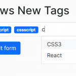 Easy Tags Input Component For Bootstrap 5/4 – Tags.js
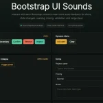 Add Web Audio Feedback to Bootstrap 5 Components – Bootstrap UI Sounds
 iOS-style Bottom Sheet Component for Bootstrap 5 – BootstrapSheet
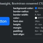 Inspect CSS Styles With Bootstrap Popover CSS Inspector
 Navbar-Synced Context Menu for Bootstrap 5 – BRC JS
 Make Bootstrap 5 Tables More Readable On Mobile Devices – AvalynxTable.js