


A lightweight JavaScript library that allows you to write conditional code to run based on Bootstrap’s built-in breakpoints. This ensures your JavaScript functions execute only under the desired screen sizes.
Features:
- Write conditional function based on Bootstrap breakpoints: xs, sm, md, lg, xl, xxl, …
- Check if width is larger, smaller, equal to, or between breakpoints
- Works with Bootstrap 4 and 5
How to use it:
1. Install & download.
# NPM
$ npm i bootstrap-breakpoint
2. Write conditions as follows:
if (bootstrapBreakpoint('up', 'xs')) {
  // screen size > xs
}
if (bootstrapBreakpoint('down', 'lg')) {
  // screen size < lg
}
if (bootstrapBreakpoint('only', 'xl')) {
  // screen size = xl
}
if (bootstrapBreakpoint('between', ['lg','xxl'])) {
  // xxl > screen size > lg
}
3. Register/enable/disable breakpoints.
BootstrapBreakpoint.breakpoints.push('xxl');
BootstrapBreakpoint.init();
// or
BootstrapBreakpoint.breakpoints = ["xs", "sm", "md", "lg", "xl", "xxl"];
BootstrapBreakpoint.init();
See Also:
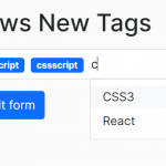 Easy Tags Input Component For Bootstrap 5/4 – Tags.js
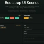 Add Web Audio Feedback to Bootstrap 5 Components – Bootstrap UI Sounds
 iOS-style Bottom Sheet Component for Bootstrap 5 – BootstrapSheet
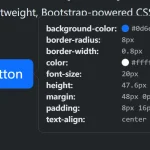 Inspect CSS Styles With Bootstrap Popover CSS Inspector
 Navbar-Synced Context Menu for Bootstrap 5 – BRC JS
 Make Bootstrap 5 Tables More Readable On Mobile Devices – AvalynxTable.js
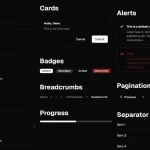 Shadstrap: Bootstrap 5 Theme with shadcn/ui Aesthetics
 Lightweight Loading Overlay Plugin For Bootstrap 5 – AvalynxLoader