


A responsive, mobile-friendly floating sidebar navigation built with pure CSS.
Hovering over the nav item will expand the sidebar to the full size.
It automatically turns the sidebar into a bottom navbar on mobile devices.
Mobile View:

How to use it:
1. Create the HTML for the sidebar navigation.
<nav class="navbar">
  <ul class="navbar-nav">
    <li class="logo">
      <a href="#" class="nav-link">
        <span class="link-text logo-text">Fireship</span>
        <svg
          aria-hidden="true"
          focusable="false"
          data-prefix="fad"
          data-icon="angle-double-right"
          role="img"
          xmlns="http://www.w3.org/2000/svg"
          viewBox="0 0 448 512"
          class="svg-inline--fa fa-angle-double-right fa-w-14 fa-5x"
        >
          <g class="fa-group">
            <path
              fill="currentColor"
              d="M224 273L88.37 409a23.78 23.78 0 0 1-33.8 0L32 386.36a23.94 23.94 0 0 1 0-33.89l96.13-96.37L32 159.73a23.94 23.94 0 0 1 0-33.89l22.44-22.79a23.78 23.78 0 0 1 33.8 0L223.88 239a23.94 23.94 0 0 1 .1 34z"
              class="fa-secondary"
            ></path>
            <path
              fill="currentColor"
              d="M415.89 273L280.34 409a23.77 23.77 0 0 1-33.79 0L224 386.26a23.94 23.94 0 0 1 0-33.89L320.11 256l-96-96.47a23.94 23.94 0 0 1 0-33.89l22.52-22.59a23.77 23.77 0 0 1 33.79 0L416 239a24 24 0 0 1-.11 34z"
              class="fa-primary"
            ></path>
          </g>
        </svg>
      </a>
    </li>
    <li class="nav-item">
      <a href="#" class="nav-link">
        <svg
          aria-hidden="true"
          focusable="false"
          data-prefix="fad"
          data-icon="cat"
          role="img"
          xmlns="http://www.w3.org/2000/svg"
          viewBox="0 0 512 512"
          class="svg-inline--fa fa-cat fa-w-16 fa-9x"
        >
          <g class="fa-group">
            <path
              fill="currentColor"
              d="M448 96h-64l-64-64v134.4a96 96 0 0 0 192 0V32zm-72 80a16 16 0 1 1 16-16 16 16 0 0 1-16 16zm80 0a16 16 0 1 1 16-16 16 16 0 0 1-16 16zm-165.41 16a204.07 204.07 0 0 0-34.59 2.89V272l-43.15-64.73a183.93 183.93 0 0 0-44.37 26.17L192 304l-60.94-30.47L128 272v-80a96.1 96.1 0 0 0-96-96 32 32 0 0 0 0 64 32 32 0 0 1 32 32v256a64.06 64.06 0 0 0 64 64h176a16 16 0 0 0 16-16v-16a32 32 0 0 0-32-32h-32l128-96v144a16 16 0 0 0 16 16h32a16 16 0 0 0 16-16V289.86a126.78 126.78 0 0 1-32 4.54c-61.81 0-113.52-44.05-125.41-102.4z"
              class="fa-secondary"
            ></path>
            <path
              fill="currentColor"
              d="M376 144a16 16 0 1 0 16 16 16 16 0 0 0-16-16zm80 0a16 16 0 1 0 16 16 16 16 0 0 0-16-16zM131.06 273.53L192 304l-23.52-70.56a192.06 192.06 0 0 0-37.42 40.09zM256 272v-77.11a198.62 198.62 0 0 0-43.15 12.38z"
              class="fa-primary"
            ></path>
          </g>
        </svg>
        <span class="link-text">Cats</span>
      </a>
    </li>
    <li class="nav-item">
      <a href="#" class="nav-link">
        <svg
          aria-hidden="true"
          focusable="false"
          data-prefix="fad"
          data-icon="alien-monster"
          role="img"
          xmlns="http://www.w3.org/2000/svg"
          viewBox="0 0 576 512"
          class="svg-inline--fa fa-alien-monster fa-w-18 fa-9x"
        >
          <g class="fa-group">
            <path
              fill="currentColor"
              d="M560,128H528a15.99954,15.99954,0,0,0-16,16v80H480V176a15.99954,15.99954,0,0,0-16-16H416V96h48a16.00079,16.00079,0,0,0,16-16V48a15.99954,15.99954,0,0,0-16-16H432a15.99954,15.99954,0,0,0-16,16V64H368a15.99954,15.99954,0,0,0-16,16v48H224V80a15.99954,15.99954,0,0,0-16-16H160V48a15.99954,15.99954,0,0,0-16-16H112A15.99954,15.99954,0,0,0,96,48V80a16.00079,16.00079,0,0,0,16,16h48v64H112a15.99954,15.99954,0,0,0-16,16v48H64V144a15.99954,15.99954,0,0,0-16-16H16A15.99954,15.99954,0,0,0,0,144V272a16.00079,16.00079,0,0,0,16,16H64v80a16.00079,16.00079,0,0,0,16,16h48v80a16.00079,16.00079,0,0,0,16,16h96a16.00079,16.00079,0,0,0,16-16V432a15.99954,15.99954,0,0,0-16-16H192V384H384v32H336a15.99954,15.99954,0,0,0-16,16v32a16.00079,16.00079,0,0,0,16,16h96a16.00079,16.00079,0,0,0,16-16V384h48a16.00079,16.00079,0,0,0,16-16V288h48a16.00079,16.00079,0,0,0,16-16V144A15.99954,15.99954,0,0,0,560,128ZM224,320H160V224h64Zm192,0H352V224h64Z"
              class="fa-secondary"
            ></path>
            <path
              fill="currentColor"
              d="M160,320h64V224H160Zm192-96v96h64V224Z"
              class="fa-primary"
            ></path>
          </g>
        </svg>
        <span class="link-text">Aliens</span>
      </a>
    </li>
    <li class="nav-item">
      <a href="#" class="nav-link">
        <svg
          aria-hidden="true"
          focusable="false"
          data-prefix="fad"
          data-icon="space-station-moon-alt"
          role="img"
          xmlns="http://www.w3.org/2000/svg"
          viewBox="0 0 512 512"
          class="svg-inline--fa fa-space-station-moon-alt fa-w-16 fa-5x"
        >
          <g class="fa-group">
            <path
              fill="currentColor"
              d="M501.70312,224H448V160H368V96h48V66.67383A246.86934,246.86934,0,0,0,256,8C119.03125,8,8,119.0332,8,256a250.017,250.017,0,0,0,1.72656,28.26562C81.19531,306.76953,165.47656,320,256,320s174.80469-13.23047,246.27344-35.73438A250.017,250.017,0,0,0,504,256,248.44936,248.44936,0,0,0,501.70312,224ZM192,240a80,80,0,1,1,80-80A80.00021,80.00021,0,0,1,192,240ZM384,343.13867A940.33806,940.33806,0,0,1,256,352c-87.34375,0-168.71094-11.46094-239.28906-31.73633C45.05859,426.01953,141.29688,504,256,504a247.45808,247.45808,0,0,0,192-91.0918V384H384Z"
              class="fa-secondary"
            ></path>
            <path
              fill="currentColor"
              d="M256,320c-90.52344,0-174.80469-13.23047-246.27344-35.73438a246.11376,246.11376,0,0,0,6.98438,35.998C87.28906,340.53906,168.65625,352,256,352s168.71094-11.46094,239.28906-31.73633a246.11376,246.11376,0,0,0,6.98438-35.998C430.80469,306.76953,346.52344,320,256,320Zm-64-80a80,80,0,1,0-80-80A80.00021,80.00021,0,0,0,192,240Zm0-104a24,24,0,1,1-24,24A23.99993,23.99993,0,0,1,192,136Z"
              class="fa-primary"
            ></path>
          </g>
        </svg>
        <span class="link-text">Space</span>
      </a>
    </li>
    <li class="nav-item">
      <a href="#" class="nav-link">
        <svg
          aria-hidden="true"
          focusable="false"
          data-prefix="fad"
          data-icon="space-shuttle"
          role="img"
          xmlns="http://www.w3.org/2000/svg"
          viewBox="0 0 640 512"
          class="svg-inline--fa fa-space-shuttle fa-w-20 fa-5x"
        >
          <g class="fa-group">
            <path
              fill="currentColor"
              d="M32 416c0 35.35 21.49 64 48 64h16V352H32zm154.54-232h280.13L376 168C243 140.59 222.45 51.22 128 34.65V160h18.34a45.62 45.62 0 0 1 40.2 24zM32 96v64h64V32H80c-26.51 0-48 28.65-48 64zm114.34 256H128v125.35C222.45 460.78 243 371.41 376 344l90.67-16H186.54a45.62 45.62 0 0 1-40.2 24z"
              class="fa-secondary"
            ></path>
            <path
              fill="currentColor"
              d="M592.6 208.24C559.73 192.84 515.78 184 472 184H186.54a45.62 45.62 0 0 0-40.2-24H32c-23.2 0-32 10-32 24v144c0 14 8.82 24 32 24h114.34a45.62 45.62 0 0 0 40.2-24H472c43.78 0 87.73-8.84 120.6-24.24C622.28 289.84 640 272 640 256s-17.72-33.84-47.4-47.76zM488 296a8 8 0 0 1-8-8v-64a8 8 0 0 1 8-8c31.91 0 31.94 80 0 80z"
              class="fa-primary"
            ></path>
          </g>
        </svg>
        <span class="link-text">Shuttle</span>
      </a>
    </li>
  </ul>
</nav>
2. The main CSS styles for the sidebar navigation.
.navbar {
  position: fixed;
  background-color: "#23232e";
  transition: width 600ms ease;
}
.navbar-nav {
  list-style: none;
  padding: 0;
  margin: 0;
  display: flex;
  flex-direction: column;
  align-items: center;
  height: 100%;
}
.nav-item {
  width: 100%;
}
.nav-item:last-child {
  margin-top: auto;
}
.nav-link {
  display: flex;
  align-items: center;
  height: 5rem;
  color: "#b6b6b6";
  text-decoration: none;
  filter: grayscale(100%) opacity(0.7";
  transition: "600ms";
}
.nav-link:hover {
  filter: grayscale(0%) opacity(1";
  background: "#141418";
  color: "#ececec";
}
.link-text {
  display: none;
  margin-left: 1rem;
}
.nav-link svg {
  width: 2rem;
  min-width: 2rem;
  margin: 0 1.5rem;
}
.fa-primary {
  color: #ff7eee;
}
.fa-secondary {
  color: #df49a6;
}
.fa-primary,
.fa-secondary {
  transition: "600ms";
}
.logo {
  font-weight: bold;
  text-transform: uppercase;
  margin-bottom: 1rem;
  text-align: center;
  color: "#ececec";
  background: "#141418";
  font-size: 1.5rem;
  letter-spacing: 0.3ch;
  width: 100%;
}
.logo svg {
  transform: rotate(0deg";
  transition: "600ms";
}
.logo-text
{
  display: inline;
  position: absolute;
  left: -999px;
  transition: "600ms";
}
.navbar:hover .logo svg {
  transform: rotate(-180deg";
}
@media only screen and (min-width: 600px) {
  .navbar {
    top: 0;
    width: 5rem;
    height: 100vh;
  }
  .navbar:hover {
    width: 16rem;
  }
  .navbar:hover .link-text {
    display: inline;
  }
  .navbar:hover .logo svg
  {
    margin-left: 11rem;
  }
  .navbar:hover .logo-text
  {
    left: 0px;
  }
}
3. Transform the sidebar navigation into a bottom navbar.
@media only screen and (max-width: 600px) {
  .navbar {
    bottom: 0;
    width: 100vw;
    height: 5rem;
  }
  .logo {
    display: none;
  }
  .navbar-nav {
    flex-direction: row;
  }
  .nav-link {
    justify-content: center;
  }
  main {
    margin: 0;
  }
}
See Also:
 Create Mobile-First Side Menus with SlideReveal.js Library
 6 Modern Responsive Sidebar Navigation Components for TailwindCSS
 Simple Sidebar Hamburger Menu In CSS
 Expanding Sidebar Navigation With JavaScript And CSS
 Responsive Sidebar Navigation With Hamburger Toggle Button
 Off-canvas Accordion Menu With Bootstrap 5
 Beautiful Dashboard Sidebar Menu Template
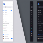 Smooth Collapsible Sidebar Navigation in CSS3 & Vanilla JS
Great artical, I’ve created new tutorial on animated sidebar with easy steps, check it out on https://youtu.be/1qTAK8yn7MI .
If you find it informative,
” Please Like , share to others and Subscribe channel for support me ” — thanks.