


A stylish Glassmorphism (frosted glass) style analog clock built with JavaScript, HTML, and CSS/CSS.
How to use it:
1. Code the HTML for the analog clock.
<div class="clock">
  <div class="clock-img">
    <img src="clock.png" alt="clock" />
  </div>
  <div class="hour">
    <span class="hr" id="hr"></span>
  </div>
  <div class="minute">
    <span class="min" id="min"></span>
  </div>
  <div class="second">
    <span class="sec" id="sec"></span>
  </div>
</div>
2. The necessary CSS styles.
.clock {
  width: 380px;
  height: 380px;
  display: flex;
  align-items: center;
  justify-content: center;
  border: 2px solid rgba(255, 255, 255, 0.1);
  border-radius: 50%;
  backdrop-filter: blur(15px);
  background: rgba(255, 255, 255, 0.05);
  box-shadow: 0 0 30px rgba(0, 0, 0, 0.2);
}
.clock-img img {
  width: 100%;
  height: 100%;
}
.clock::before {
  content: "";
  position: absolute;
  width: 15px;
  height: 15px;
  background: #fff;
  border-radius: 50%;
  z-index: 15;
}
.clock .hour,
.clock .minute,
.clock .second {
  position: absolute;
}
.clock .hour,
.clock .hour .hr {
  width: 160px;
  height: 160px;
}
.clock .minute,
.clock .minute .min {
  width: 190px;
  height: 190px;
}
.clock .second,
.clock .second .sec {
  width: 230px;
  height: 230px;
}
.hr,
.min,
.sec {
  display: flex;
  justify-content: center;
  position: absolute;
  border-radius: 50%;
}
.hr::before {
  content: "";
  position: absolute;
  width: 8px;
  height: 80px;
  background-color: #f00;
  border-radius: 10px;
  z-index: 10;
}
.min::before {
  content: "";
  position: absolute;
  width: 4px;
  height: 90px;
  background-color: #0f0;
  z-index: 11;
  border-radius: 8px;
}
.sec::before {
  content: "";
  position: absolute;
  width: 2px;
  height: 130px;
  background-color: #fff;
  z-index: 12;
  border-radius: 4px;
}
3. Load the main JavaScript clock.js right before the closing body tag.
<script src="clock.js"></script>
See Also:
 Simple & Clean Analog Clock JS Library – Clock.js
 Animated Analog Clocks for Vanilla JS, React & Vue.js – Clock UI
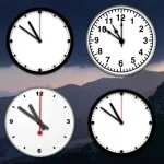 Create Customizable Analog Clocks With JavaScript – MagicClock
 Easy International Analog Clock Component – Clock.js
 Neumorphism Style Analog Clock Icon In JavaScript And CSS
 Multiple Timezone Analog Clocks – shonir-analog-clock
 Convenient Analog Clock With JavaScript And SVG – Uptime
 Analog Clock/Stopwatch Web Component