


Magic-Input is a CSS/CSS3 library for creating pretty nice toggles/switches to replace the bland and boring checkboxes and radio buttons.
How to use it:
1. Download and import the Magic-Input stylesheet.
<link rel="stylesheet" href="dist/magic-input.min.css">
2. Create iOS style toggle switches from checkboxes.
<input type="checkbox" class="mgc-switch" checked />
3. Style the native checkboxes.
<!-- Square Checkbox -->
<input type="checkbox" class="mgc" checked/>
<!-- Circle Checkbox -->
<input type="checkbox" class="mgc mgc-circle" checked/>
<!-- Radio Button -->
<input type="radio" name="radio1" class="mgr" checked/>
4. Available size classes.
<!-- Small Checkbox -->
<input type="checkbox" class="mgc mgc-sm" checked/>
<!-- Large Checkbox -->
<input type="checkbox" class="mgc mgc-circle mgc-lg" checked/>
<!-- Small Radio Button -->
<input type="radio" name="radio1" class="mgr mgr-sm" checked/>
<!-- Large Radio Button -->
<input type="radio" name="radio1" class="mgr mgr-lg" checked/>
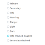
5. Available theme classes.
<!-- Checkbox -->
<input type="checkbox" class="mgc mgc-primary" checked/>
<input type="checkbox" class="mgc mgc-info" checked/>
<input type="checkbox" class="mgc mgc-success" checked/>
<input type="checkbox" class="mgc mgc-warning" checked/>
<input type="checkbox" class="mgc mgc-danger" checked/>
<!-- Radio Button -->
<input type="radio" name="radio1" class="mgr mgr-primary" checked/>
<input type="radio" name="radio1" class="mgr mgr-info" checked/>
<input type="radio" name="radio1" class="mgr mgr-success" checked/>
<input type="radio" name="radio1" class="mgr mgr-warning" checked/>
<input type="radio" name="radio1" class="mgr mgr-danger" checked/>
Changelog:
v2.0.0 (03/01/2023)
- update dependencies
See Also:
 Custom Checkboxes, Radio Buttons, Switches In Pure CSS
 CSS/CSS3 Only Custom Checkboxes, Radios And Switches – el-checkbox
 CSS Only Interactive Toggle Switches – toggle-switch.css
 Custom Checkboxes And Radio Buttons For Bulma Framework
 CSS Switch Control Extension For Bulma Framework
 Pretty Checkbox & Radio Inputs with Bootstrap and awesome-bootstrap-checkbox.css
 Convert Checkboxes & Radio Buttons Into Grouped Buttons – boxed-check.css
 CSS Only Switch Style Checkboxes