


| Author: | graphieros |
|---|---|
| Views Total: | 47 views |
| Official Page: | Go to website |
| Last Update: | May 21, 2025 |
| License: | MIT |
Preview:
Description:
Target-highlight is a lightweight JavaScript library that allows you to spotlight DOM elements with customizable overlays, borders, padding, and optional tooltips.
It’s perfect for creating interactive tutorials, guided tours, or highlighting specific page elements for your users.
Features:
- Overlay the page with customizable “spotlight” cutouts around target elements
- Customize overlay color, border color, width, radius, and padding
- Add tooltips with automatic positioning logic that adapts to available space
- Support for highlighting single or multiple elements using standard selectors
- Create step-by-step tutorials with built-in navigation controls
- Configure via options or global defaults for consistent application
- Filter elements using data attributes to include/exclude from highlighting
See it in action:
How to use it:
1. Install Target-highlight with NPM and import the necessary modules into your project.
# Yarn
$ yarn add target-highlight
# NPM
$ npm install target-highlight
import {
  targetHighlight,
  targetHide,
  defaultConfig,
  HighlightOptions,
} from "target-highlight";
2. Or import Target-highlight directly in your browser using script tag:
<script type="module">
import { targetHighlight, targetHide, defaultConfig, applyStepListeners } from "./dist/target-highlight.js"
</script>
3. Initialize targetHighlight on the target element(s).
targetHighlight('div')
targetHighlight('h2')
targetHighlight('.element')
targetHighlight('#container')
4. Configure the library by passing an options object as the second argument to targetHighlight().
overlayColor: CSS color for the page overlay (e.g.,#00000080,rgba(0,0,0,0.5)).borderColor,borderWidth,borderRadius: Style the border drawn around elements.padding: Adds space between the element and the highlight “cutout” and border (accepts CSS padding values like'5px'or'2px 5px').tooltip: String content for the tooltip, or a function returning HTML string.singleTooltip: Boolean (defaulttrue). Iftrueand multiple elements are highlighted (without data attributes), shows one tooltip for the bounding box of all elements. Iffalse, shows a tooltip for each element.forceTooltipPosition: String ('top','right','bottom','left'). Forces the tooltip to a specific side if possible. Defaultnull(automatic).overlayZIndex: Controls the stacking order. Default is2147483647.hidePointerEvents: Boolean. Iftrue, clicks pass through the border.scrollToTarget: Object. Options forelement.scrollIntoView()(e.g.,{ behavior: 'smooth', block: 'center' }). Set tonullto disable.blockedKeys: Array. Add keyboard keys that will be inactive when the application is runningnextCallback,previousCallback,stopCallback: Functions triggered by clicking elements with specific IDs (target-highlight-button-next,target-highlight-button-previous,target-highlight-button-stop) inside a tooltip (often used for steps).
targetHighlight('div',{
borderColor: '#00AAFF',
borderRadius: 0,
borderWidth: 2,
overlayColor: '#00000050',
overlayZIndex: 2147483647,
padding: '0',
singleTooltip: true,
tooltip: '',
hidePointerEvents: true,
nextCallback: () => { },
previousCallback: () => { },
stopCallback: () => { },
scrollToTarget: null,
forceTooltipPosition: null,
blockedKeys: [],
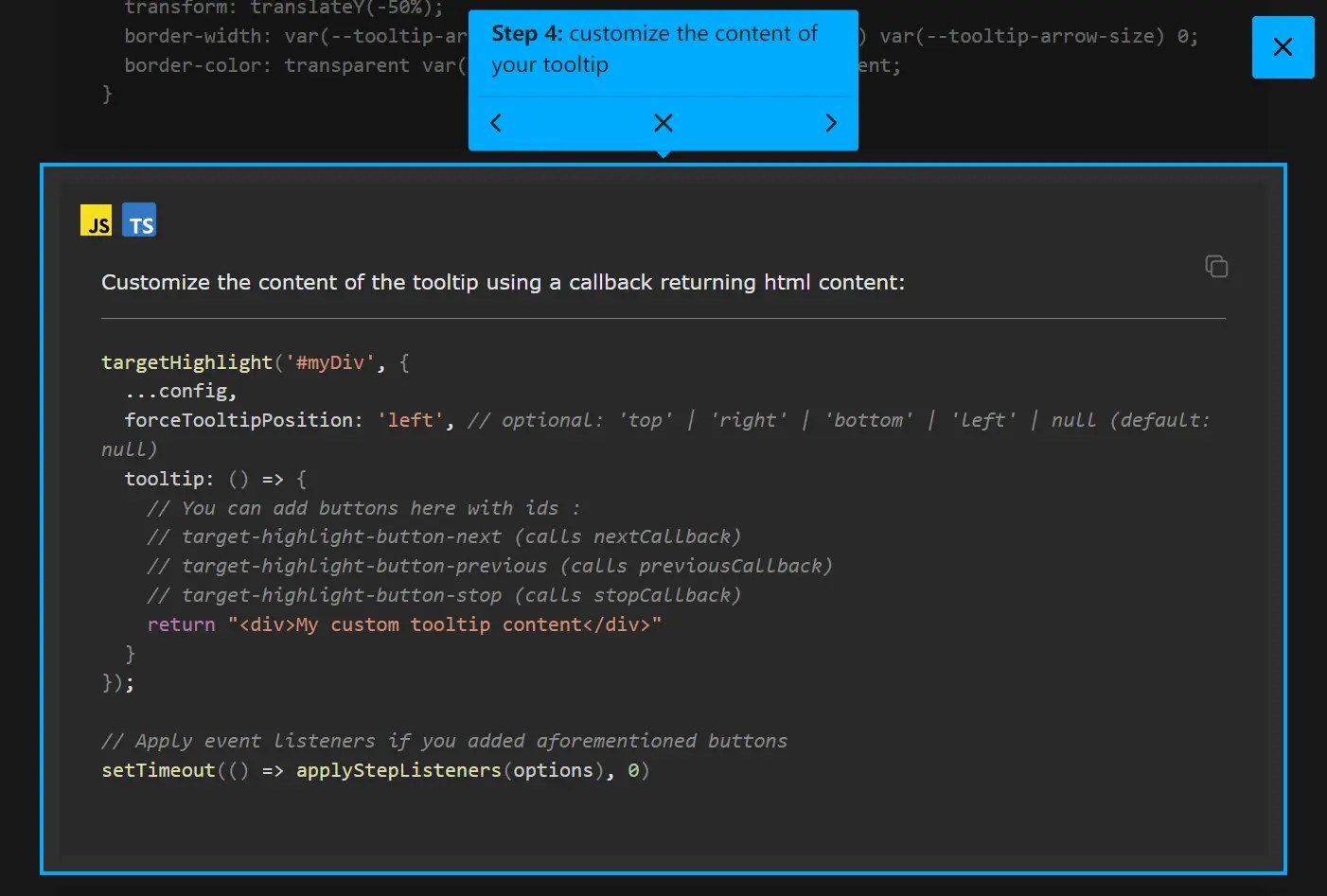
})5. You have a few ways to customize tooltips:
Global Tooltip
Pass a string or function to the tooltip option.
targetHighlight("#myDiv", {
  ...config,
  tooltip: () => {
    return `
      <div>
        My custom tooltip
      </div>
    `;
  },
});
CSS Styling
Target the .target-highlight-tooltip class.
.target-highlight-tooltip {
  background-color: #333;
  color: white;
  padding: 8px 12px;
  border-radius: 4px;
  font-size: 0.9em;
  opacity: 1;
  transition: opacity 0.3s;
  will-change: opacity;
}
.target-highlight-tooltip.fade-in {
  opacity: 0;
  animation: fadeIn 0.3s forwards;
}
.target-highlight-tooltip.fade-out {
  opacity: 1;
  animation: fadeOut 0.3s forwards;
  pointer-events: none;
}
@keyframes fadeIn {
  to {
    opacity: 1;
  }
}
@keyframes fadeOut {
  to {
    opacity: 0;
  }
}
Per-Element Tooltips (Data Attributes)
For multiple highlighted elements, add data-target-highlight-tooltip="Your text" to each target HTML element. You can also force position per element with data-target-highlight-tooltip-position="top|right|bottom|left". This overrides the main tooltip option for those specific elements. Note that data attributes only support string content.
<div
  class="myElement"
  data-target-highlight-tooltip="This is step 1"
  data-target-highlight-tooltip-position="bottom"
>
  Step 1 Content
</div>
6. Build sequential guides using data attributes and callbacks.
- Add
data-step="N"(where N is a number) to the elements you want to highlight in sequence. - Manage the current step state in your own JavaScript.
- Use the
nextCallback,previousCallback, andstopCallbackoptions to update the step state and re-calltargetHighlightfor the next/previous step’s selector (e.g.,[data-step="${currentStep}"]). - Generate tooltip content dynamically (using the function option for
tooltip) to include navigation buttons (<button id="target-highlight-button-next">...</button>, etc.). The library automatically attaches listeners to these buttons if the corresponding callbacks are provided.
<button data-step="1">Step 1</button>
<div data-step="2">Step 2</div>
<section data-step="3">Step 3</section>
const step = { current: 0, max: 3 };
function moveStep(direction) {
  if (direction === "next") {
    step.current = (step.current + 1) % (step.max + 1);
  } else {
    step.current = (step.current - 1 + step.max + 1) % (step.max + 1);
  }
  applyCurrentStep();
}
function applyCurrentStep() {
  targetHighlight(`[data-step="${step.current}"]`, {
    nextCallback: () => moveStep("next"),
    previousCallback: () => moveStep("previous"),
    stopCallback: targetHide,
    tooltip: () => `<div>Step ${step.current + 1} of ${step.max + 1}</div>
                    <button id="target-highlight-button-previous">Previous</button>
                    <button id="target-highlight-button-next">Next</button>`
  });
}
// Start the tour
applyCurrentStep();
7. Add data-target-highlight-ignore to any element you want the library to skip, even if it matches the selector.
<div class="highlight-me">Highlight This</div>
<div class="highlight-me" data-target-highlight-ignore>Ignore This</div>
Changelog:
v0.10.0 (05/21/2025)
- Add Tooltip transitions
See Also:
 Lightweight User Tour/Onboarding Library for Web Apps – CodingIntroJS
 Build Interactive Product tours & User Onboarding with Cue.js
 Create Interactive Web App Tours in Under 10KB – GTourJS
 Create Interactive Guided Tours In App – TourGuide.js
 Slider-style Guided Tour In Vanilla JavaScript – tourguide.js
 Creating Interactive Step-by-step User Guides with Guidy.js
 Build Interactive Website Walkthroughs With Journey.js
 Lightweight Text Highlighting JavaScript Library – Highlight Search Term