


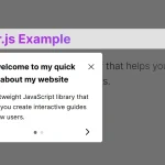
Guidy.js is a super tiny guided tour JavaScript library that guides visitors through your web applications with intuitive, step-by-step instructions. This helps direct user attention and clarifies the purpose of different parts of a website.
Features:
- Custom tooltip placement: top, right, bottom, left.
- Custom content like images and videos within each step.
- A progress indicator displays the user’s current position in the guide.
- Navigation buttons (next, previous, close) .
- Smoothly scroll the target elements into view when activated.
How to use it:
1. Install & download.
npm install guidy
2. Import it into your document.
import Guidy from 'guidy';
<!-- OR -->
<script type="module">
  import Guidy from './guidy.js';
</script>
3. Define the Steps: Create an array of objects, with each object representing a single step. Each step object requires: a selector (CSS selector for the target element), title, and description. Optional properties include position (tooltip placement relative to the target element – top, right, bottom, or left), image, video, and scroll (boolean indicating whether to scroll to the element):
const mySteps = [
  {
    selector: "#step1",
    title: "Step 1",
    description: "This is Step 1",
    position: "bottom",
    image: "/path/to/image.jpg",
  },
  {
    selector: "#step2",
    title: "Step 2",
    description: "This is Step 2",
    position: "top",
    video: "/path/to/video.mp4",
    scroll: true
  },
  // more steps here
];
4. Create a new Guidy instance, passing in the steps array and optional settings like loop (to repeat the guide) and progress (to display a progress indicator):
const guidy = new Guidy({
  steps: mySteps,
  loop: true,
  progress: true
});
5. Use the play() method to start the tour:
guidy.play();
6. Use the playStep(stepNum) method to jump to a particular step (numbered from zero):
goto step 3
guidy.playStep(2);
7. Use the close() to dismiss the tour:
guidy.close();
8. Override the default CSS to create your own styles:
#guidy_el {
  position: absolute;
  padding: 5px;
  color: black;
  z-index: 9999;
}
.guidy_el_container {
  box-shadow: 0px 10px 15px -3px rgba(0,0,0,0.2);
  padding: 15px;
  width: 300px;
  border-radius: 5px;
  background: white;
}
.guidy_el_btns button {
  background: black;
  color: white;
  width: 80px;
  height: 30px;
  border: none;
  cursor: pointer;
  font-weight: bold;
}
#guidy_el #close {
  position: absolute;
  top: 20px;
  right: 20px;
  font-size: 20px;
  cursor: pointer;
}
See Also:
 Create Interactive Web App Tours in Under 10KB – GTourJS
 Create Interactive Guided Tours In App – TourGuide.js
 Create Guided Tours And Highlight Elements – Tooltip Sequence
 Create Guided Tours For Tutorials & New Features – Walkthrough.js
 Lightweight Vanilla JS Library for Interactive Guided Tours – Boarding.js
 Interactive Guide For Web App – Driver.js
 Lightweight User Tour/Onboarding Library for Web Apps – CodingIntroJS
 Build Interactive Product tours & User Onboarding with Cue.js