


Journey.js is a lightweight, easy-to-use JavaScript library to create interactive, customizable, accessible guided tours across your websites or web apps.
It allows developers to highlight and bring attention to specific page elements in order to demonstrate workflows or new features on their websites. Visitors can easily navigate between steps with left or right keys. Some example use cases:
- Onboarding tours for new app/site users
- Feature announcements and tutorials
- Step-by-step setup wizards
- Interactive demos of products or services
How to use it:
1. Download and load the Journey.js library’s files in the HTML.
<!-- CORE -->
<link rel="stylesheet" href="/dist/journey.js.css" />
<script src="/dist/journey.js"></script>
<!-- Languages -->
<script src="/dist/translations/journey.translations.ar.js"></script>
<script src="/dist/translations/journey.translations.bg.js"></script>
...
2. Add the data-journey-js attribute to the target elements and specify the title, description, ID, and more for each step as follows:
- title: Step title
- description: Step description
- order: Step order
- attach: Determine whether to attach the dialog to the element
- alignTop: Defaults to false
- alignRight: Defaults to false
- isHint: show the dialog as a hint
- alignHintToClickPosition: If the hint should be shown at the mouse position
- sendClick: Determine whether to fire the click event on the element
- showDisabledBackground: Defaults to false
- removeHintWhenViewed: Defaults to false
- tooltip: Defaults to null
- group: Defaults to ‘default’
- ignore: Determine whether to ignore elements. Defaults to false
- moveToNextOnClick: Defaults to false
- offset: Additional offset. Defaults to 0
- useLargerDisplay: Use larger modal. Defaults to false
- onEnter(element): Callback
- onLeave(element): Callback
- onClose(element): Callback
- onOpen(element): Callback
- onFinish(element): Callback
- onStart(element): Callback
- onAddStep: Callback
- onRemoveStep: Callback
<button data-journey-js="{ 'group': 'group name', 'title': 'Button 2', 'description': 'This is a description for button 2.', 'order': 2 }">Test Button 4</button>
<button data-journey-js="{ 'group': 'group name', 'title': 'Button 1', 'description': 'This is a description for button 1.', 'order': 1 }">Test Button 1</button>
<button data-journey-js="{ 'group': 'group name', 'title': 'Button 3', 'description': 'This is a description for button 3.', 'order': 3 }">Test Button 3</button>
3. Start the journey.
$journey.start()
4. Available configuration options.
$journey.setConfiguration({

  // ignore errors
  safeMode: false,
  // DOM type
  domElementTypes: "*",
  // show close button
  showCloseButton: true,
  // show progress dots
  showProgressDots: true,
  // force Journey.js to open when the page has finished loading and state what step to start on
  browserUrlParametersEnabled: true,
  // enable Left/Right/ESC keys
  shortcutKeysEnabled: true,
  // if the progress dots should show the step numbers
  showProgressDotNumbers: true,
  // show the main buttons
  showButtons: true,
  // show "Do not show again" checkbox
  showDoNotShowAgain: false,
  // show tooltip
  showProgressDotToolTips: true,
  // show progress bar
  showProgressBar: false,
  showProgressBarText: false,
  // enable moveable
  dialogMovingEnabled: false,
  // allows scrolling to elements
  scrollToElements: false,
  // close the dialog on click background overlay
  closeDialogOnDisabledBackgroundClick: false,
  // show step numbers in the title
  showStepNumbersInTitle: false,
  // additional offset
  hintClickPositionOffset: 0,
  tooltipOffset: 0,
  text: {
    // custom button text
    backButtonText: "Previous",
    nextButtonText: "Next",
    finishButtonText: "Finish",
    // text for close button
    closeButtonToolTipText: "close",
    // text to display on the "Do not show again" checkbox
    doNotShowAgainText: "Do not show again",
    // error messages
    objectErrorText: "TErrors in object: {{error_1}}, {{error_2}}",
    attributeNotValidErrorText: "The attribute '{{attribute_name}}' is not a valid object.",
    attributeNotSetErrorText: "The attribute '{{attribute_name}}' has not been set correctly.",
    closeDialogConfirmationText: null,
  }


})
5. More API methods.
// start the journey
$journey.start();
// show/hide the journey
$journey.show();
$journey.hide();
// check if the journey is open
$journey.isOpen();
// check if the journey has been completed
$journey.isComplete();
// add steps
$journey.addStep(element, options);
// add all steps
$journey.addDocumentSteps();
// remove steps
$journey.removeStep(element);
// clear steps
$journey.clearSteps(group);
// remove all hints
$journey.clearHints();
// reverse the step order
$journey.reverseStepOrder();
// set options
$journey.setConfiguration(newOptions);
6. Override the default CSS variables to create your own styles.
:root {
    // Fonts
    --journey-js-default-font: system-ui, -apple-system, "Segoe UI", Roboto, "Helvetica Neue", "Noto Sans", "Liberation Sans", Arial, sans-serif, "Apple Color Emoji", "Segoe UI Emoji", "Segoe UI Symbol", "Noto Color Emoji";
    // Colors
    --journey-js-color-black: #3b3a3a;
    --journey-js-color-white: #F5F5F5;
    --journey-js-color-gray: #AAAAAA;
    --journey-js-color-hint: rgba( 170, 170, 170, 0.5 );
    // Dialog
    --journey-js-dialog-background-color: #002244;
    --journey-js-dialog-text-color: var(--journey-js-color-white);
    --journey-js-dialog-border-color: #72A0C1;
    // Dialog - Buttons
    --journey-js-dialog-button-background-color: #002D62;
    --journey-js-dialog-button-border-color: #3457D5;
    --journey-js-dialog-button-text-color: var(--journey-js-color-white);
    // Dialog - Buttons - Hover
    --journey-js-dialog-button-hover-background-color: #007FFF;
    --journey-js-dialog-button-hover-border-color: var(--journey-js-dialog-button-border-color);
    --journey-js-dialog-button-hover-text-color: var(--journey-js-dialog-button-text-color);
    // Dialog - Buttons - Active
    --journey-js-dialog-button-active-background-color: #00b7ff;
    --journey-js-dialog-button-active-border-color: var(--journey-js-dialog-button-border-color);
    --journey-js-dialog-button-active-text-color: var(--journey-js-dialog-button-text-color);
    // Dialog - Buttons - Disabled
    --journey-js-dialog-button-disabled-background-color: var(--journey-js-dialog-background-color);
    // Dialog - Close Button
    --journey-js-dialog-close-button-background-color: var(--journey-js-dialog-button-background-color);
    --journey-js-dialog-close-button-border-color: var(--journey-js-dialog-button-border-color);
    --journey-js-dialog-close-button-size: 1.1rem;
    --journey-js-dialog-close-button-x-color: var(--journey-js-color-white);
    // Dialog - Close Button - Hover
    --journey-js-dialog-close-button-hover-background-color: var(--journey-js-dialog-button-hover-background-color);
    --journey-js-dialog-close-button-hover-x-color: var(--journey-js-dialog-close-button-x-color);
    --journey-js-dialog-close-button-hover-border-color: var(--journey-js-dialog-close-button-border-color);
    // Dialog - Close Button - Active
    --journey-js-dialog-close-button-active-background-color: var(--journey-js-dialog-button-active-background-color);
    --journey-js-dialog-close-button-active-x-color: var(--journey-js-dialog-close-button-x-color);
    --journey-js-dialog-close-button-active-border-color: var(--journey-js-dialog-close-button-border-color);
    // Borders
    --journey-js-border-radius: 0.5rem;
    --journey-js-border-size: 0.5px;
    // Sizes
    --journey-js-spacing: 10px;
    // Transitions
    --journey-js-transition: all .3s;
}
Changelog:
v2.1.0 (09/04/2024)
- Added new options
- Code Improvements
v2.1.0 (07/23/2024)
- Added new options
v2.1.0 (07/23/2024)
- Added new options
- Code improvement
v2.0.3 (07/16/2024)
- Update
v2.0.2 (07/09/2024)
- Added a “build-all” script option so that everything (including minimized versions) can be built with one command.
- Minor CSS layout improvements.
- Removed deprecated “cancelBubble” usages and replaced them with “stopPropagation()”.
- Rewritten “getStyleValueByName()” to use the modern implementation to get a style.
- Fixed a type mismatch between the PublicApi structure and the implementation.
- Improved more type implementations.
- The “import” public API function will now show the select files dialog if no files are passed.
v2.0.1 (07/06/2024)
- Rewritten in TypeScript
v1.7.2 (06/18/2024)
- Added export support for the global “$journey” object, which can now be imported as “journey.js”.
v1.7.1 (05/31/2024)
- The public functions “start()”, “show()”, and “hide()” will now only fire if the right conditions are met (dialog open/closed, etc).
- All text translations now allow empty text to be passed (which will prevent them from defaulting to the English version).
v1.7.0 (04/17/2024)
- Added moveable support
- Added new options
- Improved UI
v1.6.1 (04/17/2024)
- Improved UI
v1.6.0 (04/15/2024)
- Added Group support
- Added new options
v1.5.1 (04/09/2024)
- Bugfixed
v1.5.0 (04/09/2024)
- Added progress bar support
- Added scroll to element support
- Added more options
- Refactored & improved code
v1.4.0 (04/07/2024)
- Added Confirm to Close functionality
- Added more options
- Added more methods
- Bugfixes
v1.3.0 (04/06/2024)
- Added smooth transitions
- Added custom tooltip
- Added more options
- Bugfixes
v1.2.0 (04/04/2024)
- Added new options
- Improvements
v1.1.1 (02/26/2024)
- Added more translations
v1.1.0 (01/21/2024)
- Bugfixes
- Added more languages
v1.0.3 (01/21/2024)
- Bugfixes
v1.0.2 (01/21/2024)
- All hover transition effects now work for hovering, and not hovering, which results in a smoother display.
- Removed the outline effect for the “Back”, “Next”, and “Finish” buttons.
- Removed replicated HEX colors (all now reference the original “:root” variable).
- Added an “:active” states for all buttons, dots, and the close button (now shows a slightly lighter background color).
v1.0.1 (01/18/2024)
- Update
v0.8.0 (01/08/2024)
- The progress dots will now show tooltips (which is the title of the step being focused).
- The “Close” button now uses slightly thicker lines for the X.
- Added more default padding around the progress dots area.
- Added more options.
- Fixed bugs.
v0.7.0 (01/06/2024)
- Added hints support! This will draw a small icon in the top left of an element, that can be clicked to show a hint.
- Renamed the configuration option “previousButtonText” to “backButtonText”.
- Added more API methods.
- Added active progress DOT is now slightly larger in width (makes it a bit more clear).
- Renamed the CSS class “button.previous” to “button.back”.
v0.6.0 (01/04/2024)
- Added new options
- Added new callbacks
- Added new shortcuts
v0.5.0 (12/30/2023)
- Browser URL parameters support! This will allow you to force Journey.js to open when the page has finished loading and state what step to start on.
See Also:
 Lightweight Vanilla JS Library for Interactive Guided Tours – Boarding.js
 Lightweight User Tour/Onboarding Library for Web Apps – CodingIntroJS
 Build Interactive Product tours & User Onboarding with Cue.js
 Interactive Guided UI Tours with Target-Highlight.js
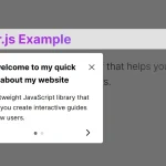 Create Interactive Web App Tours in Under 10KB – GTourJS
 Create Interactive Guided Tours In App – TourGuide.js
 Slider-style Guided Tour In Vanilla JavaScript – tourguide.js
 Creating Interactive Step-by-step User Guides with Guidy.js