


Cue.js is a feature-rich guided tour JavaScript library that helps you create customizable, accessible, interactive product tours and feature walkthroughs.
It is built with Vanilla JavaScript and works with any JS framework or library. The default styles are clean and modern, inspired by Figma.
Features List
- Declarative API: Define tours with straightforward step configurations.
- Smart Positioning: Tooltips adjust to stay within the viewport.
- Dynamic Content Support: Handles elements that appear or change.
- Customizable: Style with CSS variables or custom classes; use callbacks and custom targeting.
- Event Hooks: Integrate with analytics or trigger actions at tour lifecycle points.
- Keyboard Navigation: Accessible tour controls.
- Conditional Logic: Skip or modify steps based on user roles or application state.
How to use it:
1. Install Cue.js package and import it in your JS:
# Yarn
$ yarn add @nani_samireddy/cue.js
# NPM
$ npm install @nani_samireddy/cue.js
import Cue from '@nani_samireddy/cue.js';
// Don't forget to import the CSS
// import '@nani_samireddy/cue.js/dist/cue.min/css';
2. Or load the following JavaScript and CSS files into your HTML document.
<link rel="stylesheet" href="/dist/cue.min.css" />
<script src="/dist/cue.min.js"></script>
3. Create a new Cue.js instance and configure the tour with the following options.
- overlay (Type: boolean, Default: true): If true, a dimmed overlay covers the page, emphasizing the highlighted element.
- overlayClickExits (Type: boolean, Default: true): If true and overlay is also true, clicking the overlay exits the tour. (Synonymous with exitOnOverlayClick)
- showProgress (Type: boolean, Default: false): If true, displays “Step X of Y” text in the tooltip.
- showBullets (Type: boolean, Default: false): If true, displays navigation dots for each step in the tooltip.
- showButtons (Type: boolean, Default: true): If true, default navigation buttons (“Next”, “Back”, “Skip”, “Done”) appear. Can be overridden per step.
- keyboardNavigation (Type: boolean, Default: true): If true, users can navigate the tour with keyboard keys (Arrows, Spacebar, Escape).
- nextLabel (Type: string, Default: ‘Next’): Text for the “Next” button.
- prevLabel (Type: string, Default: ‘Back’): Text for the “Back” button.
- skipLabel (Type: string, Default: ‘Skip’): Text for the “Skip Tour” button. An empty string hides it.
- doneLabel (Type: string, Default: ‘Done’): Text for the “Done” button on the last step.
- scrollToElement (Type: boolean, Default: true): If true, the page automatically scrolls to ensure the target element is visible.
- exitOnEsc (Type: boolean, Default: true): If true, pressing the Escape key exits the tour.
- exitOnOverlayClick (Type: boolean, Default: true): If true and overlay is enabled, clicking the overlay exits the tour. (Synonymous with overlayClickExits)
- debug (Type: boolean, Default: false): If true, enables verbose console logging for development. I usually have this on during setup.
- tooltipPosition (Type: string, Default: ‘auto’): Default tooltip position (‘top’, ‘bottom’, ‘left’, ‘right’, ‘center’, ‘auto’). ‘auto’ is quite reliable.
- padding (Type: number, Default: 10): Default padding (in pixels) around the highlighted target element.
- buttonClass (Type: string, Default: ”): Custom CSS class for all default navigation buttons.
- highlightClass (Type: string, Default: ”): Custom CSS class for the highlight element.
- tooltipClass (Type: string, Default: ”): Custom CSS class for the tooltip container.
- transitionDuration (Type: number, Default: 300): Duration (in milliseconds) of CSS transitions. Match this with your CSS.
const myTour = new Cue({
  overlay: true,
  overlayClickExits: true,
  showProgress: false,
  showBullets: false,
  showButtons: true,
  keyboardNavigation: true,
  nextLabel: 'Next',
  prevLabel: 'Back',
  skipLabel: 'Skip',
  doneLabel: 'Done',
  scrollToElement: true,
  exitOnEsc: true,
  exitOnOverlayClick: true,
  debug: false,
  tooltipPosition: 'auto',
  padding: 10,
  buttonClass: '',
  highlightClass: '',
  tooltipClass: '',
  transitionDuration: 300,
});
4. Define your own steps in an array of objects. All possible step options:
- target (Type: string | HTMLElement, Required: Yes, Default: None): The CSS selector or DOM element to highlight. This is essential for the step.
- title (Type: string, Required: No, Default: ”): The main heading displayed in the tooltip.
- content (Type: string, Required: No, Default: ”): The primary explanatory text in the tooltip. Basic HTML is supported here.
- position (Type: string, Required: No, Default: Global tooltipPosition): Overrides the global tooltip position for this step. Values: ‘top’, ‘bottom’, ‘left’, ‘right’, ‘center’, ‘auto’.
- highlightClass (Type: string, Required: No, Default: Global highlightClass): Custom CSS class for this step’s highlight element.
- tooltipClass (Type: string, Required: No, Default: Global tooltipClass): Custom CSS class for this step’s tooltip container. I use this for steps that need unique styling, like a warning.
- padding (Type: number, Required: No, Default: Global padding): Padding (in pixels) around the highlighted element for this specific step.
- scrollToElement (Type: boolean, Required: No, Default: Global scrollToElement): Overrides global scroll behavior. If true, scrolls to make the target visible for this step.
- disableInteraction (Type: boolean, Required: No, Default: false): If true, the target element becomes non-interactive (clicks, hovers disabled) during this step. Good for “read-only” informational steps.
- showButtons (Type: boolean, Required: No, Default: Global showButtons): Overrides global button visibility for this step. Setting to false means you’ll likely need custom navigation or programmatic advancement via
cue.nextStep(). - preStep (Type: Function, Required: No, Default: None): Callback executed before this step is displayed. Supports async functions, which Cue.js will await. Crucial for dynamic content or setup tasks.
- postStep (Type: Function, Required: No, Default: None): Callback executed after this step is hidden. Also supports async functions. Useful for cleanup.
- onTargetNotFound (Type: Function, Required: No, Default: Exits tour): Callback if the target element isn’t found. Must return ‘skip’ to skip the step, or ‘stop’ (or nothing) to end the tour. This is a lifesaver for optional features in a tour.
const mySteps = [
  {
    target: '#element-1',
    title: 'Step 1',
    content: 'Step 1 Content',
  },
  {
    target: '#element-2',
    title: 'Step 2',
    content: 'Step 2 Content',
  },
  // more steps here
];
5. Set your steps and start the tour.
myTour.setSteps(mySteps);
myTour.start();
6. More API methods.
// Navigates to a specific step
myTour.goToStep(index)`
// Goto the next/prev step
myTour.nextStep()
myTour.prevStep()
// Stops the tour
myTour.exit()
// Useful if layout changes while a step is active.
myTour.refresh()
// Get info about the current state
myTour.getCurrentStep()
myTour.getCurrentStepIndex()
7. Event handlers.
myCue.onStart(() => {
  console.log('Tour initiated');
});
myCue.onChange((stepData, currentIndex) => {
  console.log(`Step ${currentIndex + 1}: ${stepData.title}`);
});
myCue.onBeforeChange((stepData, newStepIndex) => {
  console.log('Just before the tour transitions to a new step.');
});
myCue.onAfterChange((stepData, currentStepIndex) => {
  console.log('After a steps elements have fully animated into place and are stable.');
});
myCue.onComplete(() => {
  console.log('Tour finished successfully');
});
myCue.onExit((currentStepIndex) => {
  console.log(`Tour abandoned at step ${currentStepIndex + 1}`);
});
myCue.onResize(() => {
  console.log('henever the browser window is resized while the tour is active.');
});
8. Cue.js uses CSS custom properties (variables) for its default styles. You can change the appearance everywhere by overriding these variables in your own CSS.
:root {
  /* Primary Colors */
  --cue-primary-color: #1a73e8;
  --cue-accent-color: #673ab7;
  --cue-primary-color-rgb: 26, 115, 232; /* For rgba usage */
  /* Text & Backgrounds */
  --cue-text-color: #3c4043;
  --cue-subtle-text-color: #70757a;
  --cue-bg-color: #ffffff;
  --cue-light-bg-color: #f8f9fa;
  --cue-border-color: #e0e0e0;
  /* Shadows */
  --cue-shadow-sm: 0 1px 2px 0 rgba(0, 0, 0, 0.05);
  --cue-shadow-md: 0 4px 6px -1px rgba(0, 0, 0, 0.1), 0 2px 4px -1px rgba(0, 0, 0, 0.06);
  --cue-shadow-lg: 0 10px 15px -3px rgba(0, 0, 0, 0.1), 0 4px 6px -2px rgba(0, 0, 0, 0.05);
  /* Rounded Corners */
  --cue-border-radius: 8px;
  --cue-button-border-radius: 6px;
  /* Overlay */
  --cue-overlay-color: rgba(0, 0, 0, 0.4);
  /* Z-Index & Transitions */
  --cue-z-index: 99999;
  --cue-transition-duration: 0.3s;
}
See Also:
 Lightweight Vanilla JS Library for Interactive Guided Tours – Boarding.js
 Lightweight User Tour/Onboarding Library for Web Apps – CodingIntroJS
 Interactive Guided UI Tours with Target-Highlight.js
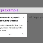 Create Interactive Web App Tours in Under 10KB – GTourJS
 Create Interactive Guided Tours In App – TourGuide.js
 Slider-style Guided Tour In Vanilla JavaScript – tourguide.js
 Creating Interactive Step-by-step User Guides with Guidy.js
 Build Interactive Website Walkthroughs With Journey.js