


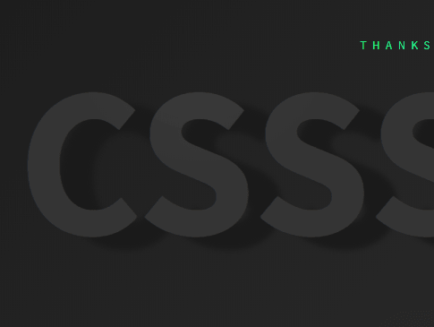
A fancy, interactive, direction-aware text shadow effect that reacts to mouse movement. Created with pure JavaScript and CSS transition & text-shadow properties.
How to use it:
Create the text to which you want to apply the interactive shadow effect.
<h1 class="demo">
  <p>CSSScript</p>
  CSSScript
</h1>
The CSS rules for the text shadow effect.
.demo {
  --x-shadow: 0;
  --y-shadow: 0;
  --x:50%;
  --y:50%;
  font-size: 15rem;
  transition: all 0.2s ease;
  position: relative;
  padding: 2rem;
}
.demo:hover {
  transition: all 0.2s ease;
  text-shadow: var(--x-shadow) var(--y-shadow) 10px #1A1A1A;
}
.demo p {
  position: absolute;
  top: 2rem;
  left: 2rem;
  background-image: radial-gradient(circle closest-side, rgba(255, 255, 255, 0.05), transparent);
  background-position: var(--x) var(--y);
  background-repeat: no-repeat;
  text-shadow: none;
  -webkit-background-clip: text;
  -webkit-text-fill-color: transparent;
  transition: all 0.1s ease;
}
The main JavaScript to make the text-shadow effect interactive and direction-aware.
const title = document.querySelector('.demo')
// light
document.onmousemove = function(e) {
  let x = e.pageX - window.innerWidth/2;
  let y = e.pageY - window.innerHeight/2;

  title.style.setProperty('--x', x + 'px')
  title.style.setProperty('--y', y + 'px')
}
// shadow
title.onmousemove = function(e) {
  let x = e.pageX - window.innerWidth/2;
  let y = e.pageY - window.innerHeight/2;
  let rad = Math.atan2(y, x).toFixed(2);
  let length = Math.round(Math.sqrt((Math.pow(x,2))+(Math.pow(y,2)))/10);
  let x_shadow = Math.round(length * Math.cos(rad));
  let y_shadow = Math.round(length * Math.sin(rad));
  title.style.setProperty('--x-shadow', - x_shadow + 'px')
  title.style.setProperty('--y-shadow', - y_shadow + 'px')
}
See Also:
 8 Elegant CSS Box Shadow Presets (Copy & Paste) – Shadow.css
 Colorful & Blurred Shadows For Images – Cosha
 Lightweight Visual Indicator For Scrollable Content – overflow-shadow
 Apply Box Shadow To Sticky Navigation On Scroll
 Dynamic CSS Box Shadow Generator – zShadows.css
 Interactive CSS Box Shadow Library – Dropper UI
 Interactive Box & Text Shadow Library – ShadowCSS
 Draw Precise And Efficient Shadows Of Polygons Using WebGL – PolyShadow.js