


A vanilla JavaScript implementation of Material Design-inspired tabs component with click ripple effect and sliding active menu indicator.
How to use it:
1. Create a tab bar UI from a nav.
<nav class="tabs-box">
  <div aria-label="simple tabs example" class="tabs-menu js-tabs-menu" role="tablist">
    <button class="tab-button js-tab-button" type="button" role="tab">
      <span class="tab-button__content">CSS</span>
    </button>
    <button class="tab-button js-tab-button" type="button" role="tab">
      <span class="tab-button__content">Script</span>
    </button>
    <button class="tab-button js-tab-button" type="button" role="tab">
      <span class="tab-button__content">.Com</span>
    </button>
    <span class="tab-indicator js-tab-indicator"></span>
  </div>
</nav>
2. The necessary CSS/CSS3 styles.
:root {
  --primary-color: #3498DB;
  --accent-color: #E74C3C;
  --grey-700-color: #423f3f;
  --grey-900-color: #333333;
  --base-spacing: 8px;
  --font-m: 14px;
  --shadow-small: 0px 2px 4px -1px rgb(0 0 0 / 20%), 0px 4px 5px 0px rgb(0 0 0 / 14%), 0px 1px 10px 0px rgb(0 0 0 / 12%);
}
.tabs-box {
  display: flex;
  justify-content: center;
  max-width: 640px;
  height: 48px;
  width: 100%;
  background-color: var(--primary-color);
  box-shadow: var(--shadow-small);
  border-top-left-radius: 3px;
  border-top-right-radius: 3px;
}
.tabs-menu {
  display: flex;
  justify-content: center;
  position: relative;
}
.tab-button {
  display: flex;
  justify-content: center;
  align-items: center;
  border: none;
  position: relative;
  overflow: hidden;
  font-weight: 500;
  font-size: var(--font-m);
  color: #fff;
  text-transform: uppercase;
  letter-spacing: 0.02857em;
  white-space: normal;
  letter-spacing: 0.02857em;
  background-color: transparent;
  padding: var(--base-spacing) calc(var(--base-spacing) * 2);
  cursor: pointer;
  transition: color 250ms ease-in;
}
.tab-button .active {
  color: var(--grey-700);
}
.tab-button__content {
  display: block;
  pointer-events: none;
}
.tab-button:hover,
.tab-button:focus {
  outline: none;
  color: var(--grey-700)
}
.tab-indicator {
  background-color: var(--accent-color);
  height: 3px;
  position: absolute;
  left: 0;
  bottom: 0;
  transition: left 250ms ease-in-out, width 650ms ease-in-out;
}
.tab-button__ripple {
  position: absolute;
  background-color: black;
  transform: translate(-50%, -50%);
  border-radius: 50%;
  animation: ripple 1000ms linear infinite;
  pointer-events: none;
}
.focus::after {
  content: '';
  position: absolute;
  background-color: black;
  opacity: .2;
  border-radius: 50%;
  width: 80%;
  height: auto;
  padding-top: 80%;
  background: black;
  transition: transform 300ms ease-in-out;
  transform: scale(0);
  animation: focusRipple 300ms linear infinite, focusPulse 1700ms linear 300ms infinite;
}
@keyframes ripple {
  0% {
    width: 0;
    height: 0;
    opacity: .4;
  }
  100% {
    width: 500px;
    height: 500px;
    opacity: 0;
  }
}
@keyframes focusRipple {
  0% {
    transform: scale(0);
  }
  100% {
    transform: scale(1);
  }
}
@keyframes focusPulse {
  0%, 100% {
    transform: scale(1);
  }
  50% {
    transform: scale(1.1);
  }
}
3. The main JavaScript to enable the tab bar.
const ACTIVE_CLASS = 'active'
const tabItems = document.querySelectorAll('.js-tab-button');
const indicator = document.querySelector('.js-tab-indicator');
const tabsMenu = document.querySelector('.js-tabs-menu');
const indicatorPosition = tabItems[0].getBoundingClientRect().left - tabsMenu.getBoundingClientRect().left;
indicator.style.width = `${tabItems[0].clientWidth}px`;
tabItems.forEach(tab => {
  tab.setAttribute('aria-selected', 'false');
  tab.addEventListener('click', (e) => {
    handleTabSelection(e);
    const current = document.querySelector(`.focus`);
    if(current) {
      current.className = current.className.replace(` focus`, '');
    }
  })
  tab.addEventListener('mousedown', handleRippleEffect);
  tab.addEventListener('keydown', handleArrowKeysFocus);
});
function handleTabSelection(e) {
  toggleActiveClass(e);
  moveTabIndicator(e);
  handleA11y(e);
}
function toggleActiveClass(e) {
  const current = document.querySelector(`.${ACTIVE_CLASS}`);
  if(current) {
    current.className = current.className.replace(` ${ACTIVE_CLASS}`, '');
  }
  e.target.className += ` ${ACTIVE_CLASS}`;
}
function toggleFocusClass(e) {
  const current = document.querySelector(`.focus`);
  if(current) {
    current.className = current.className.replace(` focus`, '');
  }
  e.currentTarget.className += ` focus`;
}
function moveTabIndicator(e) {
  const indicatorPosition = e.target.getBoundingClientRect().left - tabsMenu.getBoundingClientRect().left;
  indicator.style.width = `${e.target.clientWidth}px`;
  indicator.style.left = `${indicatorPosition}px`;
}
function handleRippleEffect(e) {
  const posX = e.target.offsetLeft;
  const posY = e.target.offsetTop;
  const span = document.createElement('span');
  const x = e.pageX - e.target.getBoundingClientRect().left;
  const y = e.pageY - e.target.getBoundingClientRect().top;
  span.classList.add('tab-button__ripple');
  e.target.appendChild(span);
  span.style.left = `${x}px`;
  span.style.top = `${y}px`;
  setTimeout(() => {
    span.remove();
  }, 1000);
}
function handleA11y(e) {
  tabItems.forEach(tab => {
    const addActiveFocus = () => {
      e.target.setAttribute('aria-selected', 'true')
      e.target.setAttribute('tabindex', '0');
    };
    const removeActiveFocus = () => {
      tab.setAttribute('aria-selected', 'false');
      tab.setAttribute('tabindex', '-1');
    };
     tab === e.target ? addActiveFocus() : removeActiveFocus();
  });
}
function handleArrowKeysFocus(e) {
  const totalTabItems = tabItems.length - 1;
  const leftArrowKey = e.which === 37;
  const rightArrowKey = e.which === 39;
  let index = Array.prototype.indexOf.call(tabItems, e.currentTarget);
  let newIndex;
  const decrementIndex = () => {
    newIndex = index - 1;
    if (newIndex < 0) {
      newIndex = totalTabItems;
    }
  }
  const incrementIndex = () => {
    newIndex = index + 1;
    if (newIndex > totalTabItems) {
      newIndex = 0;
    }
  }
  if (leftArrowKey) {
    decrementIndex();
    toggleFocusClass(e);
  }
  if (rightArrowKey) {
    incrementIndex();
    toggleFocusClass(e);
  }
  const current = document.querySelector(`.focus`);
  if(current) {
    current.className = current.className.replace(` focus`, '');
  }
  if (tabItems[newIndex]) {
    tabItems[newIndex].className += ` focus`;
    tabItems[newIndex].focus();
  }
}
// Initially activate the first tab
tabItems[0].setAttribute('tabindex', '0');
tabItems[0].setAttribute('aria-selected', 'true');
See Also:
 Google Material Inspired Time Picker Component – timepicker-ui
 Material Design 3 Expressive Loading Indicator to React/Vue/Svelte/Vanilla JS
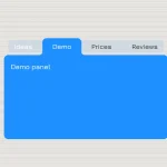 CSS-Only Inverted Corner Tabs With Anchor Positioning
 Material Design Icon Picker in Vanilla JavaScript
 Material Design-style Time Picker Web Component – clock-timepicker
 Material Design 3 Date Picker with Vanilla JS & Bootstrap 5
 Lightweight Material Design 3 CSS Framework – GMX.css
 Animated Tabs Component In Pure CSS – Tabsy CSS
How do I put the indicator where I want it?