


notifyjs is a vanilla JS notification plugin that shows Material Snackbar and Toasts style notification messages to the user.
How to use it:
1. Install and import the notifyjs.
# NPM
$ npm install @codewithkyle/notifyjs --save
import snackbar from "@codewithkyle/notifyjs/snackbar";
2. Or import the modules from a CDN.
import toaster from "https://cdn.jsdelivr.net/npm/@codewithkyle/notifyjs@5/dist/toaster.js";
import snackbar from "https://cdn.jsdelivr.net/npm/@codewithkyle/notifyjs@5/dist/snackbar.js";
import notifications from "https://cdn.jsdelivr.net/npm/@codewithkyle/notifyjs@5/dist/notifications.js";
import sonner from "https://cdn.jsdelivr.net/npm/@codewithkyle/notifyjs@5/dist/sonner.js";
3. Create a snackbar notification on the page.
snackbar({
  // required snackbar message
  message: 'Snackbar Notification Message',
  // optional settings
  duration?: number; // in seconds
  closeable?: boolean;
  buttons?: Array<{
    label: string;
    callback: Function;
    ariaLabel?: string;
    classes?: Array<string> | string;
    autofocus?: boolean;
    event?: string;
    eventData?: any;
  }>;
  force?: boolean; // defaults to true
  classes?: Array<string> | string;
  autofocus?: boolean; // defaults to true
});
4. Create a toast notification on the page.
import toaster from "@codewithkyle/notifyjs/toaster";
toaster.push({
  // required toast message
  message: 'Toast Notification Message',
  // optional settings
  message: string;
  duration?: number; // in seconds
  classes?: string | string[];
});
5. Create a growl-style notification box on the page.
import notifications from "@codewithkyle/notifyjs/notifications";
notifications.push({
  // required notification message
  title: 'Notification Title',
  message: 'Notification Message',
  // optional settings
  closeable?: boolean;
  icon?: string; // svg or img
  duration?: number; // in seconds
  classes?: string[];
  autofocus?: boolean; // defaults to true
  buttons?: Array<{
    label: string;
    callback: Function;
    ariaLabel?: string;
    classes?: Array<string> | string;
    autofocus?: boolean;
    event?: string;
    eventData?: any;
  }>;
  timer?: "vertical" | "horizontal" | null; // defaults to null
});
6. Create a ‘Sonner’ notification.
import sonner from "@codewithkyle/notifyjs/sonner";
sonner.push({
  message: string;
  duration?: number; // in seconds
  closeable?: boolean;
  buttons?: Array<{
    label: string;
    callback?: Function;
    ariaLabel?: string;
    classes?: Array<string> | string;
    autofocus?: boolean;
    event?: string;
    eventData?: any;
  }>;
  force?: boolean; // defaults to true
  classes?: Array<string> | string;
  autofocus?: boolean; // defaults to true
});
7. Apply your own CSS styles and animations to the notifications.
<!-- Snackbar HTML Structure -->
<snackbar-component>
  <p>Custom notification message</p>
  <snackbar-actions>
    <button>Action</button>
    <button class="close">
      <svg />
    </button>
  </snackbar-actions>
</snackbar-component>
<!-- Toast HTML Structure --> <toaster-component> <output role="status">Custom toast message.</output> </toaster-component>
<!-- Notification HTML Structure -->
<notifications-component>
  <notification-component>
    <i>
      <svg />
    </i>
    <copy-wrapper>
      <h3>Title</h3>
      <p>Custom notification message</p>
      <notification-actions>
        <button>Action</button>
      </notification-actions>
    </copy-wrapper>
    <button class="close">
      <svg />
    </button>
    <notification-timer class="vertical || horizontal"></notification-timer>
  </notification-component>
</notifications-component>
<!-- Sonner HTML Structure -->
<sonner-component>
<sonner-toast-component>
<copy-wrapper>
<h3>Example heading</h3>
<p>This is an example sonner message.</p>
</copy-wrapper>
<button>Click me</button>
</sonner-toast-component>
</sonner-component>8. Custom events.
// notify:sonner
// notify:alert
// notify:toast
// notify:snackbar
const event = new CustomEvent("notify:sonner", {
  detail: {
    heading: "Sonner Example",
    message: `Example sonner toast message.`,
  }
});
window.dispatchEvent(event);
Changelog:
v5.0.0 (03/16/2025)
- Added Sonner notification
- Added Custom event triggers
- Added Custom event callbacks
v4.1.0 (05/30/2023)
- Update
v3.1.1 (01/16/2022)
- Bugfix
v3.1.0 (03/27/2021)
- improved snackbar rendering performance
- improved toast rendering performance
- reduced package size
v3.0.0 (03/26/2021)
- snackbar notifications now default to force: true
- closeable snackbar and toaster notifications now default autofocus: true
- new append() function
- bugs fixed
v2.1.1 (01/21/2021)
- Fixed: snackbar undefined element when forced bug
v2.1.0 (11/09/2020)
- Added ability to autofocus buttons
- Added role attributes to snackbar and toast notifications
- Added: toast notifications can contain buttons
- Added: toast notification timers
- Fixed: toast notifications now stack with newest notifications appearing at the bottom (better UX/expected notification behavior)
v2.0.3 (09/16/2020)
- Fixed snackbar button without class bug
v2.0.1 (04/24/2020)
- Refactored elements into web components
- Renamed NotificationManager() to Notifier()
- Fixed: toast components use node.inserBefore() instead of forcing the column-reverse CSS property to render in the correct order
- Removed deprecated position value
- Removed notify() export — replaced with snackbar()
v1.2.2 (04/18/2020)
- Fixed toaster notification null check bug
- Fixed toaster notification close button bug
v1.2.0 (04/05/2020)
- toaster notification toast() creation
- renames existing notification funciton to snackbar()
v1.1.0 (02/12/2020)
- Added support for applying dynamic notificaiton classes
- Added support for dynamic button classes
- Added generic material design based CSS stylesheet
v1.0.2 (01/10/2020)
- new notify export providing access to a global notification manager
v1.0.0 (12/16/2019)
- Added TypeScript declaration file for Notify.js
- Updated to ES2019
- Removed support for IE 11
- Removed minimum notification duration
v0.2.0 (09/30/2019)
- Reworked library to use window.requestAnimationFrame instead of setTimeout in order to increase performance
- Notifications are queued and will be displayed in the order they’re submitted
- Added positioning information/values
- Updated HTML structure to allow for more robust layouts/designs
- Removed the 10 second maximum notification duration
See Also:
 Smooth Snackbar & Toast Notification In JavaScript – js-snackbar
 Feature-rich Web Notification Library – AST-Notif
 Advanced Toast/Tooltip/Popover/Confirm/Modal Notification Library – toast-anchor
 Lightweight Toast & Growl Notifications Inspired by macOS – Toastify
 Material Design Toast & Snackbar Library with Action Buttons – MiniSnackbar
 Customizable Growl/Toast Alerts with LocalNotification.js
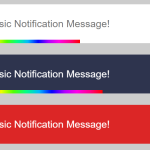 Auto-dismissable Notification Popup With Progress Bar – Notification.js
 Sleek Toast & Growl Alert Notification Library – Nostfly.js