


| Author: | abdulrahman-mh |
|---|---|
| Views Total: | 183 views |
| Official Page: | Go to website |
| Last Update: | May 26, 2025 |
| License: | MIT |
Preview:

Description:
Textrix is a vanilla JavaScript-driven WYSIWYG rich-text editor that provides a Medium-like authoring experience for modern web applications.
Unlike traditional text editors, Textrix maintains true WYSIWYG fidelity when generating static HTML output—what you see in the editor is exactly what gets published.
Table of Contents:
- Features
- Installation
- Options
- API Method
- Publishing Static HTML
- Media Plugin
- Bubble Menu Plugin
- Floating Menu Plugin
- Code Block Plugin
- Emoji Plugin
Features:
- Performance: Handles large documents surprisingly well.
- ProseMirror Foundation: Built on the robust ProseMirror library for reliable document modeling
- Customizable: Uses a plugin system, so you can extend or modify functionality.
- Rich Media: Supports embedding images, videos, and other web content with layout controls.
- Markdown: Includes Markdown shortcuts for formatting.
- Collaboration: Offers real-time editing capabilities and version history (requires backend setup).
- i18n Ready: Built with localization and RTL support in mind.
- Tree-shakeable: Helps keep your bundle size down by only including needed features.
See It In Action:
Installation:
# NPM
$ npm install textrix
// Import stylesheet
import 'textrix/themes/textrix.min.css';
// Import code
import { Editor } from 'textrix';
// import plugins
import { Media, Emoji, BubbleMenu, FloatingMenu } from 'textrix/features';
// OR use ESM via CDN:
<link rel="stylesheet" href="https://cdn.jsdelivr.net/npm/textrix/dist/themes/textrix.min.css" />
import { Editor } from 'https://cdn.jsdelivr.net/npm/textrix/dist/es/index.js';
import { BubbleMenu, FloatingMenu, Media, Emoji } from 'https://cdn.jsdelivr.net/npm/textrix/dist/es/features.js';// Or UMD for direct browser usage: <link rel="stylesheet" href="https://cdn.jsdelivr.net/npm/textrix/dist/themes/textrix.min.css" /> <script src="https://cdn.jsdelivr.net/npm/textrix/dist/umd/editor.min.js"></script> <!-- Load Plugins --> <script src="https://cdn.jsdelivr.net/npm/textrix/dist/umd/features/common.min.js"></script> <!-- Or load plugins individually --> <script src="https://cdn.jsdelivr.net/npm/textrix/dist/umd/features/emoji.min.js"></script>
2. Create a container for your Medium-like editor.
<div class="example"></div>
3. Create a new Editor instance, pass the container element, and enable any plugins you prefer.
const editor = new Editor({
  element: document.querySelector('.example'),
  features: [
    BubbleMenu, // Pop-up formatting menu on text selection
    FloatingMenu, // Menu that appears on empty lines for inserts
    Media, // Image and media embed support
    Emoji,  // Emoji picker triggered by ':'
  ],
});
4. Available options to customize the editor.
const editor = new Editor({
  //  Initial content (JSON or HTML).
  content: {}
    type: 'doc',
    content: [
      // …
    ],
  },
  // This disables `<h3>` and blockquotes while keeping all other formats active.
  formats: { h3: false, quote: false },
  // Boolean to enable or disable editing.
  editable: true,
  // Enable Markdown-like syntax input.
  markdownShortcuts: true,
  // Custom labels and UI strings (great for localization 🌍).
  messages: { mainPlaceholder: 'Tell your story...' },
  // Override default icons.
  icons: '',
  // callbacks
  onSelectionUpdate: ({ isEmpty, charCount, wordCount }) => {
   console.log(`${wordCount} words, ${charCount} characters`);
  },
  onUpdate: ({ editor }) => {
    clearTimeout(saveTimeout)
    saveTimeout = setTimeout(() => {
      // Save the doc
      const docJSON = editor.getJSON()
      sendToBackend(docJSON)
      }, 2000); // Save after 2 second of idle
  }
});
5. API Methods:
editor.setEditable(isEditable: boolean): Toggle read-only state.editor.setOptions(options: object): Update editor configuration after initialization.editor.getJSON(): Get the current content as a ProseMirror JSON object. This is usually what you’ll store in your database.editor.getHTML(): Generate the static HTML output directly from the editor instance.editor.setContent(content: object | string, options?: object): Replace the editor content. Accepts JSON or HTML.editor.getMetadata(): Retrieve metadata like title, featured image, etc., if defined within the document structure.editor.destroy(): Clean up the editor instance and event listeners. Call this when the component unmounts.editor.isEmpty: Boolean property indicating if the editor has content.editor.isEditable: Boolean property reflecting the current editable state.editor.isDestroyed: Boolean property indicating ifdestroy()has been called.
6. Publishing Static HTML. You can store the content as JSON (editor.getJSON()) and generate HTML when needed.
Client-Side Generation:
const htmlOutput = editor.getHTML();
// Now you can display 'htmlOutput' or save it
Server-Side Generation: This is generally better for security and separating concerns. You’ll need the generateHTML function from Textrix and a schema matching your editor configuration.
// On your backend (Node.js example)
import { generateHTML, buildSchema } from 'textrix'; // Assuming access to Textrix package
// Load the stored JSON document
const doc = { /* ... your stored ProseMirror JSON ... */ };
// You need to build a schema that matches the features
// used in the editor instance that created the content.
// This part requires careful setup matching your frontend editor config.
const schema = buildSchema(/* pass feature configurations if needed */);
const htmlOutput = generateHTML(doc, schema, { stripHeadlines: true }); // Optional: remove title/subtitle
// console.log(htmlOutput); -> <p>Hello world!</p>
// Serve this HTML
Getting the backend schema right is crucial; it must accurately reflect the nodes and marks allowed by the editor configuration that produced the JSON. If they mismatch, generation might fail or produce incorrect HTML.
Media Plugin
The Media plugin is useful if you need users to insert images or embed external content like videos or social media posts. It handles uploads, URL embeds, and provides layout controls.
Core Functionality:
- Image Insertion: Supports uploading images directly or via drag-and-drop.
- Rich Media Embeds: Handles URLs from sources like YouTube, Vimeo, Twitter, etc., embedding them as interactive elements (if configured).
- Captions: Allows users to add
figcaptiontext directly below images or embeds. - Layout Control: Users can change the visual layout of media elements (e.g., grid, inset, fill-width, outset).
- Grouping & Reordering: Media items can be dragged to reorder them or group them into responsive grids.
Usage & Configuration:
const editor = new Editor({
  element: document.querySelector('.myEditor'),
  features: [
    // Other features...
    Media.configure({
      // Required for uploads: Function to handle the upload process
      uploadImage: async ({ file }) => {
        // Your logic to upload the file to a server/CDN
        const imageUrl = await myUploadFunction(file);
        // Must return an object with the final URL
        return { url: imageUrl };
      },
      // Optional: Function to fetch data for URL embeds
      fetchMediaEmbedData: async ({ url }) => {
        // Your logic to call an endpoint (or your backend)
        // that analyzes the URL and returns embed details.
        // Example response structure:
        return {
          mediaId: 'someUniqueId', // Or null if not applicable
          iframeSrc: `https://example.com/embed?url=${encodeURIComponent(url)}`,
          title: 'Fetched Embed Title',
          // other metadata if needed
        };
      },
      // Optional: Function to generate responsive image URLs
      getOptimizedImageUrl: ({ src, layout }) => {
        // Logic to append query params or modify URL for different sizes
        // based on the 'layout' (grid, inset-center, etc.)
        const widths = {
          grid: 500,
          'inset-center': 800,
          'outset-center': 1200,
          'fill-width': 5000, // Or your max content width
        };
        const targetWidth = layout ? widths[layout] : 1000; // Default width
        const optimizedUrl = new URL(src);
        optimizedUrl.searchParams.set('w', targetWidth); // Example param
        return optimizedUrl.toString();
      },
      // Optional: Max image file size in bytes
      maxImageSizeBytes: 10 * 1024 * 1024, // 10 MB (default is 25MB)
      // Optional: Callback for when an image exceeds the size limit
      onMaxFileSizeError: (file) => {
        console.error(`${file.name} is too large! Max size: ${this.maxImageSizeBytes / 1024 / 1024}MB`);
        // Display a user-friendly message
        alert(`${file.name} exceeds the maximum upload size.`);
      },
      // Optional: Vertical margin when scrolling focused media into view
      // mediaFocusOffset: 0, // Default
    }),
  ],
});
Bubble Menu Plugin
The BubbleMenu provides that floating toolbar you often see when selecting text in modern editors. It gives quick access to common formatting actions or context-specific controls (like image layouts when an image is selected).
Core Functionality:
- Appears automatically when text or a specific node (like an image) is selected.
- Provides buttons for common inline formatting (bold, italic, link) and block type changes (headings, quotes).
- Context-aware: Shows different options depending on whether text or media is selected.
Usage & Configuration:
BubbleMenu.configure({
  // Disable the bold button entirely
  bold: false,
  // Customize the italic button
  italic: {
    icon: '<svg>...</svg>', // Provide your custom SVG icon string
    divider: true,         // Add a visual separator after this item
    priority: 500,         // Control order (lower numbers appear first)
  },
  // You can configure other default items similarly:
  // link: {...},
  // h3: {...},
  // h4: {...},
  // quote: {...},
  // For media-specific items (these appear when media is selected):
  // mediaLayoutGrid: false, // Disable grid layout option
  // mediaLayoutInset: { priority: 100 },
  // ...etc. for other layouts like outset, fill-width
})
Available Menu Items (Default Set):
bold: Toggle bold text (<strong>).italic: Toggle italic text (<em>).link: Add or edit hyperlinks (<a>).h3: Convert block to heading level 3 (<h3>).h4: Convert block to heading level 4 (<h4>).quote: Convert block to a blockquote (<blockquote>).- Media Layouts (when media selected):
mediaLayoutGrid,mediaLayoutInset,mediaLayoutOutset,mediaLayoutFillWidth, etc.
Floating Menu Plugin
The FloatingMenu appears automatically next to an empty paragraph line, offering quick actions to insert block-level content like images, videos, code blocks, or horizontal rules.
Core Functionality:
- Shows an “insert” button (often a ‘+’) on empty lines.
- Clicking the button reveals a menu of block types to insert.
- Reduces the need to rely solely on Markdown shortcuts or main toolbars for block insertion.
Usage & Configuration:
FloatingMenu.configure({
  // Disable inserting images from Unsplash
  unsplash: false,
  // Customize the image upload item
  image: {
    icon: '<span>IMG</span>', // Custom icon (SVG string preferred)
    priority: 200,           // Adjust order (lower first)
    title: 'Upload Image',   // Custom tooltip/label
  },
  // Configure other items similarly:
  // video: { priority: 300 },
  // embed: false,
  // codeBlock: { icon: '...' },
  // newPart: { title: 'Section Break' } // Customize horizontal rule
})
Available Menu Items (Default Set):
image: Trigger image upload (requires configuredMediaplugin).unsplash: Insert image from Unsplash (may require configuration/API key depending on implementation).video: Embed video (usesMediaplugin’sfetchMediaEmbedDataif configured).embed: Embed other rich content (usesMediaplugin’sfetchMediaEmbedData).codeBlock: Insert a syntax-highlighted code block (requiresCodeBlockplugin).newPart: Insert a horizontal rule (<hr>), often styled as a section break.
Consideration: The usefulness of items like unsplash, video, and embed depends heavily on how you’ve configured the Media plugin, specifically the fetchMediaEmbedData function. If that’s not set up, these buttons might not work as expected.
Code Block Plugin
The CodeBlock plugin allows inserting and editing preformatted code blocks with syntax highlighting.
Core Functionality:
- Uses Highlight.js under the hood for syntax highlighting.
- Supports automatic language detection.
- Allows manual language selection from a dropdown.
- Real-time highlighting as you type or paste code.
Usage & Configuration:
FloatingMenu.configure({
  codeBlock: {
    icon: '<svg>...</svg>', // Custom icon for the menu item
    priority: 400,         // Change its position in the menu
    title: 'Insert Code Snippet' // Custom label
  }
})
Adding Code Blocks:
- Input Rule: Typing three backticks (“`) followed by a space on a new line.
- Floating Menu: Clicking the ‘+’ button on an empty line and selecting the “Code Block” option (if
FloatingMenuis enabled andcodeBlockitem is configured). - Keyboard Shortcut: Pressing
Cmd + Opt + 6(Mac) orCtrl + Alt + 6(Windows/Linux).
Emoji Picker Plugin
The Emoji plugin provides a simple way to search and insert emojis using a familiar colon (:) trigger.
Core Functionality:
- Type
:followed by characters to open a search suggestion list. - Filters over 1500+ standard emojis as you type.
- Select an emoji from the list to insert it into the text.
- Also supports auto-conversion if you type the full emoji name between colons (e.g.,
:smile:) or paste text containing such patterns.
Changelog:
v0.1.9 (05/26/2025)
- Content publishing: a new zoomImageHandler function to use it on publishing mode to handle a smooth zooming on the images like Medium’s dose.
- Images grid: Fix some images grid styles, and better handle figcaptions on it.
See Also:
 Minimal WYSIWYG Editor In Pure JavaScript – Suneditor
 Lightweight WYSIWYG Editor for Modern Web Apps – RayEditor
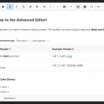 Dual-Mode WYSIWYG Rich Text & Markdown Editor in JavaScript
 Lightweight JavaScript Plugin for Rich Text Editing – HREditor
 Minimal Rich Text Editor In Pure JS – tiny-editor
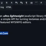 Ultra-light WYSIWYG Rich Text Editor – Tex.js
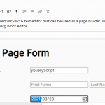 Wordpress Gutenberg Like WYSIWYG Block Editor – Pexego
 Simple Extensible WYSIWYG Editor – ysEditor.js