


This is the pure version of jQuery bootstrap-fs-modal plugin which provides better user experiences of Bootstrap 4 modal components on mobile devices.
Installation:
# NPM
$ npm install bootstrap4-fs-modal --save
How to use it:
Include the bootstrap4-fs-modal’s main style sheet into your Bootstrap 4 project.
<link rel="stylesheet" href="https://maxcdn.bootstrapcdn.com/bootstrap/4.0.0-beta.2/css/bootstrap.min.css" integrity="sha384-PsH8R72JQ3SOdhVi3uxftmaW6Vc51MKb0q5P2rRUpPvrszuE4W1povHYgTpBfshb" crossorigin="anonymous">
<link href="dist/css/bootstrap-fs-modal.css" rel="stylesheet">
<script src="https://code.jquery.com/jquery-3.2.1.slim.min.js" integrity="sha384-KJ3o2DKtIkvYIK3UENzmM7KCkRr/rE9/Qpg6aAZGJwFDMVNA/GpGFF93hXpG5KkN" crossorigin="anonymous"></script>
<script src="https://cdnjs.cloudflare.com/ajax/libs/popper.js/1.12.3/umd/popper.min.js" integrity="sha384-vFJXuSJphROIrBnz7yo7oB41mKfc8JzQZiCq4NCceLEaO4IHwicKwpJf9c9IpFgh" crossorigin="anonymous"></script>
<script src="https://maxcdn.bootstrapcdn.com/bootstrap/4.0.0-beta.2/js/bootstrap.min.js" integrity="sha384-alpBpkh1PFOepccYVYDB4do5UnbKysX5WZXm3XxPqe5iKTfUKjNkCk9SaVuEZflJ" crossorigin="anonymous"></script>
Add the CSS class modal-fullscreen to the target modal container and done.
<div class="modal fade modal-fullscreen" id="modalSmall" tabindex="-1" role="dialog" aria-labelledby="modalSmallLabel" aria-hidden="true">
<div class="modal-dialog" role="document">
<div class="modal-content">
<div class="modal-header">
<h5 class="modal-title" id="modalSmallLabel">Modal with small content</h5>
<button type="button" class="close" data-dismiss="modal" aria-label="Close">
<span aria-hidden="true">×</span>
</button>
</div>
<div class="modal-body">
<p>
Lorem ipsum dolor sit amet, consectetur. Sed posuere at neque nec hendrerit. Sed vitae felis gravida, ultricies dui eget, venenatis leo. Nunc hendrerit tellus.
</p>
</div>
<div class="modal-footer">
<button type="button" class="btn btn-secondary" data-dismiss="modal">Close</button>
<button type="button" id="btnTestRefreshSmall" class="btn btn-default">
<span class="d-none d-md-inline">Reload Data</span>
<span class="d-md-none">Reload</span>
</button>
<button type="button" id="btnTestSaveSmall" class="btn btn-default">
<span class="d-none d-md-inline">Save changes</span>
<span class="d-md-none">Save</span>
</button>
</div>
</div>
</div>
</div>Add the CSS class bootstrap-fs-modal to the parent container.
<body class="bootstrap-fs-modal">
Override the default variables to create your own styles.
$modal-header-height: 50px;
$modal-header-background: #f8f8f8;
See Also:
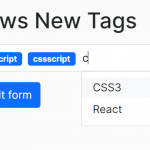 Easy Tags Input Component For Bootstrap 5/4 – Tags.js
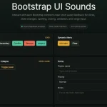 Add Web Audio Feedback to Bootstrap 5 Components – Bootstrap UI Sounds
 iOS-style Bottom Sheet Component for Bootstrap 5 – BootstrapSheet
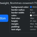 Inspect CSS Styles With Bootstrap Popover CSS Inspector
 Navbar-Synced Context Menu for Bootstrap 5 – BRC JS
 Make Bootstrap 5 Tables More Readable On Mobile Devices – AvalynxTable.js
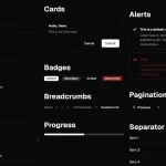 Shadstrap: Bootstrap 5 Theme with shadcn/ui Aesthetics
 Bootstrap 5 Select Dropdown Enhancer – AvalynxSelect