


A user-friendly multi select JS library that allows the user to select single or multiple options from a tree-style hierarchical dropdown list.
See Also:
- Multi-Select Drop Down Tree Plugin With jQuery – Combo Tree
- Filterable & Checkable Multi-Select Dropdown In JavaScript
How to use it:
1. Import the Treeselect’s JavaScript and Stylesheet.
<link rel="stylesheet" href="./dist/treeselect-js.css" />
import Treeselect from '../dist/treeselect-js.mjs.js';
2. Create an empty DIV container to hold the Multi-Select dropdown box.
<div class="example" />
</div>
3. Define your nested options as follows:
const options = [
  {
    name: 'JavaScript',
    value: 'JavaScript',
    htmlAttr: {},
    isGroupSelectable: true,
    disabled: false,
    children: [
      {
        name: 'React',
        value: 'React',
        children: [
          {
          name: 'React.js',
          value: 'React.js',
          children: []
          },
          {
          name: 'React Native',
          value: 'React Native',
          children: []
          }
        ]
      },
      {
        name: 'Vue',
        value: 'Vue',
        children: []
      }
    ]
  },
  {
    name: 'HTML',
    value: 'html',
    children: [
      {
        name: 'HTML5',
        value: 'HTML5',
        children: []
      },
      {
        name: 'XML',
        value: 'XML',
        children: []
      }
    ]
  }
]
4. Initialize the Treeselect and populate the Multi-Select dropdown box with the data you just created.
const treeselect = new Treeselect({
  parentHtmlContainer: document.querySelector('.example'),
  options: options,
})
5. Available options to customize the Treeselect.
const treeselect = new Treeselect({
  // parent container element
  parentHtmlContainer: HTMLElement,
  // an array of option values
  value: [],
  // define your options here
  options: [],
  // keep the tree select always open
  alwaysOpen: true,
  // open all options to this level
  openLevel: 0,
  // append the Treeselect to the body
  appendToBody: false,
  // shows selected options as tags
  showTags: true,
  // text to show if you use 'showTags'
  tagsCountText: '{count} {tagsCountText}',
  // shows remove icon
  clearable: true,
  // is searchable?
  searchable: true,
  // placeholder text
  placeholder: 'Search...',

  // text to display when no results found
  emptyText: 'No results found...',
  // converts multi-select to the single value select
  isSingleSelect: false,
  // returns groups if they selected instead of separate ids
  isGroupedValue: false,
  // All nodes in treeselect work as an independent entity.
  // Check/uncheck action ignore children/parent updates workflow.
  // Disabled nodes ignore children/parent workflow as well.
  isIndependentNodes: false,
  // It is impossible to select groups. You can select only leaves.
  disabledBranchNode: false,
  // mproves list rendering performance by using visibility-based optimizations and IntersectionObserver.
  // Useful for efficiently rendering large lists.
  isBoostedRendering: false,
  // auto, top, bottom
  direction: 'auto',
  // all groups which have checked values will be expanded on the init.
  expandSelected: false,
  // The list saves the last scroll position before close. If you open the list your scroll will be on the previous position.
  // If you set the value to false - the scroll will have position 0 and the first item will be focused every time.
  saveScrollPosition: true,
  //  A class name for list.
  listClassName: '',
  // shows count of children near the group's name.
  showCount: false,
  // group options
  grouped: true,
  // element that appends to the end of the dropdown list
  listSlotHtmlComponent: null,
  // is dropdown list disabled?
  disabled: false,
  // add the list as a static DOM element
  // this prop will be ignored if you use appendToBody.
  staticList: false,
  // id attribute for the accessibility.
  id: '',
  // { arrowUp, arrowDown, arrowRight, attention, clear, cross, check, partialCheck }
  // object contains all svg icons
  iconElements: {},
  srcElement: null,
  // callback and functions
  inputCallback: (value) => void (undefined),
  openCallback: (value) => void (undefined),
  closeCallback: (value) => void (undefined),
  nameChangeCallback: (value) => void (undefined),
  searchCallback: (value) => void (undefined),
  openCloseGroupCallback: (groupId: ValueOptionType, isClosed: boolean) => void (undefined)
  mount: () => void,
  updateValue: (newValue: ValueOptionType[]) => void,
  destroy: () => void,
  focus: () => void,
  toggleOpenClose: () => void,

})
6. Events.
treeselect.srcElement.addEventListener('input', (e) => {
  // ...
})
treeselect.srcElement.addEventListener('open', (e) => {
  // ...
})
treeselect.srcElement.addEventListener('close', (e) => {
  // ...
})
treeselect.srcElement.addEventListener('name-change', (e) => {
  // ...
})
treeselect.srcElement.addEventListener('search', (e) => {
  // ...
})
treeselect.srcElement.addEventListener('open-close-group', (e) => {
  // ...
})
7. API methods.
// update options
treeselect.updateValue(Array[String]);
// remount and update settings
treeselect.mount();
// toggle between open & close
treeselect.toggleOpenClose();
// set focus on treeselect input without open/close state changes.
treeselect.focus();
// destroy the instance
treeselect.destroy();
Changelog:
v0.14.1 (02/27/2026)
- Move CSS variables to :root.
- Change CSS variable names from –treeselect to –treeselectjs for better consistency and clarity.
v0.14.0 (02/27/2026)
- add CSS color variables for better customization.
- decrease bundle size.
v0.13.3 (12/19/2025)
- add an opportunity to use multiple classes support for the listClassName prop.
v0.13.2 (11/26/2025)
- Fix shadow root issues
v0.13.1 (04/12/2025)
- Fix slot blur event ignore in Firefox and Safari.
v0.13.0 (03/06/2025)
- Increase list component performance.
- Add isBoostedRendering prop.
- Add isGroupSelectable field to the options prop.
v0.12.3 (03/06/2025)
- Provide an opportunity to overwrite the title attribute for options with the help of the htmlAtt field.
v0.12.2 (03/04/2025)
- Add type TagsSortFnType and type TagsSortItem to the export
v0.12.1 (02/22/2025)
- Add tagsSortFn property
v0.12.0 (01/13/2025)
- Add 0 as a valid value to the options values.
v0.11.0 (06/17/2024)
- Add a listClassName prop.
v0.10.0 (11/19/2023)
- Add RTL mode prop (rlt).
v0.9.3 (09/24/2023)
- Add open-close-group event and openCloseGroupCallback prop.
v0.9.1 (07/11/2023)
- Add ariaLabel attribute for the accessibility. Prop uses placeholder as a default value.
v0.9.0 (06/06/2023)
- Add isIndependentNodes prop
- Add ‘search’ event
- Add searchCallback prop
v0.8.6 (04/19/2023)
- Add info about Vue wrapper.
v0.8.5 (04/18/2023)
- Bugfix
v0.8.4 (04/16/2023)
- Bugfix
v0.8.2 (04/16/2023)
- Add info about react wrapper.
v0.8.1 (04/14/2023)
- Add export for major types.
v0.8.0 (04/12/2023)
- Add vite and remove parcel.
- Add umd file.
v0.7.0 (03/27/2023)
- Fix: public filed value contains a currently selected value.
- Add a disabled field to the options array.
- Add the htmlAttr field to the list item.
- Add expandSelected prop.
- Add saveScrollPosition prop.
- Improve cursor behavior during searchable actions.
v0.6.0 (03/20/2023)
- Bugfixes
v0.5.8 (01/30/2023)
- Fix: remove global variable for single-select.
v0.5.7 (12/16/2022)
- Add preventing of scripts in names.
v0.5.6 (11/03/2022)
- Fix nameChangeCallback empty name.
- Add read-only attribute for unsearchable mode. Hide keyboard for mobile devices.
- Remove empty id from input element.
- Fix the scroll position during key navigation with the slot.
v0.5.5 (11/01/2022)
- Add selectedName field to the Treeselect class.
v0.5.4 (11/01/2022)
- Fix: parent node selects for isSingleSelect mode if a parent has only one child node.
- Add nameChangeCallback method.
v0.5.3 (10/15/2022)
- Add class is-single-select to the input.
- Add overflow to the placeholder.
v0.5.2 (10/04/2022)
- Add text align for labels and checkbox icons.
v0.5.1 (10/03/2022)
- Fix disabled prop resetting.
- Fix direction prop wrong validation.
v0.5.0 (09/30/2022)
- Added Direction prop
- Added openCallback
- Added closeCallback
v0.4.3 (09/08/2022)
- Fix focus/blur behavior for visibility/display style changes.
v0.4.2 (09/06/2022)
- Add isGroupedValue prop.
- Add disabledBranchNode prop.
- Add title to the selected value in isSingleSelect mode.
- Add styles for selected value inside the list.
- Fix tab navigation bug. (You couldn’t unfocus element).
v0.4.1 (09/05/2022)
- Fix keyboard focus issues.
- Add prevent enter key for correct forms work.
v0.4.0 (09/05/2022)
- Add isSingleSelect prop.
- Add showCount prop.
- Rename main files form treeslecet-js to treeselectjs.
v0.3.6 (08/24/2022)
- Remove invisible input line for unsearchable mode.
- Swap event listeners with callbacks.
- Move Input element to the tags list.
- Unsearchable mode input fix.
v0.3.3 (07/29/2022)
- Remove swc/helpers dependency.
v0.3.2 (07/28/2022)
- added dependency
v0.3.1 (07/23/2022)
- Typescript support.
- New props were added: id, iconElements, inputCallback.
- ES modules and CommonJS support were added.
- Ability to use numbers as value.
- iconElements – Now we can create a component to reset default icons.
- Code refactoring.
- Build with browserlist (“> 0.5%, last 2 versions, not dead”).
- Package size was minimized.
v0.2.9 (07/07/2022)
- Add tagsCountText prop.
- Fix the wrong input value if the user tries to remove the tag from input.
- Add toggleOpenClose and focus methods.
v0.2.8 (07/02/2022)
- Bug Fixes
v0.2.7 (06/30/2022)
- Add staticList prop.
- Fix resize bug for the appendToBody prop.
- Fix code misspellings.
v0.2.6 (06/29/2022)
- Fix: a bug that is related to the wrong partial checkbox check.
- Method for the list position was updated.
- Fix: a bug related to the wrong position for the list on blur if alwaysOpen prop is selected.
- Added validation message for duplicate values.
See Also:
 Feature-rich Custom Select JavaScript Library – SimpSelect
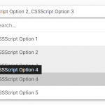 High Performance Select Box with Virtual Scroll (Vanilla JS) – Virtual Select
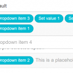 Customizable Select Box & Input Field Enhancement Library – Choices.js
 Tagging & Searchable Dropdown with Multi-Select – Searchdown.js
 Select Multiple Elements With Mouse Drag & Touch Gestures – Selectables
 Multi-select Dropdown Component For JavaScript – slim-select
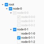 Dynamic Interactive Tree View With Checkboxes – Treejs
 Render JSON Data As A Tree View – json-view