


A mobile-friendly hamburger navigation that morphs the hamburger button into a fullscreen menu using JavaScript and CSS transition, transform and clip-path properties.
How to use it:
Create the hamburger navigation.
<nav class="nav">
  <ul>
    <li>Home</li>
    <li>Contact</li>
    <li>About</li>
    <li>Blog</li>
  </ul>
</nav>
Create a hamburger button to toggle the navigation.
<button class="nav-tgl" type="button" aria-label="toggle menu">
  <span aria-hidden="true"></span>
</button>
The necessary CSS/CSS3 rules for the navigation & hamburger button.
.nav-tgl {
  display: inline-block;
  cursor: pointer;
  position: fixed;
  z-index: 100;
  right: 30px;
  top: 30px;
  width: 70px;
  height: 70px;
  border: none;
  border-radius: 50%;
  padding: 0;
  background: #fff;
  box-shadow: 0px 4px 24px rgba(0, 0, 0, 0.24);
  line-height: 0.6;
  text-align: center;
}
.nav-tgl > span {
  display: inline-block;
  position: relative;
  height: 2px;
  width: 34px;
  border-radius: 1px;
  background: #293335;
  vertical-align: middle;
}
.nav-tgl > span:before, .nav-tgl > span:after {
  display: inline-block;
  position: absolute;
  content: "";
  height: 2px;
  border-radius: 1px;
  background: #293335;
  transition: all 200ms;
}
.nav-tgl > span:before {
  top: -11px;
  left: 3px;
  width: 28px;
}
.nav-tgl > span:after {
  top: 11px;
  left: 6px;
  width: 22px;
}
.nav-tgl:focus {
  outline: none;
}
.nav-tgl:hover > span:after, .nav-tgl:hover > span:before {
  width: 34px;
  left: 0;
}
.nav-tgl.toggled > span {
  height: 0;
}
.nav-tgl.toggled > span:after, .nav-tgl.toggled > span:before {
  top: 0px;
  left: 0;
  width: 34px;
}
.nav-tgl.toggled > span:after {
  transform: rotate(-45deg);
}
.nav-tgl.toggled > span:before {
  transform: rotate(45deg);
}
.nav:before {
  display: block;
  position: fixed;
  top: 0;
  left: 0;
  content: '';
  width: 100vw;
  height: 100vh;
  background: rgba(0, 0, 0, 0.8);
  transition: all 500ms ease-in-out;
  clip-path: circle(30px at calc(100% - 65px) 65px);
  visibility: hidden;
}
.active.nav:before {
  visibility: visible;
  clip-path: circle(100%);
}
.nav ul {
  display: none;
}
The main JavaScript to enable the hamburger navigation.
let toggled = false;
const nav = document.getElementsByClassName('nav')[0];
const btn = document.getElementsByClassName('nav-tgl')[0];
btn.onclick = function(evt) {
  if (!toggled) {
    toggled = true;
    evt.target.classList.add('toggled');
    nav.classList.add('active');
  } else {
    toggled = false;
    evt.target.classList.remove('toggled');
    nav.classList.remove('active');
  }
}
See Also:
 Responsive Sliding Hamburge Menu System
 Simple Sidebar Hamburger Menu In CSS
 Responsive Sidebar Navigation With Hamburger Toggle Button
 Expanding Dropdown Menu In JavaScript
 Hamburger Site Navigation With Menu Rotation
 3D Perspective Hamburger Menu With JavaScript And CSS3
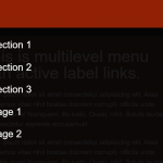 Mobile-friendly Hamburger Navigation With Submenus
 Sliding Hamburger Navigation With GSAP
Hi! Very nice effect. But how can i place text inside it? Many Thanks!!